So you’re going to design the visuals for a new website or app. But what should it look like? One of the first – and quite important – considerations is to determine a color scheme for the project.
That usually comes down to two basic choices: light or dark. While there are pros and cons of color choices when designing something that will be viewed on a small screen? Does it matter?
Let’s Start With a Comparison
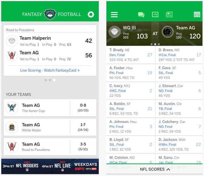
Photo credit: ESPN Fantasy Football
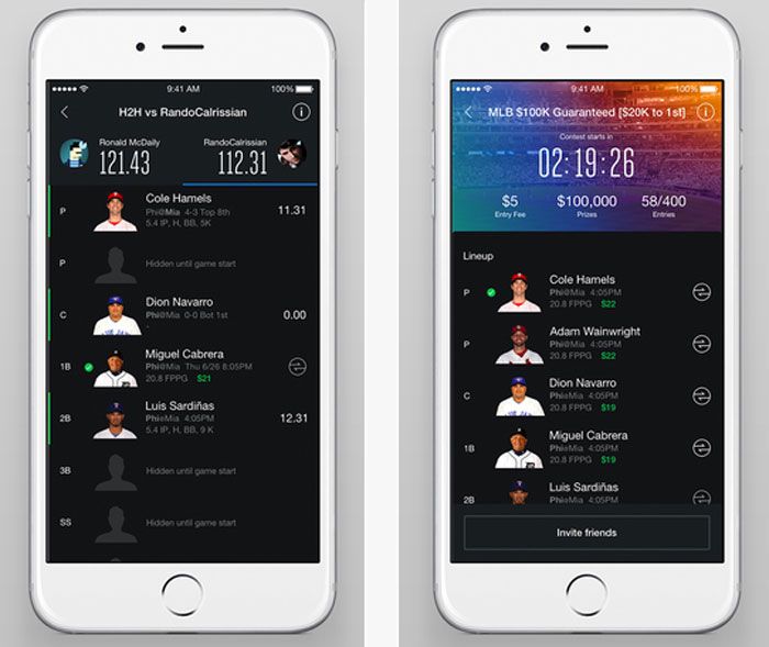
Photo credit: Yahoo! Fantasy Football
It would be hard to find something more talked about than fantasy sports. Almost everywhere you go someone is talking about a team or lineup. So we’re going to look at two fantasy sports apps that work in basically the same way with one big difference: The ESPN version uses a light color scheme while Yahoo! opted for dark.
Both apps are designed cleanly and include plenty of features. They use intuitive interfaces that offer drag and drop movements, taps for actions and simple animations.
But what do you prefer? Look at both quickly and choose. If you could only download one app which one would it be?
You are likely to find plenty of different responses based on location, age and even just personal preference for either platform. Other factors such as typeface and size, types of interactions to be performed and type of content can impact the choice as well.
Color and “Feelings” About the Interface
Dark and light color associations can create immediate feelings for the user. Just as color impacts emotion in other design context, the same is especially true when it comes to mobile.
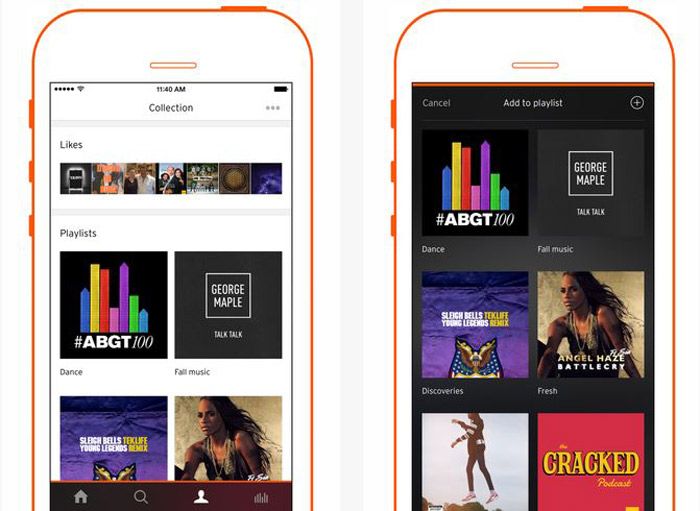
Photo credit: Soundcloud
Because the space is small, there’s an inclination to cram too many things on the screen at once. This can cause the user stress and confusion due to the clutter. It can also feel a bit claustrophobic. Add in a dark color scheme and that feeling is only magnified because dark colors use more virtual space, meaning they are heavier in on the screen. Soundcloud, for example, has light and dark interfaces so that users can get the experience that feels right to them.
Lighter colors create a sense of more open space. When it comes to how users “feel” about color, users typically don’t notice a light or white background. However, a dark or black background jumps out. This is because the darker color has more visual weight. Also, we’re more accustomed to lighter color backgrounds with darker text and elements since the invention of the printing press.
When the web was new, designs aped from print design, from books and magazines. And it makes sense that digital products still hold true to this pattern because white type on a dark background is hard to read. And while this is mostly true, there are some exceptions when reverse type and darker color schemes can really help the design stand out.
Provide Visual Clarity
At the end of the day, light versus dark color schemes come back to one key design component – contrast. Color contrast provides the necessary function needed for visual clarity. Simply, it makes content on the screen readable.
That’s why a dark-on-dark color scheme is seldom recommended. In most environments, dark-on-dark is incredibility difficult to read. And it’s even harder when reading on a small screen. (The same is also true of light-on-light.) There needs to be a balance of lighter and darker elements so that light can pass through and users can easily read. This is especially true when displayed on a screen surface, where some degree of backlighting is needed.
There’s even a working scientific formula for it. The W3C Working Draft for Usability has an equation for determining optimum color brightness ranges to help create the most user-friendly combinations.
- Color brightness is determined by the following formula:
((Red value X 299) + (Green value X 587) + (Blue value X 114)) / 1000
Note: This algorithm is taken from a formula for converting RGB values to YIQ values. This brightness value gives a perceived brightness for a color. - Color difference is determined by the following formula:
(maximum (Red value 1, Red value 2) – minimum (Red value 1, Red value 2)) + (maximum (Green value 1, Green value 2) – minimum (Green value 1, Green value 2)) + (maximum (Blue value 1, Blue value 2) – minimum (Blue value 1, Blue value 2)) - The rage for color brightness difference is 125. The range for color difference is 500.
Color Impacts Interactions
Color is more than an aesthetic tool. It has a direct impact on usability. (Just think: If every element on the screen is black, where would you tap to make something happen?)
Color comes to play in a number of ways but very specifically can influence interactions and signals users as to how to use the interface.
- Static items vs. functionality items
- Status or state changes
- Notifications and micro-interactions
Card-style design is perfect for this because it can help contain many of these interactions. It’s also flexible enough for a variety of interface styles. So if you want to design using a dark outline for aesthetic reasons, cards can be used within the design to help users better understand interactions.
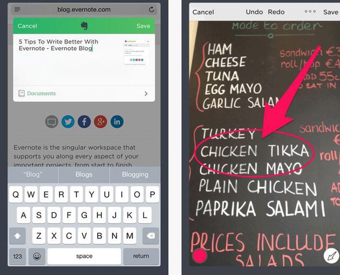
Photo credit: Evernote
Evernote added cards for the iPhone 6s 3D interface, but was already a leader in the card-style design. Even users on other phone models find notes and notebooks cleanly arranged using small cards that are easy to tap. What’s a little different about Evernote is that it uses light and dark elements in different parts of the design. Cards pull it all together to create an easy to use interface.
The Argument for Lighter Color Schemes
If you are looking for a magic bullet, it’s not here. There are times when light color schemes work best, and other situations where dark can work best. Part of determining that best practice is knowing your audience and what they might prefer.
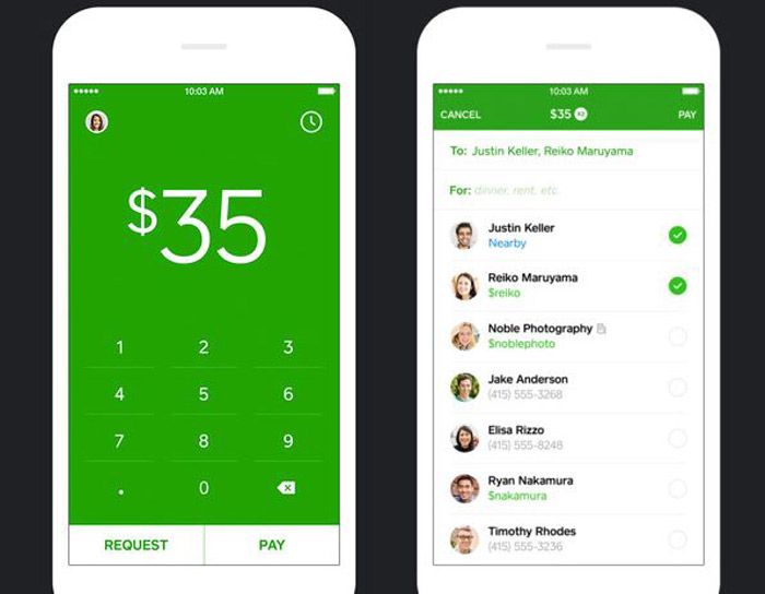
Photo credit: Square Cash App
- Reading environments: Study after study has come back with a similar result – the preferred reading environment is darker text on a lighter background (but not necessarily black on white).
- Responsive websites: When you are designing for large and small devices, it can be more manageable to work with lighter color schemes so that you don’t get caught with some readability issues during responsive scaling.
- Easy to create contrast: Light color schemes make it easy to create contrast. Almost any bright or saturated color will stand out from the background.
- Older audience: Typically audiences that are older or have accessibility issues prefer this combination.
Dark Color Schemes Can Work as Well
Darker color schemes tend to be a bit more on the trendy side. any of these interfaces skew toward websites that aren’t designed for heavy reading. They often include elements with high interactivity and require plenty of space and organization to eliminate any claustrophobic or chaotic feelings sometimes associated with darker color schemes.
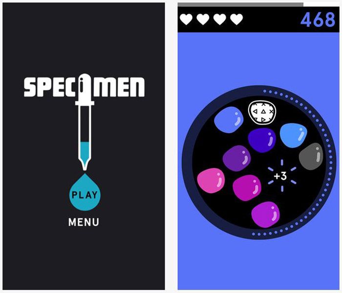
Photo credit: Specimen
- Apps: One place where dark color schemes are really taking off is in apps. Because they are different from associated websites and specifically designed for small devices, many of the cross-device issues are less of a concern.
- Design with lots of images: Photos and other image-based elements can look great against dark backgrounds. For highly visual projects that don’t require a lot of on-screen reading, this is a great option.
- Oversized everything: For over-the-top designs, dark color schemes can work well because size creates enough contrast to increase readability and usability. (The challenge is creating oversized elements on small screens.)
- Gaming: Player interfaces have been using dark color schemes for a while and this will likely continue to grow. Part of the phenomenon here is that gamers tend to skew younger and once the audience is used to a certain look, the comfort level associated with it make it the norm.
Takeaways
Let’s go back to the original example of the fantasy sports apps. Which do you prefer? Can you identify why? Personally, I use the Yahoo! app to manage my team, but I prefer the look of the ESPN app. The player tiles look easier to move and manage without having to think about how to make it work. Information is easy to see at a glance and I don’t need a visual as a secondary method to identify players. The lighter color interface is more streamlined, makes me feel a little less stressed about my lineup (which is hard to explain and quantify) and provides an experience that I am more inclined to interact with more frequently. With the darker interface, I prefer to access it on my desktop because it is easier to use in that environment.
So where do we go from here? Should you design with a light or dark color scheme? Well, it all depends.
Lighter color schemes are preferred in more complex designs and make common tools such as transparencies for notifications and other layered elements more user-friendly. Darker color schemes tend to function best in simple environments where there are many other things to do, interact with or look at.
Both color outlines can impact usability. Remember to think about contrast with either color framework. The right answer when it comes to color is usually somewhere in the middle. Testing is key.