Designing the Overlooked Empty States – UX Best Practices
Empty states are a pause, not a dead end. Whether a user stumbles across an empty state due to first-use, accomplishment, or error, your product needs to guide them to the next logical step.
This article explores empty states and their vital importance for UX design. We also offer some tips with real-world examples from leading product developers.
Have you ever tried interactive prototyping? Interactive prototypes enhance testing so designers deliver meaningful product experiences to their users. Design your first interactive prototype with UXPin. Sign up for a free trial.

What are Empty States?
An empty state is a UI design pattern telling users the system has no content to display. Some empty states instruct users on how to find, create, or add content to the screen.
Designers also use empty states to communicate a screen/feature’s purpose with tips and instructions. For example, Gmail’s empty state tells users how to customize the inbox’s tabs.

Types of Empty States
Empty states represent a pivotal point in the user journey. Each is an opportunity to build rapport, drive engagement, educate, entertain, or delight users.
There are four primary empty states users encounter in product design:
- First use: When new users first interact with a digital product.
- User cleared: The user has just completed a task or cleared all content associated with the app or site.
- Error state: The user has encountered a roadblock during the interaction.
- No data: The system has no data to display or no results from a search query.
Many designers overlook the opportunities for empty states to engage users. They tend to focus more on the associated tasks and features rather than optimizing empty states for engagement.
Empty State Examples
Here are four user interface design examples of when and how to use the types of empty states mentioned above.
First use/onboarding
Onboarding or first use empty states, present users with a blank canvas with instructions to get started. These screens must invoke action, typically with a primary call to action button.
Facebook Messenger’s empty state install screen has a lot going on in a small space, but the primary CTA is prominent using plain language.
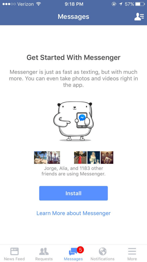
Let’s explore what users can do on this empty state screen:
- Lets you know that you can take pictures or record videos in-app
- Exerts social pressure by telling you how many of your Facebook friends are using the app
- Allows you to look up additional information about the app before installing
- An adorable graphic to create rapport and encourage engagement
Facebook Messenger’s install screen is a fantastic example of how designers can use empty states to encourage and educate first-time users.
Completing tasks/user cleared
Empty states are an opportunity to prompt users toward new interactions or congratulate them on completing tasks. This feedback acts as a placeholder and reward, helping to develop habit-forming products.
These “user-cleared” empty states are essential for encouraging further engagement. Here are three things to incorporate in task completion empty states:
- Step 1: First, inform the user they have completed the task
- Step 2: Reward the user–i.e., congratulate them
- Step 3: Steer them toward the next step
We’ll use the WritekUpp app for iOS as an example:
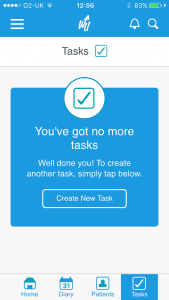
- Step 1: “You’ve got no more tasks”
- Step 2: “Well done you!”
- Step 3: “To create another task, simply tap below.” followed by the CTA: “Create New Task”
Error states
Errors are inevitable and can happen on both ends–from the user and the system. What’s important is telling the user what went wrong, why it happened (to avoid future occurrences), and what to do next.
This example from the iOS App Store shows what happens when users follow a link to an app unavailable in their region. The App Store informs the user what went wrong “Item Not Available” and why “The item you’ve requested is not currently available in the UK Store.”
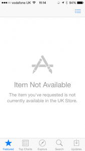
What’s missing from the App Store in this example is what to do next–which likely causes frustration. A good option would be “Search for similar apps available in your region.”
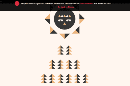
Humor can help people feel better about errors but must not confuse or create added friction. This error screen from Piccsy is an excellent example of subtle humor. Here, Piccsy presents users with an illustration linking to the artist and a CTA to return to the app.
IMDB uses a similar humorous strategy with its 404 page. The page informs the user that the URL “was not found” with a link to return to the homepage. IMDB also includes a 404-altered quote from a movie, linking to the film’s IMDB page.
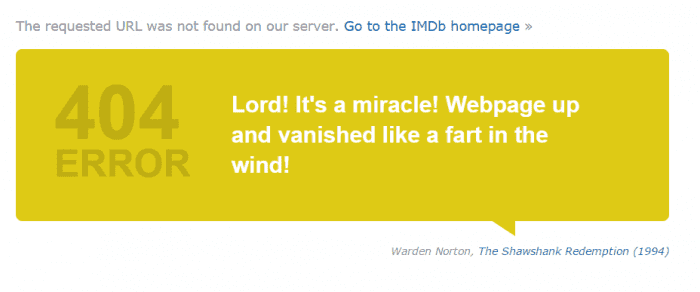
What’s clever about the IMDB 404 error page is that it educates and entertains. Users might discover a new movie while being amused by a humorous quote.
No data
Empty states must help users find content when the system doesn’t have answers. This example from DuckDuckGo shows what happens when there are no results for a query–rare with the sheer volume of content on search engines.
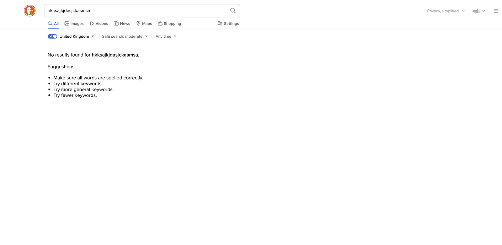
First, DuckDuckGo displays the user’s query, “No results found for [QUERY].” This prompts the user to check their keyword for errors. Next, the search engine offers suggestions to fix the problem:
- Make sure all words are spelled correctly.
- Try different keywords.
- Try more general keywords.
- Try fewer keywords.
These “no data” empty states can frustrate users because the system doesn’t have an answer. Keeping user interfaces clean with actionable advice can help them solve the problem–as DuckDuckGo does above.
Empty State Design Tips
Use visual cues
Visual cues through empty-state illustrations or GIFs help users understand what to do next. These must be relevant to the action while offering encouragement. Most importantly, the graphics mustn’t distract users.
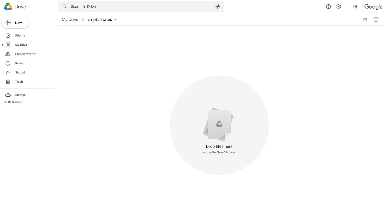
For example, Google uses a document illustration to accompany the CTA, “Drop files here or use the ‘New’ button.” The simple image is relevant to the task, doesn’t distract the user, and draws attention to the instruction.
Offer suggestions
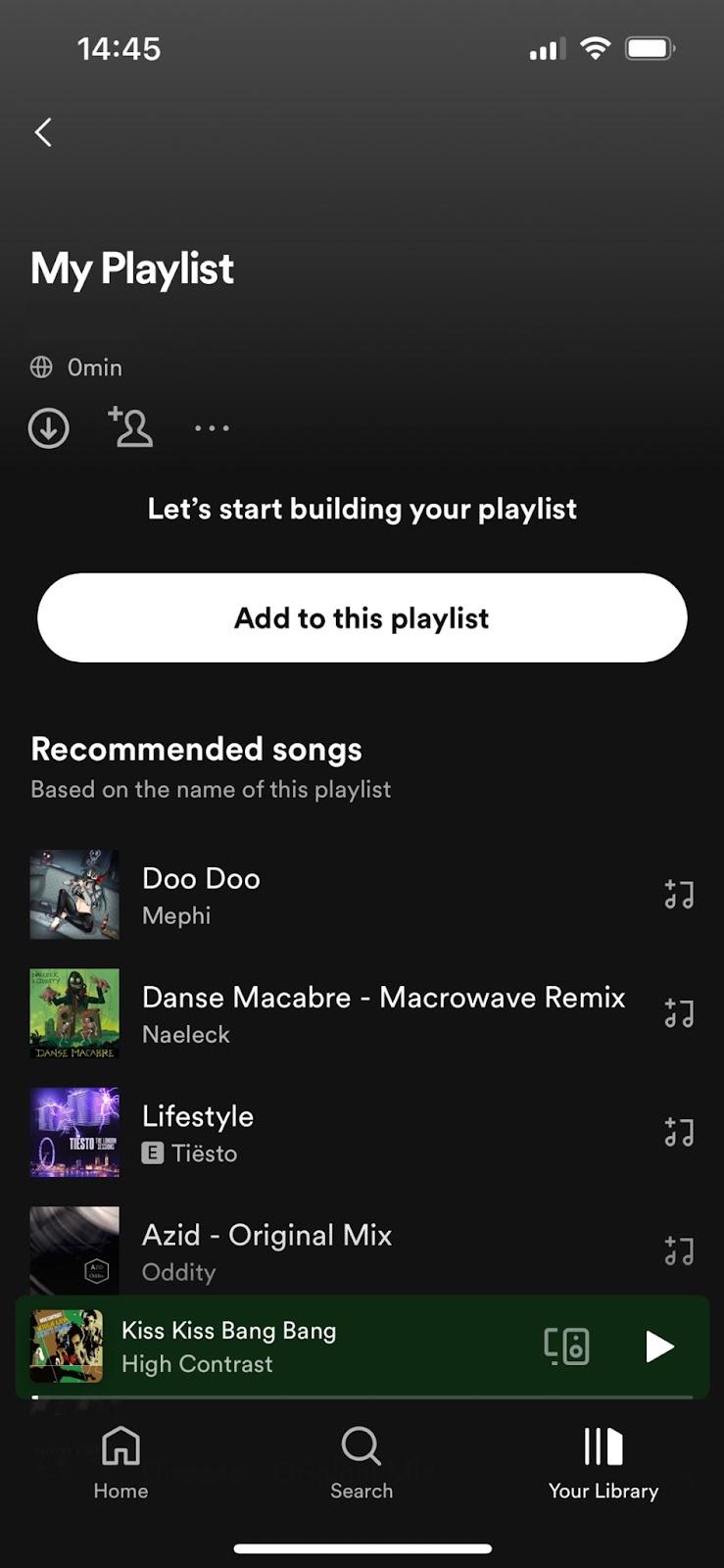
Suggestions help guide users with directions and ideas to get started. For example, Spotify’s new playlist empty state includes a CTA to add songs but also offers “Recommended songs” based on the playlist’s name–meaning if the user renamed the playlist to something more descriptive, “90s rap playlist,” they might get better recommendations.
Personalize empty states
Personalizing empty states with user data (i.e., their name) or personalized content creates a more meaningful experience, increasing engagement and product satisfaction. For example, Facebook Messager’s install screen shows the user’s friends also using the service.
Make empty-state copy meaningful
Microcopy expert and UX writer Kinneret Yifrah, argues that empty-state copy must be meaningful. She structures copy with three key elements:
- Heading: describes the state
- Motivation: how will it benefit the user or how to do it
- CTA: descriptive call-to-action button
Using this structure, we can create an empty state for an example alert:
- Heading: You haven’t set up any alerts yet.
- Motivation: Alerts will keep you updated, so you won’t have to worry about missing out on something important.
- CTA: Create alert
Following Kinneret’s user-focused strategy will help create meaningful copy that motivates users to take action.
Prototype and Test Empty States With UXPin
With UXPin’s advanced features, designers can create empty-state prototypes that replicate the final product user experience accurately. UXPin prototypes are fully interactive with immersive code-like functionality, giving design teams actionable feedback to test and iterate for higher-quality outcomes.
Interactive prototyping
Interactive prototypes respond to user engagement like clicks/taps, swipes, scrolls, etc. Additionally, UXPin’s prototypes allow designers to capture data from user inputs and use them elsewhere in the application. These prototypes include navigation, transitions, animations, popups, and other interaction design characteristics that accurately replicate the final product experience.
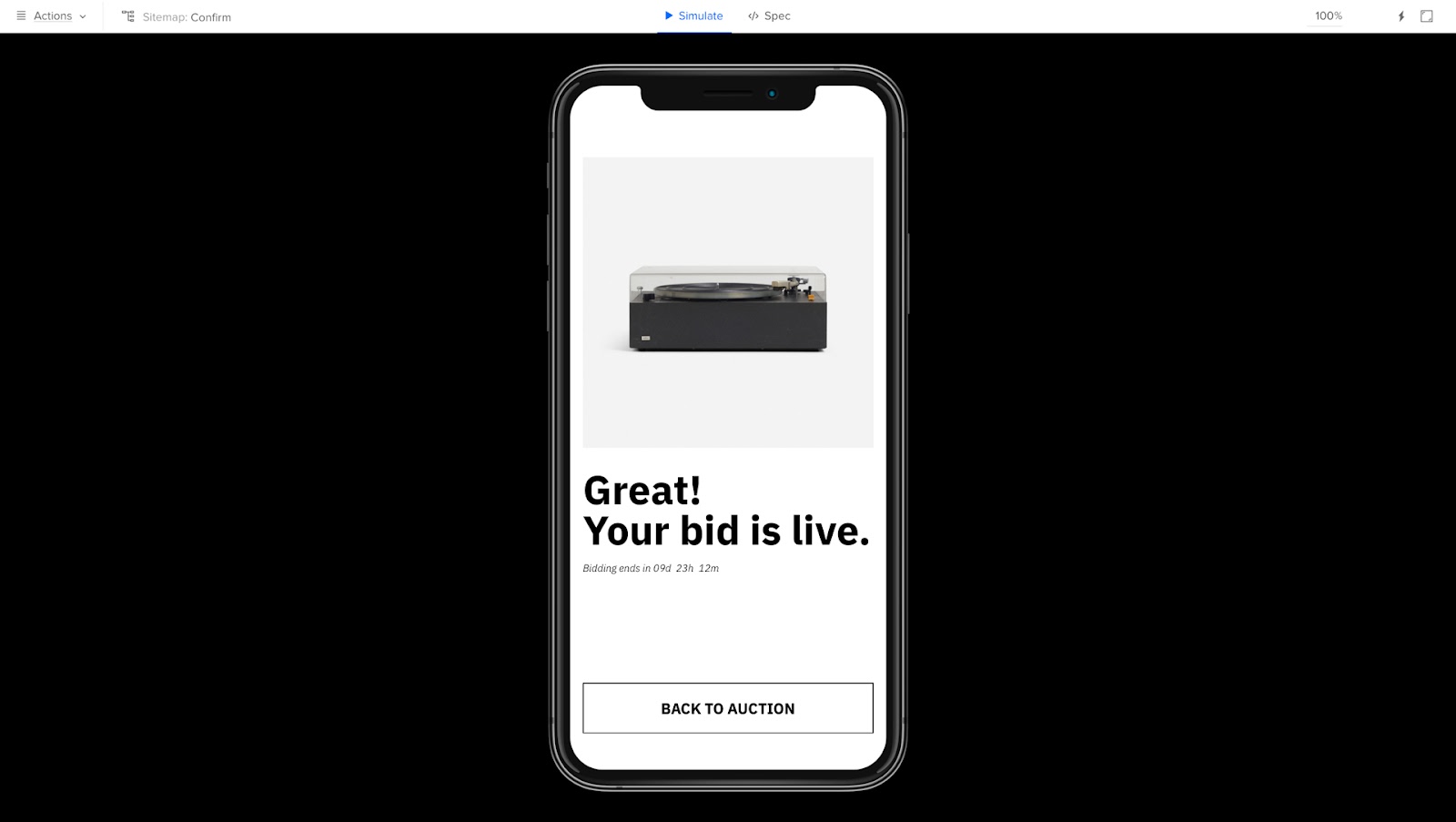
For example, our example Auction app allows users to select an item and place a bid.
The confirmation screen tells the user their bid is live and when the auction ends. A prominent CTA takes the user back to the auction’s homepage.
With UXPin, you can make this screen more personalized using Variables, including the user’s name and their bid captured from the previous screen.
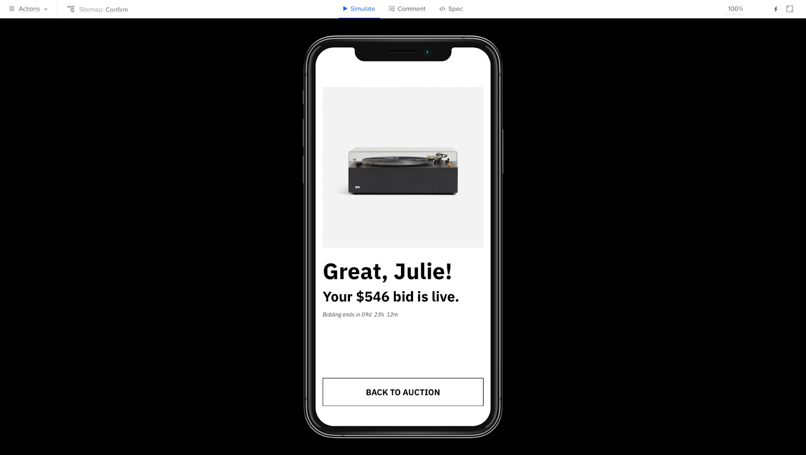
While the auction app doesn’t have an empty state, it demonstrates the powerful functionality UXPin offers designers for accurate prototyping and testing.
Actionable feedback
Better prototypes result in meaningful, actionable feedback from usability participants and stakeholders. Designers can solve more problems while identifying valuable business opportunities during the design process.
Smooth design handoffs
These prototypes also streamline design handoffs because front-end developers can visualize exactly what the product must do. UXPin prototypes require less explanation and documentation, allowing product teams to release products faster with less friction between design and development.
Design, prototype, and test at higher fidelity with code-like functionality in UXPin. Sign up for a free trial to build your first interactive prototype with the world’s most advanced UX design tool.


