
Mobile design taught us to design small, now wearable design is making us design even smaller. While designing for a watch might seem intimidating at first, going back to the basics of design theory can help you make the right wearable choices.
Wearables present a unique set of challenges when it comes to design.
The canvas is small — tiny, even — and there are many different types of popular wearable devices. (And even more watch-style items hit the market all the time.) Some wearables offer color screens and plenty of features while others are super-simple aesthetically with robust functionality.
Different Types of Wearables
From simple fitness trackers to more feature-packed watches that sync with your phone’s operating system, there’s a lot more variations to consider when designing for these small interfaces.
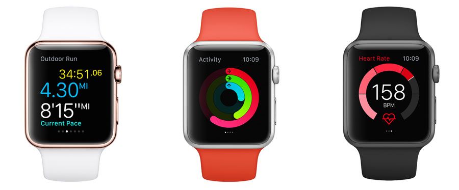
Photo credit: Apple Watch
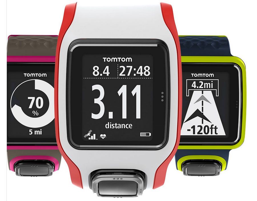
Photo credit: Tom Tom Multi-Sport
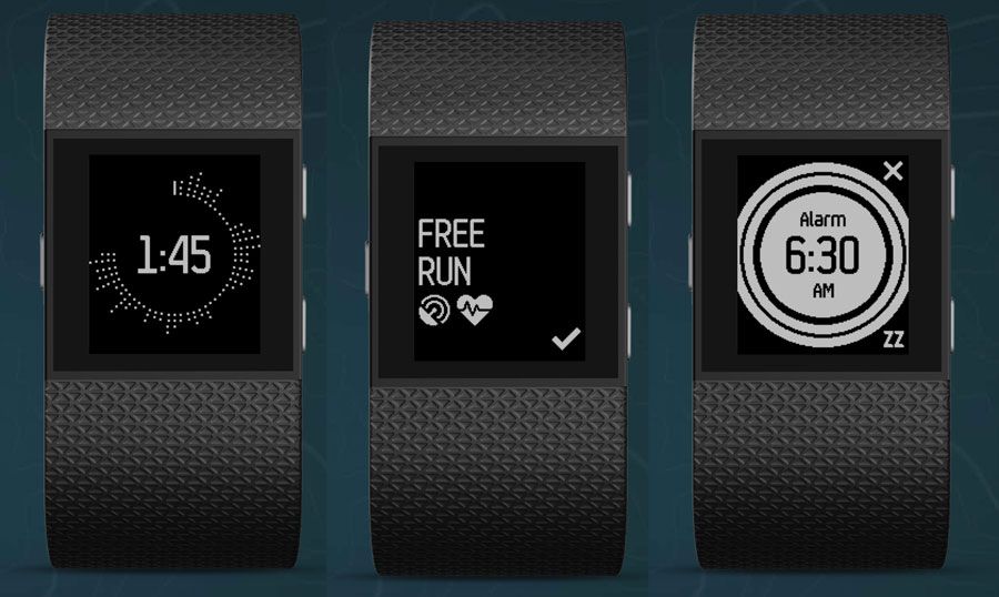
Photo credit: Fitbit Surge
Currently, we see three major categories of wearables:
- Phone-based watches, such as the Apple Watch or Samsung Gear S2
- Independent watches, such as those with GPS functionality that are popular with athletes
- Activity trackers, such as the Fitbit Surge
Each of these devices comes with a screen that is only a few millimeters in size, making watch UI design quite the design challenge. Some devices include full-color screens that support animation. Many of the other features you are accustomed to seeing with your phone, while others are still limited to a white-on-black display (or vice versa).
Applying UI Design Theory
So how do you design for all of this? And how do you do it consistently?
It all comes back to design theory and the concepts you learned around the time you created your first design projects. These concepts include color, contrast, space and typography.
Color
Most watch screens today are black and many watch apps run with light elements on a dark background. This make color choice especially important because you need to use colors that will work well and stand out in this environment.
When it comes to working with a dark background, that means design elements need to be designed with a palette of light or bright colors reminiscent of Flat and Material Design.
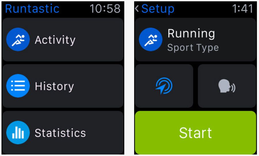
Photo credit: Runtastic
Above, Runtastic does a good job using color with bright hues that are easy to see against its dark background. Blue helps establish branding while brighter greens denote buttons and user actions. All of the color options are easy to see and contribute to the design and functionality.
Contrast
Contrast is also important on small screens.
Designs should clearly define individual elements and include plenty of separation between them. This is particularly important if there are multiple tap targets on the screen. Contrast is also important because it makes elements easy to see at a glance, which is the way many watch users will interact with the device.
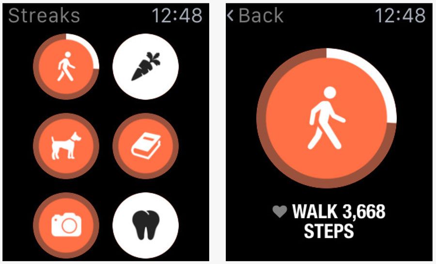
Photo credit: Streaks
Above, Streaks uses bright and dark options to create stark contrast between elements, contributing to readability and tap-ability. Each circular item is designed for touch and the function is easy to see thanks to color and size choices that make each element clear.
Space
Space can make or break the design on a small screen. Too much space and you don’t have room for any content. Too little space and elements are hard to see or read. There’s a narrow middle ground that helps provide function and usability.
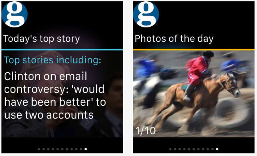
Photo credit: The Guardian
Above, The Guardian newspaper does this well. Images and text placements include plenty of room to provide a single message on each “screen.” This message includes text — note the low character count per line and exaggerated leading — and images.
Typography
Only one type of typography works on these tiny screens: simple typography.
Almost all of the apps on the market include simple sans serifs with medium stroke weights. (Some thinner typefaces or heavier options for accents.) Type size is typically larger than you would guess. Aim for about 20 characters per line with no more than 6 lines per “screen.” Any more text and you go beyond what is scannable.
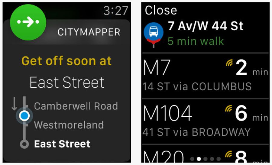
Photo credit: Citymapper
Above, Citymapper uses several layers of interface text to create a solid and distinct hierarchy for different actions. Typefaces are simple and text is clear. The watch app puts all of these elements together — color, contrast, space and great typography — to help users determine what information is most important.
Grab design ebooks created by best designers
All for free

Do you want to know more about UI Design?
Download 'Mobile UI Design Book of Trends' FOR FREE!
Download e-book for freeWhen it comes to wearables, simplicity, minimalism and micro-interactions are also important. When you put it all together, you should end up with something that looks (and works) great on a tiny screen.
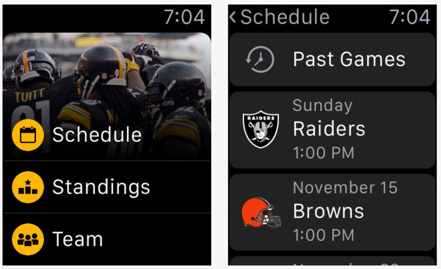
Photo credit: Pittsburgh Steelers App
Above, the Pittsburgh Steelers app, combines all these elements for an app that is aesthetically pleasing with plenty of color and images yet still easy to use. The content and information is designed in a functional way, thanks to plenty of space and contrast between elements and actions that are easily distinguishable.
What’s Next?
When it comes to wearables, we’re just starting to learn best practice for wearables, making their UI design open to any practical ideas.
While most of the interfaces behind wearables are native, could we build them to be more integrated with websites and other apps. Most designers are building wearable aesthetics to mirror the other tools already, but could they be built together?
Will we start to think about how we use wearables in different ways?
It seems like every person you ask uses their wearable for a different reason or purpose. For now, however, it seems most phone-linked wearables are just an extension of the phone itself. We might imagine that this could change, but it’s hard to foresee a time when users browse the web from a watch-sized screen.
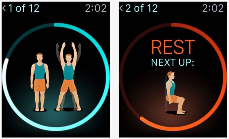
Photo Credit: 7-Minute Workout
When do wearable apps become more of the native go-to?
It wasn’t that long ago when we didn’t talk about mobile-first design. Now it’s the first thing you hear.
Could that happen with wearables? It’s hard to tell. Market saturation will likely have to increase before the industry moves in that direction. (Estimates have the leading wearables at Fitbit and Apple Watch, with between 2.5 and 6 million in watch sales. Compare that with an estimated 94 million iPhone users.)
Takeaway
Basic design principles exist for a reason. Regardless of device size or scale, you can use these concepts to create a design that works. That’s not to say you should adhere to every “rule” from UI design theory.
Experiment. But listen to the little voice in the back of your head. When you doubt the way something works or how you should tackle a design project — no matter how small — start with the basics. And always test with users.

Feature photo credit: Forbes

