Flat design is more than a passing trend.
The aesthetic will continue to evolve and is sticking around thanks to its roots in design theory (minimalism, Swiss, clean typography, etc.).
But what constitutes flat design? This trend can be characterized by five elements:
- No added effects such as drop shadows, embossing or gradients
- Focus on great, and simple typography (particularly sans serifs)
- Use of simple elements and iconography
- Bold color palettes with more and brighter hues than we were used to
- Design with an overall minimalist approach with as few elements as possible
While flat design is still tied to these concepts, the “rules” are a lot looser today. And the trend is evolving.
As we dive headlong into 2016, here is how you can keep up with the ever-changing trend as flat design continues to morph into something new.
The New Flat Design: Flat 2.0
A long history of flat evolution brings us nowadays to Flat 2.0.
As we said in the free e-book Flat Design Trends 2016, this style is a compromise between the origins of flat design, hints of skeuomorphism, material design and usability. (It really is a bit of everything.)
There’s no defining characteristic to Flat 2.0, other than it “seems flat, but isn’t quite completely flat.” This is the realm where most of flat design seems to live. The best parts of flat design are mixed with elements that enhance usability. (Right now that movement is shifting toward layering and 3D styling.)
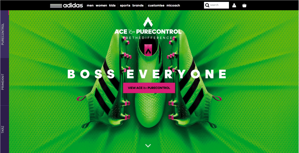
Photo credit: Adidas
Designers employ a few common effects to achieve that somewhat-Flat-2.0 look. Here’s what they are:
- Raised or sunken elements to make it easier to see what actions a user is supposed to take. The three-dimensional effect helps users engage with an action, such as a click or tap.
- Animated elements help guide users to actionable elements. The trick with this technique is that animations are subtle and don’t get in the way of the design.
- Elements that appear to act within the laws of physics or act realistically, such as those outlined by the principles of Material Design, create a “life-like” experience. When things on the screen act in the same manner as physical things, users have no trouble using or understanding them.
- Particularly for e-commerce, 360-degree animation or rotation is a popular tool. This gives users the ability to see an item (or product) in a very real way.
- Big, bold and oversized everything from type to imagery helps create a bold first impression, drawing users at a glance. Oversized elements are highly usable as well, particularly on smaller screens because you don’t have to worry about the “fat fingers” effect.
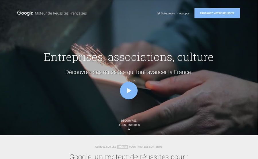
Photo credit: Moteur de Reussites
It only makes sense to feature a Google Labs example when thinking about Flat 2.0. Moteur de Reussites has an aesthetic that is very much material design in scope, but is also identifiable with Flat 2.0. That’s the trick to this evolution: Flat takes on a bit of everything, thanks to its classically-rooted principles.
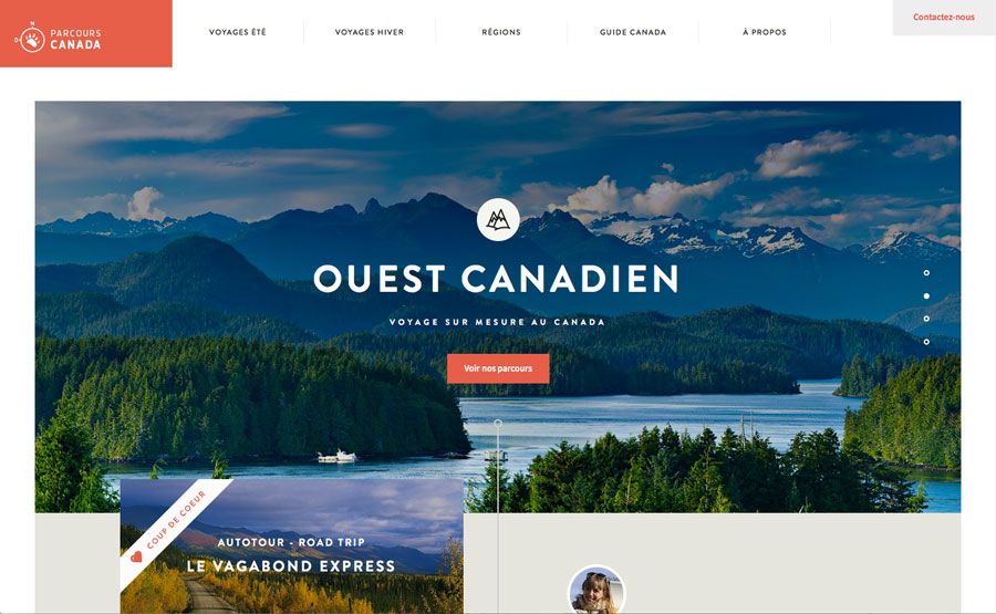
This Canadian tourism site uses plenty of flat concepts as well.
Bright pops of color, simple layers, geometric shapes and brilliant typography pull it all together. The site is usable and aesthetically pleasing. Flat 2.0 elements help the user focus on calls to action, buttons and next steps in the navigation. The design effect creates a “mini-tour” with layers of elements that encourage the user to want to visit.
Useful Resources
To help you get started on this trend that’s as beautiful as it is practice, here are 10 additional resources:
1. Circle icons: Ghost button styles in circular shapes ($3)
2. Colofilter.css: Create a duotone effect
3. Flat Colors: More than 11,000 colors and 2,000 palettes
4. Brand New: Take a look at the gallery of brand logo changes and note the dominance of flat
5. Long Shadow Graphic Styles: Illustrator library to help you create the perfect exaggerated shadow ($5)
6. Google Material Design: Full documentation on Google’s design language, which is constantly evolving
7. Hype for Type Top 10 Fonts of 2015: Inspiration for new flat pairings
8. CSS Button Generator: Make ghost (or colored) buttons with CSS
9. Icon Hover Effects: Simple animation styles and code for icons
10. Flat Icons: 1,303 SVG icon packs in flat styles
Takeaways
So where do we go from here? What lessons have we learned?
- Flat design is not going anywhere anytime soon.
- Flat design is so connected to design theory that it will continue to grow and evolve.
- Flat design is a highly visual and usable technique that can work for varying site types.
One thing is certain: it’s not too late to start thinking about a flat aesthetic. More and more companies — from big to small — have all gone flat.
With that, we’ll see others follow suit. Because it is rooted in elements of simplicity, flat design can be integrated into projects using other trends and techniques so that every project looks custom and original. Pair flat with almost any other trend and the result is a modern, fresh look.
Each designer can manipulate the style in any way. That’s because there’s no perfect model of what constitutes a “flat design.”
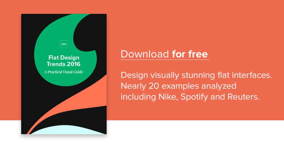
If you found this article useful, check out the free guide Flat Design Trends 2016 below. We deconstruct over 20 examples to explain useful flat-inspired UI techniques.