
It’s unclear when rotating carousels debuted, but we see them all over the web today. Like so many things, they’re the product of digital marketing’s obsession with the newest “shiny object.”
The obsession itself isn’t a problem, but it can create them—few ask whether the new, shiny object is actually effective or smart.
Table of Contents
Carousels: Why Do They Exist?
Here’s the hard truth. Despite the popularity of rotating carousels, they do not improve UX, they’re generally ineffective, and many websites are deeply attached to them.
They’ve survived because they help designers appease competing stakeholders, often acting as an organizational crutch.
Think I’m making some pretty bold claims? Here are just a few studies that demonstrate their ineffectiveness.
Data-Driven Concerns About Carousels
1. Merely 1% of visitors clicked on carousels when the University of Notre Dame tested its website. That’s a very low conversion rate. To make matters worse, less than one-fifth of those users clicked on anything other than the first image in the carousel.
2. Banner blindness kicks in with rotating carousels. Advocates of carousels point out that movement draws attention, yet eye-tracking experiments nullify those benefits because of the the phenomenon known as banner blindness. In other words, we’ve learned to tune out visual noise.
3. Carousels are problematic on mobile devices. In many cases, they are simply not optimized for mobile viewing. Scaling down isn’t the answer—images becomes impossible to read or even cut off from view. They also affect site loading times, in some cases.
As mobile increasingly demands attention as a force to be reckoned with, designers may have to abandon carousels for purely technical reasons. There are also a few data-driven concerns about rotating carousels, but they’re hardly the only ones. Since this list could go on, but for now let’s move on to the user experience focused concerns.
UX Concerns About Carousels
1. Control creates trust. Anything less erodes that trust. Trust is essential to converting visitors—especially during a first impression. Undermining your efforts with poor design choices may inadvertently sabotage your brand. You wouldn’t post self-rotating stock in a store, so why would you enjoy it online?
2. Rotating banners decrease readability. Have you ever tried to read a rotating carousel graphic, only to have it move on you? This results in decreased conversions because a visitor simply doesn’t have adequate time to process the information. Plus, studies show that users automatically assume that it might be an advertisement, which makes them more likely to ignore it.
3. Your story doesn’t get heard. Most viewers (84% in the Notre Dame test) never go beyond the second slide. This is particularly a concern if you’re trying to show a holistic view of your brand, you are going to leave things out. Most visitors don’t get past your first slide, which means they’re only seeing one dimension of your company.
4. Rotating carousels eat up design costs. Why spend money on something that isn’t likely to work for you, and may even be counter-productive? A rotating carousel might appeal to your designers, but if that slider doesn’t produce results, it’s going to waste time, energy, and money.So we’ve shown that rotating carousels don’t make sense—from both a data and UX perspective. If they don’t work, the next logical question is, “What does?”
At The Good, we suggest four alternatives that have proven successful with our clients.
4 Effective Alternatives to Carousels
1. Highlight your top products. Show top products on your home page. If your customers are crazy about your new car model, highlight that new car model on the home page.
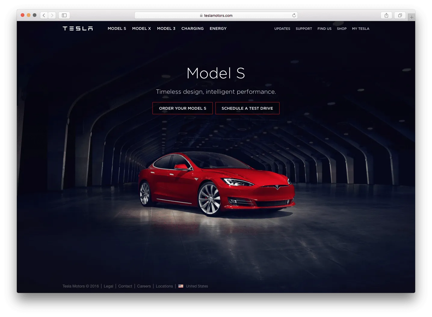
For example, Tesla Motors understands that their customers are crazy about the Model S. They easily could have cycled through all of their models in a slider, but remaining on a single, static page is much more effective.
2. Offer easy access to top content. If your customers really dive into your site (or one of your products naturally produces a ton of great content), link to it from your homepage so your customers can access it immediately.
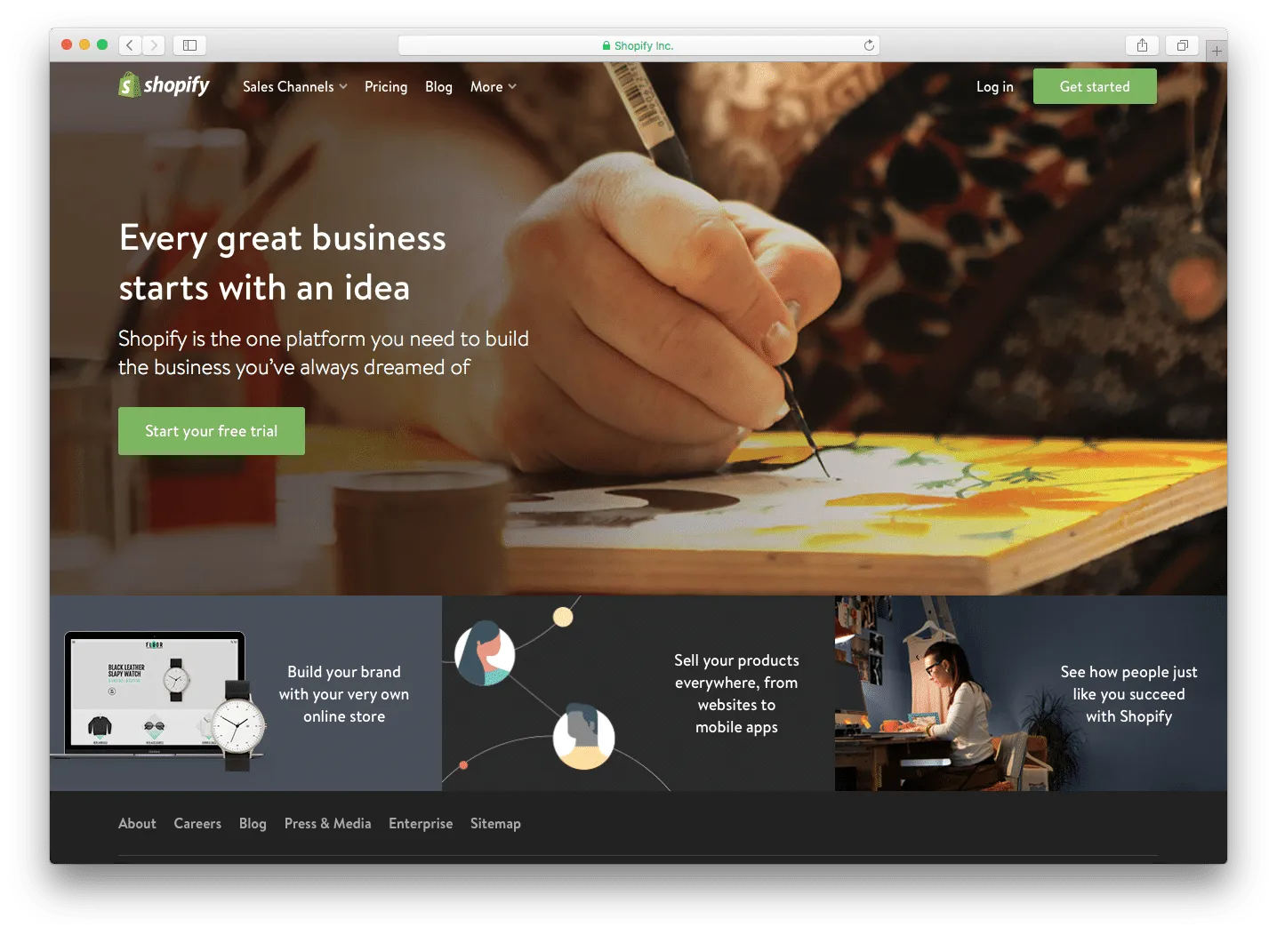
Shopify’s static header image invites visitors to convert right away, but it also gives them static alternatives. It’s a highly effective method to use when you have to include multiple items to appease multiple stakeholders.
3. Combine top content and top products. Experiment with combinations of top content and top products to see which performs better. Test, change it up, and test again.
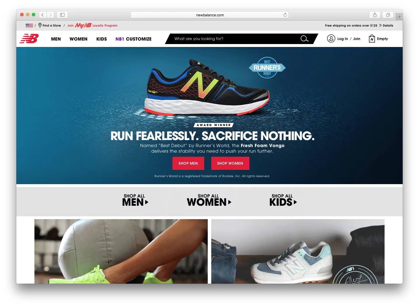
As soon as visitors arrive, New Balance announces their latest award-winning shoe and prominently displays a fast path to find whatever they need—by gender, age, or style.
4. Focus on your current promotion. This is really effective when customers are looking for particular products during the holidays or for seasonal items.
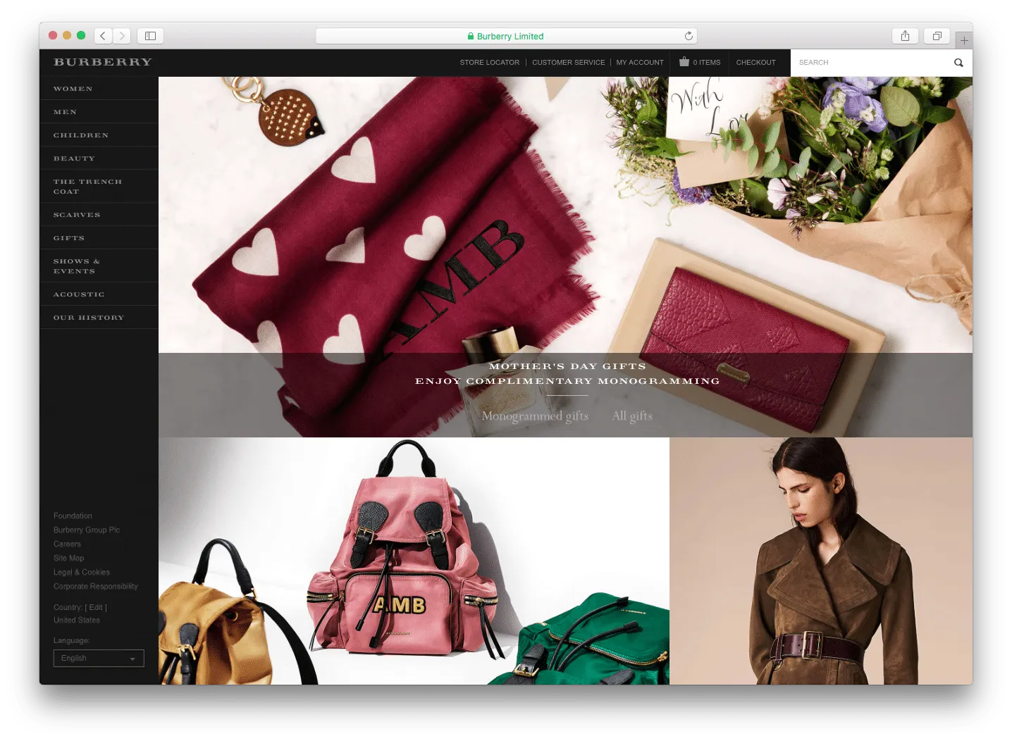
Burberry times certain promotions around Mother’s Day to showcase products particularly relevant to mothers (and those shopping for them).
Rotating Carousels: A Better Plan
The lesson outlined here is that—for almost all websites—rotating carousels aren’t the best use of space. Your brand is better off using slider content in an expanded, static format or removing its secondary content entirely.
Are you ready to take the next step, but not sure how?
Try this. Instead of working to convince stakeholders that a drastic change is needed—based purely on your “preference”—use A/B split tests of both versions. Let the data determine the change, because results speak for themselves.
By selecting one of the four alternatives we listed, you may find something that works better for your brand and results in a more straightforward decision making process (that’s more difficult for stakeholders to argue with).
To identify additional areas where visitors are getting stuck on your website, The Good offers a free Stuck Score™ evaluation to help you identify areas ripe for optimization. Get off the carousel merry-go-round. Cater to your users, not to the whims of those who insist on “flashy” design over “effective” design.
For more web design advice, check out the free e-book Web UI Design Best Practices. The guide includes 33 visual case studies from top companies.

