Responsive Images – The Definitive Guide
Web design isn’t always cheap. But of all web design costs to the designer, we should first consider the user’s costs.
Mobile users often pay for every byte they download (and upload) away from wifi. HTML and CSS files, while getting larger every year, aren’t as large as hefty JPG, PNGs and animated GIFs. Conscientious designers know that best practice includes making websites and apps that download as quickly as possible. It’s like trimming out extra adverbs from copy, or extra div elements from markup.
If users don’t need pixels, don’t send them.
As we’ve seen, thinking “responsive” is more than slapping media queries into our code. Responsive images have their own set of challenges that designers must overcome. To make sites that work well and look great on a variety of screens, they need a smart strategy for images from the beginning.
Difficult? Perhaps. Worth the effort? Yes. A picture may be worth a thousand words, but if it weighs a million bytes, then users may give up before the picture downloads.
Build prototypes fast with UXPin, a code-first prototyping solution that makes staying consistent easy across all teams, not just design. Let your developers access specs and share a code-based design system with them. Try UXPin for free.

Choosing the right format for UI
JPG, SVG, GIF and PNG (and PNG-24) — anyone new to web design may confuse the three. That’s not surprising when even seasoned veterans opt for JPG when a SVG would do, or default for PNG-24 instead of PNG-8.
JPG
Or JPEG, short for Joint Photographic Experts Group, was developed in 1991 and published in 1992 as a means to standardize pictures transmitted over the internet. Bandwidth was at a premium, so users prefered files that showed more picture for fewer bytes.
The JPG format uses lossy compression, meaning that once applied, an image can never be fully decompressed back to the original quality. It trades smaller files for reduced quality on a scale of 0 – 100. Oddly, files with 100% JPG compression have the highest quality and the worst file size. 0% compression yields the smallest files with the worst quality.
Artifacts are parts of an image that JPG compression changes for the sake of file size. They resemble blocks of homogenous color, when visible, as if herding colors into areas about 20 pixels square. Hard edges in images are the first victims of artifacts. That, and because JPG compression can look natural on complex images, means that this format is ideal for photos.
Bottom line: JPG compression works well for complicated images with lots of detail, like photos.
PNG (8-bit)
Unlike JPG, Portable Network Graphics files use lossless compression that doesn’t compound as the file is opened and resaved. Instead, PNG-8 files include a list of every unique color they use.
And by unique, I mean unique as in #FFFFFF is not #FFFFFE, although to the unaided human eye they’re indistinguishable. Each pixel is assigned to a color in the file’s list, reducing the need for identical pixels to waste precious bytes reproducing what’s already been said.
If the first hundred pixels use RGB(255,255,255), there’s no need to say so — just state that pixels 1–500 belong to color #1. For this reason the PNG format is great at compressing images with perfectly flat colors.
Bottom line: The PNG-8 format can hold up to 256 unique colors in its list, called a color table. It can also make pixels fully transparent. These facts make PNG-8 ideal for today’s trendy “flat color” look.
PNG (24-bit)
Files that use PNG’s other variety, PNG-24, look great because they use no compression. Nor do they use a color table. Every detail is preserved when saving PNG-24 files … and that’s the problem.
Opacity is another problem. While pixels in PNG-8’s images can be transparent, it’s all or nothing. Either you see them or you don’t.

Bottom line: Pixels in PNG-24 files can have partial opacity, meaning they tint elements behind them. Again, at the expense of file size.
GIF
Graphical Interchange Format, or GIF, resembles PNG-8 in many ways.
It’s universally accepted by every browser. It’s established, having been around since 1987 (somewhat younger, PNG debuted in 1996). GIF uses color tables. It’s compression is slightly less efficient, on average, than PNG. And it can make its pixels completely transparent.
Where GIFs shine is their ability to hold more than one “image” per file, and show them sequentially. That is, GIF supports animation. Animated GIF files usually find their way into content more than design, as their animations can’t be started and stopped — they’re not truly interactive. That and their slightly-higher file sizes mean that designers often prefer PNG over GIF for flat-color images.
Bottom line: If you need simple animations, GIF is the way to go. Otherwise you’re probably better off with PNG-8’s slightly more efficient compression scheme for simple images (like flat-color illustrations) or JPEG for complicated images (like photos).
Squeezing Every Byte
Compressing image files — the act of reducing file size by eliminating redundant data or altering the image for easier downloads — is crucial to making websites load quickly. Fast websites, in turn, earn more users.
Most image editors like Photoshop, Sketch and Pixelmator export compressed, web-friendly files without fuss. But they’re not always ideal. Other tools can help compress images even further.
Compression Services
As the name implies, this free, online service takes extra bytes out of any JPG file without sacrificing quality.
Compress JPG slimmed down the above image, saved in Photoshop at 70%, from 217KB to a svelte 160KB. Quality remains untouched.
2. TinyPNG
Another free service squeezes 8-bit and 24-bit PNG files for faster load times.

TinyPNG reduced the above image from 16KB to 12KB by eliminating nearly redundant colors in its color table — without affecting its quality.
How much is too much … or too little?
Although it varies per image, our goal is to get the best quality image in as few bytes as possible. At some point, we trim too much out.
But how much? Is there a sweet spot for compression?
For JPGs
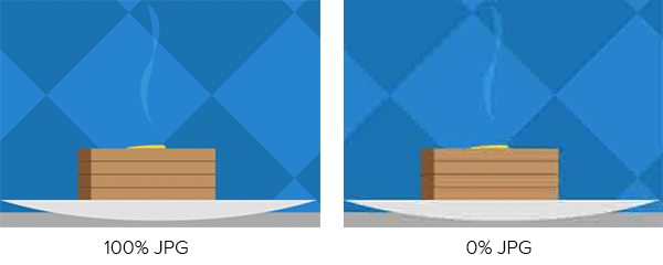
To find out, we saved the crowd photo above with increments of JPG compression. Results ranged from 45KB at 0% compression to 479KB at 100%. Contrary to what the term suggests, remember that the highest compressed JPGs have the highest quality (and largest file size).
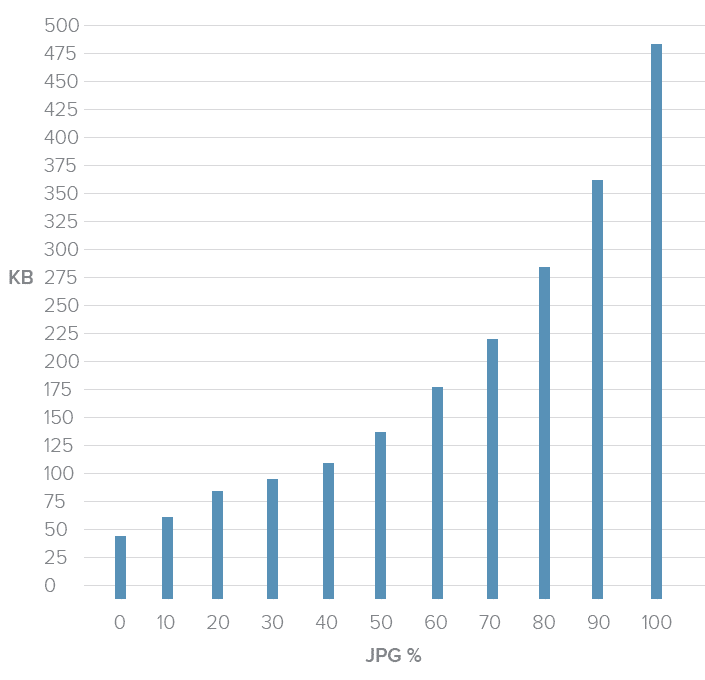
This chart shows a dramatic decrease in the higher compression ranges. Just dropping the quality from 100% to 70% reduced the file size by almost half — a real bargain. The lower compression percentages, though, didn’t see as much of a difference. Although bytes fell from 0 – 20%, we saw quality drop too quickly to be worth the savings.
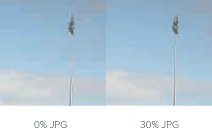
The image was 45KB at 0% compression (left) and 94KB at 30% compression (right). Although it halved the file size, the increase in artifacts, or blocky areas where JPG compression takes effect, wasn’t worth the savings.
Best practice: Don’t compress JPG files higher than 70%, or lower than 20%. This is a guideline rather than a hard rule, but we’ve found it the 20–70 range covers most cases.
For PNGs
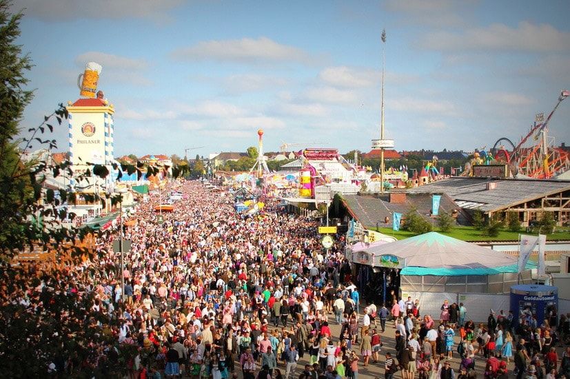
The story gets more complicated when we look at PNG files. We ran the same experiment on this graphic:

Notice that these colors aren’t strictly flat. There’s a fine gradient over the entire composition. To account for that, we need dithering: a pattern of dots that simulate subtle gradients.
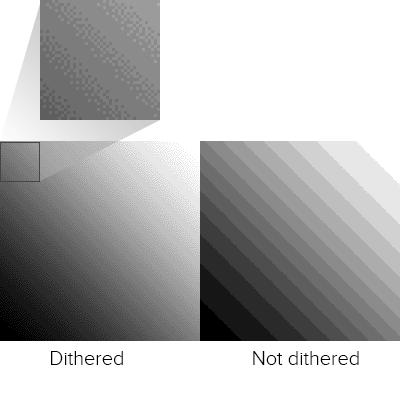
Unlike JPG, the PNG format doesn’t use percentages. The number of colors in its color table determine its quality and, to an extent, its file size. With 88% dithering, the results were, well …
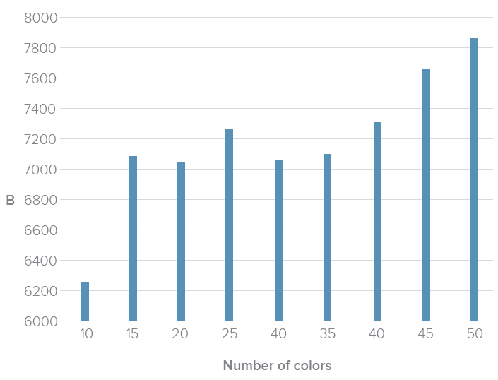
In general we saw a relationship between the number of colors and file size. But not much. Photoshop struggled to find the best patterns with limited color tables. In fact, 40 colors had about the same number of bytes as 25, meaning the same file size but with much higher quality.
Best practice: For best results when squeezing every byte out of a PNG, the best approach is to experiment with different color tables. Unfortunately the right amount is a subjective matter that varies per image. When it looks “right” is up to you.
SVG
Scalable Vector Graphics, or SVG, use lines instead of pixels — vectors instead of raster images — to display line art. SVGs are actually a form of XML, easily created in programs like Inkscape and Adobe Illustrator.
SVG files can generate gradients without dithering, and scale up to fit containers of any size from older smartphones to widescreen TVs. They don’t lose resolution because, as vectors, browsers connect the dots on the fly. They can be animated with JavaScript. And instead of files that must be downloaded separately, which ties up time and server power, SVG can be embedded right in HTML documents.
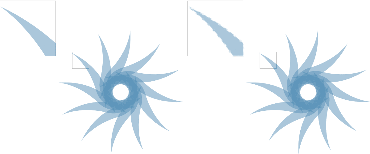
Above: vector art (left) scales up well. On the other hand, raster art (right) looks blocky and pixelated.
But like PNGs and GIFs, SVGs suffer as images become more complex. They’re terrible for photos and grow quickly in file size as they gain points and curves.
Best practice: If you’re looking for the flat 2.0 look, with its sharp lines and gentle gradients, and aim for recent browsers (IE8 is out of luck), SVGs are the way to go.
Code Considerations
Aside from image files themselves, we can do lots with code to make pixels respond well to different situations.
Essential CSS Properties
One of the most common — and most reliable — solutions is to set a bit of CSS:
img { max-width: 100%; }
This selector and property makes most images fit into their containers. For example, if a media query sets a wrapper to 300 pixels in width, then no image inside that wrapper will exceed 300 pixels. This technique has excellent support across modern browsers, which is why you’ll find it in many responsive websites today.
Future HTML Image Elements
Today we’re limited to background images with CSS and the <img> element. But when (and if) implemented, a new technology will go a long way to making images as responsive as page layouts in responsive web design.
The experimental <picture> element contains one or more <source> child element that uses media queries to declare when they should load. Browsers replace the src attribute of an <img> element within <picture> with the relevant source, if any.
For example:
<picture alt=”Descriptive text fallback”>
<img src=”sample-default.png”>
<source srcset=”sample-large.png” media=”(min-width: 640px)”>
<source srcset=”sample-small.png” media=”(max-width: 639px)”>
</picture>
The code above would replace sample-default.png with either a large or small variation, depending on the image’s container’s width.
As a bonus, browsers that don’t support <picture> will still read the default <img> element as normal. That’s good news because, at the time of this writing, these elements are not universally accepted — in fact, few modern browsers support them today. But support for <picture> and <source> is growing, and smart designers will keep an eye out for their usage in the future.
Browser rendering
Sometimes the best image is none at all. Modern browsers are capable of rendering their own graphics, including gradients, animations, bezier vectors, shadows and geometric shapes. With a little creativity, we can even make stripes.
Creating images in browsers puts the burden of visuals on the user’s end. It doesn’t require downloading any image files, which saves bandwidth and time. But it does require the browser to have certain capabilities.
Best practice: Use browser rendering for aesthetics, like background colors and fancy borders, but don’t rely on it for content. Always test your designs for readability without fancy CSS3 tricks, or even without CSS at all, to see how gracefully it degrades on less-capable browsers.
Implications for UI Design
From icons to backgrounds to content, there’s no doubt that images are crucial for good user interfaces. But responsive images face many challenges including bandwidth concerns and sizing issues.
In a perfect world we’d have the ability to either crop an image for smaller viewports, focusing on the most important parts, or the ability to upload different images for different breakpoints. It is possible to do so. Workarounds exist, and we look forward to <picture> and srcset. Until then the best-practice approach is to test your images at various sizes to make sure they’re readable on various devices and browsers.
Designers concerned with responsive web design must consider images in their work. Using the right file format, optimizing compression (but not too much) and watching future technologies go a long way to making websites load quickly and look great on screens of any size, resolution or orientation.
It all comes down to one question: what serves the user best. Create UIs with images, videos, and GIFs that come from your design library. Try UXPin, all-in-one design solution for code-first UI design. Build UIs 8.6x faster and copy production-ready code without translating vectors to code. Try UXPin for free.


