Minimalism is a popular style right now that’s as visually stunning as it is useful.
The style decreases loading times and increases comprehension, all the while giving the site a refined, elegant look.
But what do you do if your site has too much content and you don’t know where to minimalize?
If the goals are aligned, any site can benefit from a minimalist style, even content-heavy ones. This article will explain how to design minimally for sites with maximum content by dissecting some examples, and how the cards layout pattern can help.
3 Big Sites That Look Small
It might seem like a juxtaposition of sorts, but designers are finding creative ways to use minimal design styles even with a lot of content.
This can be pretty tricky to do. It takes a design and content team that has a lot of trust in one another to create the right balance between content and design. This can be really effective for e-commerce websites, which often contains hundreds of inventory pages along with long-scrolling pages to showcase products and styles.
Let’s take a look at 3 examples of large-content site that successfully pull off minimalism: Jatex, Nordstom and Groupon.
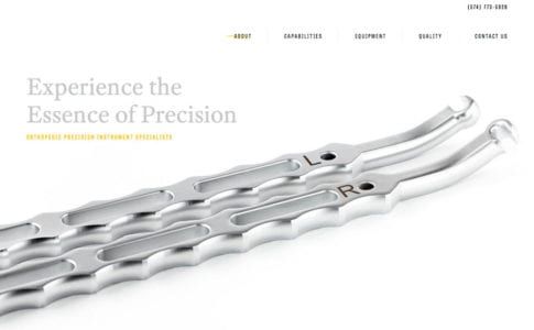
Photo credit: Jatex
Jatex features its main product, orthopedic devices, against an all white background with limited navigation and plenty of whitespace. The homepage is an almost text-book example of what a minimal design looks like.
Start moving through the site and there is a lot of information about this product, including specifications, capabilities, quality questions and answers and contact forms for medical professionals. The organization is clear and simple for a website that contains complex and complicated content. The clear structure and space contribute to overall readability and make it seem easy, even for a user who stumbles on the site by accident.
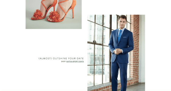
Photo Credit: Nordstrom
The front page of Nordstom is also a good example. It strikes that balance between short concise copy and an engaging minimal design. There’s just enough copy to entice you to click through to a department and see more on shoes or suits.

Photo credit: Groupon
Jatex and Groupon are each in the business of selling products, but the sites are designed as almost a yin and yang of how to do minimalism for sales.
When you first look at the product page for Groupon, you might start to second-guess the idea of minimalism in the design. But look a little closer and you’ll find that there’s actually a lot of content, just organized in a way the captures the spirit of minimalism.
The interface uses a single focal point (the picture) with only the most necessary elements to help users interact with the design. The more involved content falls below the scroll. This keeps things sparse up top with an image, short description and purchase information. (What more do you need?)
Working with complicated content does not mean the design has to be cumbersome; it’s actually the perfect setup for a minimal aesthetic. Separate content into groupings to make it manageable and use principles of space, alignment and clean typography to create hierarchy and easy reading.
And if you’re using WordPress, you may find the Hipsta Minimal Theme useful.
Applying the Card Layout
One of the best ways to consolidate space for any site, minimalist or not, is the card layout, one of the biggest trends of the past year. Thanks in part to Google’s Material Design, cards are the go-to design pattern for many Android-based mobile applications and for Apple apps as well. Cards are also finding homes in plenty of desktop sites..
The popularity is due in part to the phenomenal usability of cards. Something Pinterest has known about for sometime.
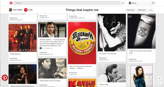
Photo Credit: Pinterest
Cards are a simple method of creating organization and flow in a design. Plus, they work with almost any type of content:
- Photos
- Text
- Video
- Coupons
- Music
- Payment information
- Signups or forms
- Game data
- Social media streams or sharing
- Rewards information
- Links
- Combinations of elements
Cards also rely on established user behavior patterns, making interfaces easy to use. Every element lives in a container that relates to a specific action, such as activating a link, filling out a form, sharing on social media or watching a video. While the first cards resembled playing cards, newer card-style interfaces are much sleeker.
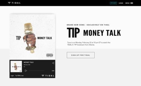
Photo credit: Tidal
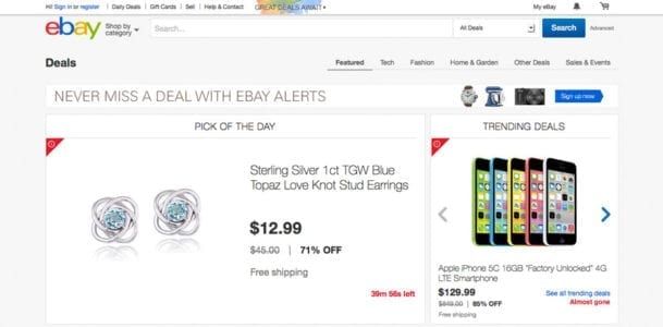
Photo credit: eBay
That’s why big-name websites are using card-style design patterns in a minimal framework. Cards are a visual element that relates to a specific action against a simple backdrop, as seen above in the designs for Tidal and eBay.
This simplicity is easy to look at, calming and feels unobtrusive — all of which gives the user the feeling of control, like they have the power to do what they want on the site. It’s no wonder that a combination of minimalism and cards is a popular option for sites where users have many different choices, a common part of large-content sites like online shops.
Cards are a fluid option that can work between desktop and mobile sites responsively. However, it’s important to note that cards will look (and maybe even function) differently between devices. Look back at the eBay design above. The cards are different sizes and the “pick of the day” is horizontally oriented, while the “trending deals” is more square.
Each of these shapes presents a problem on mobile, with a solution that is more vertical. Each card will reshape for smaller device sizes.
Here’s a few things to keep in mind when using cards in a responsive design:
- Is the text equally readable on desktop and mobile devices?
- Do shapes work with device aspect ratios?
- How will photos and images look across devices and will they be the same or different?
- Are the clickable and tappable areas the same? (It is recommended to make the entire card a single linked element.)
For more on designing a minimalist card, check out the free e-book Web Design Techniques: Cards & Minimalism.
Next Steps
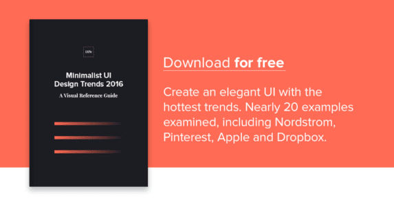
Interestingly, the minimalist trend can get quite complicated to apply. For a fuller treatment of the design style, read the free guide Minimalist UI Design Trends 2016. This up-to-date guide explains the all the essential techniques and considerations for minimalism today, including 20 analyzed examples from companies that do it well.