It’s been about 15 years since Steve Krug first advised us to not make users think.
Friction is anything that prevents users from accomplishing their goals — confusion, distraction, hesitation, or anything else that forces them to think.
Let’s take a refresher course on how to smooth over friction points in your design.
Know Your Enemy: Identifying Friction
What Krug was describing is academically called “cognitive load,” and in UX design refers to taxing the user’s attention and brain. Of course some cognitive load is necessary (we’ll explain later in the post), but you generally want to minimize thinking as much as possible.
The Nielson Norman Group explains cognitive load by dividing it into two types, intrinsic and extraneous.
Intrinsic refers to the thought involved in accomplishing a goal, i.e. “If I click on the ‘Categories’ tab will I find the content I want?” Extraneous is, essentially, everything else, the friction, i.e., “Where is the categories tab? I can’t find it.”
Typically, unwanted friction manifests itself as:
- Busy visuals that confuse or distract
- Inconsistency (“Why doesn’t the button look like it did on the last page?”)
- Unnecessary decisions and actions
- Unfamiliar features or functions
Friction slips in accidentally, which is why your designs need to always be externally consistent (in line with user expectations and previous knowledge) and internally consistent (good visual hygiene across pages).
How to Smooth Out Friction
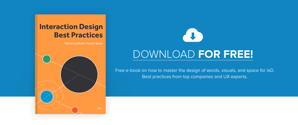
We explain more how to target more specific forms of friction in Interaction Design Best Practices: Volume 2, but here are some general tips that can help any UX project.
1. Reveal redundancies by listing out user flow steps.
List out each individual action needed to accomplish a task.
For example, logging in sometimes requires:
- Click to open login window
- Click to enter username input field
- Enter username
- Click or tab to enter password input field
- … etc.
In those first five steps, you’ll notice some redundancies.
What if the cursor started in the username input field when the login window opened? What if the login window opened up automatically?
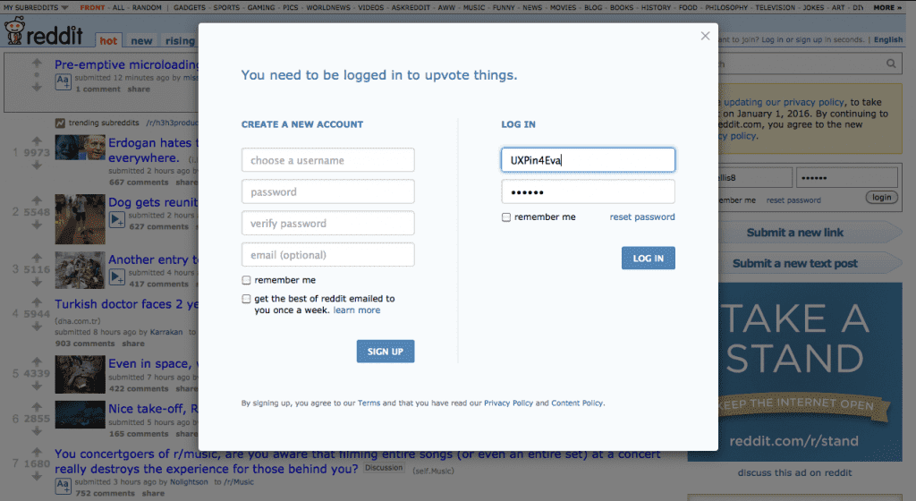
Photo credit: Reddit
Reddit tackles friction in exactly this way: whenever a user tries to complete an action like commenting that requires logging in, the login window opens automatically. Frequent users can even save their information, reducing the login process to only two clicks.
Notice however, that we haven’t just shortened the number of steps. Each step is also effortless, which is just as important.
When it came time for us to design the signup page for UXPin, we applied the same type of thinking. You’ll notice that the form only asks for an email, since you can set your password once you’ve redirected inside the app.

Photo credit: UXPin
2. Use recognizable UI patterns
Every time the user must learn how something new works, it creates friction. For the sake of external consistency, use as many appropriate UI patterns as possible.
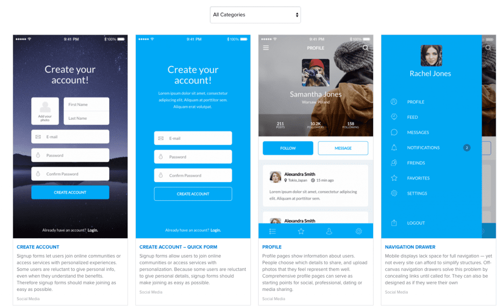
Photo credit: Patterns
Recognizable conventions, such as an envelope icon representing email, require no extra thought for the users. For example, the default settings, guided actions, and stepped forms described in Web UI Design Best Practices are especially useful for reducing friction.
Recognition also applies to microcopy, where clear text like “Submit” work better than something clever like “go ahead,” which may cause momentary confusion.
Clarity before cleverness. Always.
Grab design ebooks created by best designers
All for free


Do you want to know more about UI Design?
Download 'Free Ebook: Web Design Trends 2016' FOR FREE!
Download e-book for free3. Build navigation based on user research
A lot can go wrong with navigation, making it a nest of potential friction.
While you can theorize the best navigation for ages, streamline the process by learning from users. The right user testing reveals how they inherently categorize and access information.
Card sorting is extremely effective for creating the site architecture based on natural thought patterns. Once you’ve created the architecture, tree testing then helps you test your information pathways (both are explained more thoroughly in the Guide to Usability Testing).
4. Chunk it out
Chunking is the technique of grouping together visual elements to make their meaning more comprehensible.
Below, Etsy showcases 16 different product images. Under different circumstances, this might overwhelm users, but by chunking them into groups of 4, they undercut the visual friction.
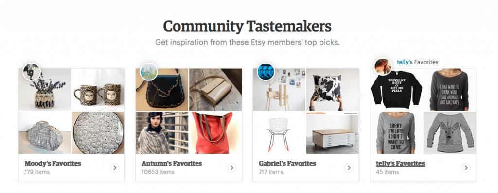
Photo credit: Etsy
Chunking works around the natural limitations of the human brain and memory retention — it’s the same effect as breaking a 10-digit phone number into 3 “chunks.” It allows users to process the information by suggesting how each piece should be interpreted, and lets them skip over entire chunks that don’t interest them.
Good Friction?
Before you wage all-out war on friction, keep in mind that, under the right circumstances, it can help.
1. Some work pays off
“Too good to be true” is a genuine threat to the UX of some products, so sometimes it pays to make your users “work for it.” Look at sites based around browsing for content. Part of the thrill is sifting through the mediocre content to find and repost the gems.
The process of discovery gives the users a sense of accomplishment, deepening their emotional investment.
2. Quality control
Another benefit of friction is filtering out irrelevant users — especially for sites where users generate the content.
A more involved signup process also blocks off those that lack the level of commitment to reap the benefits of the full experience.
Part of Dribbble’s appeal, for instance, is that the site is invite-only. Not only does the scarcity effect increase the perceived value, the additional friction also helps filter out low quality posts and potential spam.
Photo credit: Dribbble
3. Saving users from themselves
Notice how the nuclear button is always protected by a key-activated cover? The same principle applies to UX design.
For actions with severe consequences, some friction is not a bad idea. The “Undo” option is fine for reversing individual mistakes (e.g. unintentionally deleting a single account from your sales pipeline), but the “Confirm” window can offer a reflective pause before a possible cluster of mistakes (e.g. unintentionally deleting your entire sales pipeline).
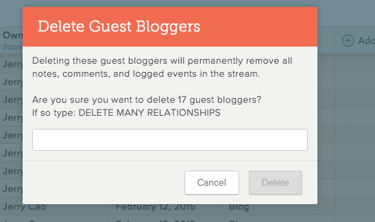
Photo credit: Salesforce IQ
Conclusion
We’ve said it before, and we’ll say it again: execute the fundamentals flawlessly.
All the classic principles of UX design are naturally anti-friction, so fulfilling the basics already indirectly reduces friction. In particular, pay attention to the best practices for:
- Consistency — inconsistency creates confusion
- Visual hierarchy — guide users on the right path with visual cues
- Navigation — a lost user can’t accomplish anything.
For more help with friction, check out the free guides mentioned above.
- Web UI Design Best Practices
- Interaction Design Best Practices: Volume 2
- The Guide to Usability Testing