Designing mobile apps is a long and difficult process that spans the moment an idea arises to when we finally upload the finished application.
During that journey, we go through multiple defined stages, like wireframing, visual design, and building animated prototypes. In the midst of all the transition, it’s easy to skimp over design elements that feel like UX “nice-to-haves”.
In essence, I’m talking about elements such as empty screens, edge cases, placeholders (like loading screens), and micro-interactions. I’ll explain why these subtleties are just as important as the more obvious components of the UI, and how they help determine the success or failure of our app.
Empty screens or blank slates
When we are wrapped up in the design process, we normally design for a populated interface where everything in the layout looks well arranged.
In those cases, we must design the ideal amount of information in a packed screen: for example, a list of favorite items or a contact list with items already in there.
But how should we design our screen when the content is pending user action? Even if it’s meant to be just a temporary stage, we must respect its communication value for users.
The purpose of a blank slate is more than a just decoration. Besides informing the user about what content to expect on the page, empty states also act as a type of onboarding. They tell users exactly actions are required so that content can appear and the app will function as promised.
When you really think about it, such simple pages actually carry quite a large responsibility.
Let’s think about a real-life example to put things in perspective. When you first walk into a hotel, the receptionist usually explains where your room and other facilities are located, where and when to eat breakfast, and how and when to check out. Before you can enjoy your stay at the hotel, you experience an “empty state” in which context is required to orient yourself and proceed onwards.
Just like you want the guest in their room enjoying their stay as quickly as possible, you want your users to do something so that the screen won’ empty as soon as possible. Here’s a few tips to keep in mind:
- If your empty state loads for a first-time user, keep it visually simple: concise copy, clear icons, high-contrast illustrations, and a “call to action” button is normally more than enough. In the below example from the Khaylo Workout App, notice the nice balance between the instructive text and glove illustration. It’s visually pleasing, but also clearly explains the required action.
Flipboard includes a big call to action to guide you with the necessary action to stop seeing that screen, and get a more meaningful one.
- If the empty state was triggered by positive user action (e.g. they read and deleted all their messages), reward them with a delightful message. For example, look at how the empty state Jelly produces when the user has helped answer all pending questions.
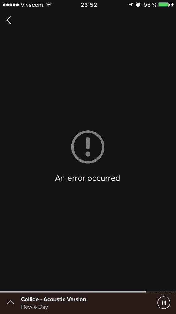
Spotify’s error screen isn’t as helpful as it could be. When showing errors, explain why you cannot see anything, and how to solve this.
- If the empty state was due to user error, you must strike a balance between friendliness and helpfulness. Delight and humor can help alleviate some of the user’s frustration, but it’s more important that you clearly explain the steps to get back on track.
Extreme cases
Contrary to empty screens, you also must design for situations where information is overflowing (or the data is just extremely complex). Not only does designing for these edge cases provide technical feedback to developers (e.g. load testing), they also show you how well your interface performs under pressure.
Instagram has prepared its interface to adapt to different text lengths.
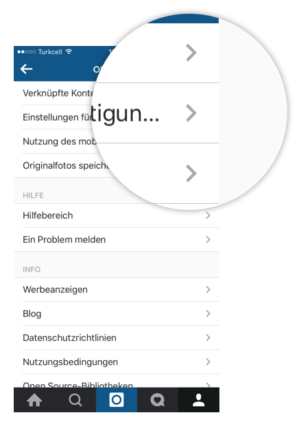
For example, in our ideal world everybody would have names such as “John Smith”. Simple, straightforward, and predictable. But reality begs to differ. To name one case, I recently visited Germany and The Netherlands where names can stretch out to multiple words and syllables.
If we were designing an app that requires a contact list, you can already see how a simple problem about someone’s name grows into a much more difficult UI issue:
- Will you add a second line or break the text with ellipses? What will happen with other content blocks if they contain excessive information as well?
- When it comes to lists, how will we navigate through a list with an insane amount of complex names? Don’t forget that your app will probably have an international user base as well.
It’s not so simple to account for these edge cases. Test how your design resists: include long texts, pictures in different sizes and aspect ratios; and in general, try to get out from an ideal situation, but resemble a situation that you could find in real life. For example, take a look to your own contact list in your phone and use names similar to the ones your friends have.
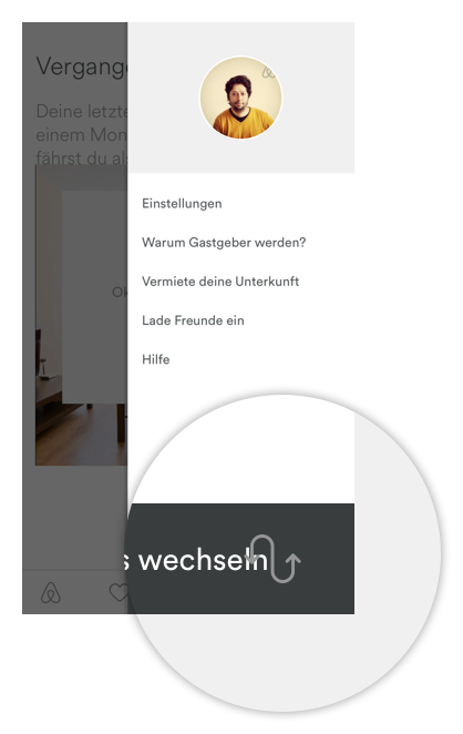
Airbnb didn’t pass the “German Test”. You can notice the text overlapping with the icon if it’s long.
Also, be careful with call to action buttons. If you are using not only an icon but texts, check how does it look like when changing the language to German, for instance.
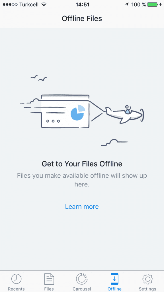
Placeholders and loading elements
When we are designing, we don’t have the means to simulate different loading speeds. And even if we could, chances are that we still end up designing interfaces that are supposed to load very quickly. We don’t always design the uncomfortable moments when users must wait for content to display.
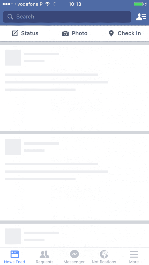

Facebook presents a temporary timeline layout before showing the actual information on it.
Murphy’s Law could not be truer for UX design. Internet speeds are not always guaranteed. This is especially true, for example, when an image is downloading.
In cases like this, we have to decide what to show to distract users. Here is when placeholders come in handy as simple (but temporary) information containers. This could be something as simple as an icon.
- Ideally, the load screen shouldn’t highlight much, as its function is kind of secondary. While we should notice that it’s there, it doesn’t need to be really eye-catching.
- If possible, you may want to go a step further. You can also think of a graphic element that besides accomplishing its goal, can also help make the user perceive that loading times are shorter than they really are. For example, when you are looking for an image on Google Images, before the actual image appears, you can see a placeholder filled with the predominant color of the loading image.
As explained in Interaction Design Best Practices, you should always try to make the wait more pleasant if you can’t shorten the line.
Microinteractions
Usually, what we call details are what actually make our app stand out from our competition. As explained in UX Design 2015 & 2016, micro-interactions are one of the best techniques for giving delightful feedback.
Often considered superfluous, accessory or secondary, microinteractions actually create a feeling of well-being once they are discovered by users. For example, take a look at this fashion model app that was prototyped in UXPin. As you hover over the model, notice how the app reveals their measurements and allows you to download their resume. A simple action reveals additional functionality, deepening the sense of exploration.

Photo credit: UXPin
Here are a few tips
- Micro-interactions must survive long-term use. Don’t get too clever or else what seems fun the first time might become annoying after the 50th use.
- Add some humanity to the microinteraction. Text should read like a conversation, and the motion must feel fluid to make the microinteraction come to life.
- Execute simple animations flawlessly. For microinteractions, complex animations will just overwhelm users. For example, if you open a program in OS X, the dock icon also bounces. It’s simple and fun, but lets you know the program is responding without interrupting your train of thought.
- Focus on visual harmony. If your app has a green color scheme, micro-interactions should use the same palette so that the connection to the parent design or app is unmistakably clear.
- Include microinteractions in places that are normally hiding, revealing them when the user executes an action. For example, upon screen refresh, add a transitional loading animation. You’ll create a sense of discoverability with users, as if they’ve uncovered a rare visual delight within a common task.
- Whatever you do, keep it subtle. Microinteractions should catch the user’s attention like a sly wink, not distract them like an uncomfortable stare.
Conclusion
It may be tempting to keep ourselves inside our “design comfort zone” and think of an interface only prepared to face ideal situations, where everything is under control. Instead, we must prepare for reality in which our design needs to respond to all types of unforeseen pressure.
Extra foresight separates good design from mediocre design. You must account for the details as well as the big picture.
The elements we described are just as important as other design components because UX is the sum of all parts working coherently and harmoniously.
So, here’s my invitation for you to review your current projects, and analyze them consciously and deeply, to detect which of these items are still missing.
For more mobile design advice, check out the free e-book Mobile UI Design Trends 2015 & 2016. Top trends are broken down into simple design techniques by analyzing 79 examples. The book also includes 61 of our favorite resources.