As slick consumer UX becomes the norm, end-user expectations will only increase.
Enterprise products today need to be just as intuitive and fast as their consumer counterparts.
To see the success of consumer-inspired UX principles, you need to look no farther than modern enterprise products like Slack, Blue Jeans, Intercom, and others.
As I explained in the 47-page free guide The Future of Enterprise UX, today’s successful enterprise products require:
- Compelling first-use experience
- Simplified navigation and interface overhead
- A feeling of satisfaction upon task completion
- Sufficient end-user customization
- Useful offline mode
- Lightning-fast performance
But how does that actually play out in the real world?
In this post, I’ll dive deeper into the decisions behind redesigns at Intuit and Asana (where I currently serve as the Head of Design). For each project, I’ll quickly explain the following areas:
- Goals
- Problems
- Challenges
- Key insights
- Business Results
Let’s get started!
1. Quickbooks Redesign
Goals:
Our goal was to optimize for new users, to make the product usable on tablet devices, and to modernize the application so that it looked consistent across devices and within the application.
We wanted to simplify the user experience while making the product viable for desktop users who had access to more power features.
Problems to solve:
QuickBooks Online existed for over 10 years.
Initially ahead of its time, the product became antiquated and complex as new competitive threats increased. As the product approached the 250k user mark, we realized we needed to rebuild the product UI from scratch in order to scale for future growth.
In August of 2013, I was given the opportunity to partner with the developer and product lead to redesign QuickBooks online end-to-end.
Design challenges:
The original QuickBooks Online tool was burdened by over 70 tabs in the navigation. This was overwhelming to users and made the product harder to understand.

Quickbooks before redesign.
For the redesign, we needed to create a more object-oriented user experience.
Users had access to 7 key tabs of functionality, but actions didn’t have a physical location. If you wanted to create an invoice for example, you could do that from the customer tab, or anywhere else in the application. By creating workflows as objects, we were able to flatten the product experience and help the user focus on their chosen task.
Key decisions/insights:
Creating a great product experience isn’t about getting everything perfect.
Focus on the 3-4 areas in the product that must be outstanding and hold those to a very high bar with your design team. Make sure those experiences exceed customers expectations.
We started with a focused set of design principles:
- Be simple, easy to use, and guiding.
- Design for the customer and instill confidence.
- Establish modern and iconic ownable moments.
- Celebrate data while respecting user and device context.
We then defined a new design language (I’ve included a few elements below).
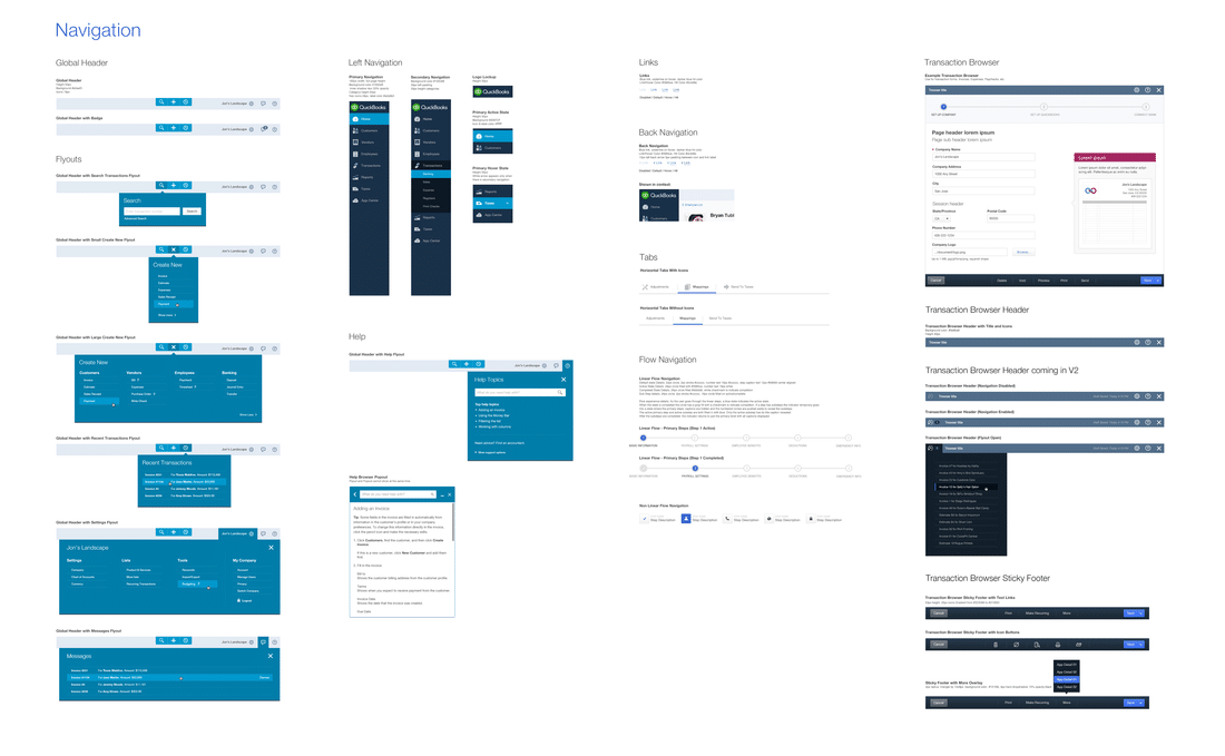
Navigational elements of Quickbooks Design Language.
With the QuickBooks redesign, we actually didn’t rework the entire application for launch. The most important pages were redesigned, while lesser used functionality on older pages were iframed into the new UI.
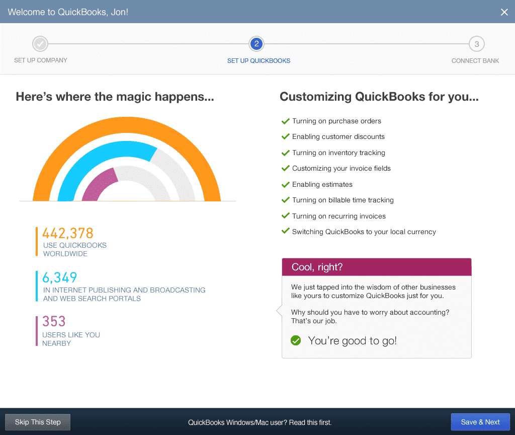
Quickbooks after redesign.
In doing so, we launched faster without disappointing customers.
Outcomes:
- QuickBooks went from ~250k users to over 700k in one year.
- Significant increase in conversion to paid users in the US and globally.
- 23% increase in first visit task completion.
- Net promotor increase of 9 points.
- 33% increase in users adding on other paid services to Quickbooks (like payments).
- Decrease in support call volume.
2. Asana Redesign
Goals:
Maximize clarity for new users & improve NPS for existing users.
Problems to solve:
The designers redesigned both the web and mobile apps, reworking the page structure and layout to better communicate the mental model of the product. In Asana, users create projects, which are made up of tasks, which have conversations tied to them.
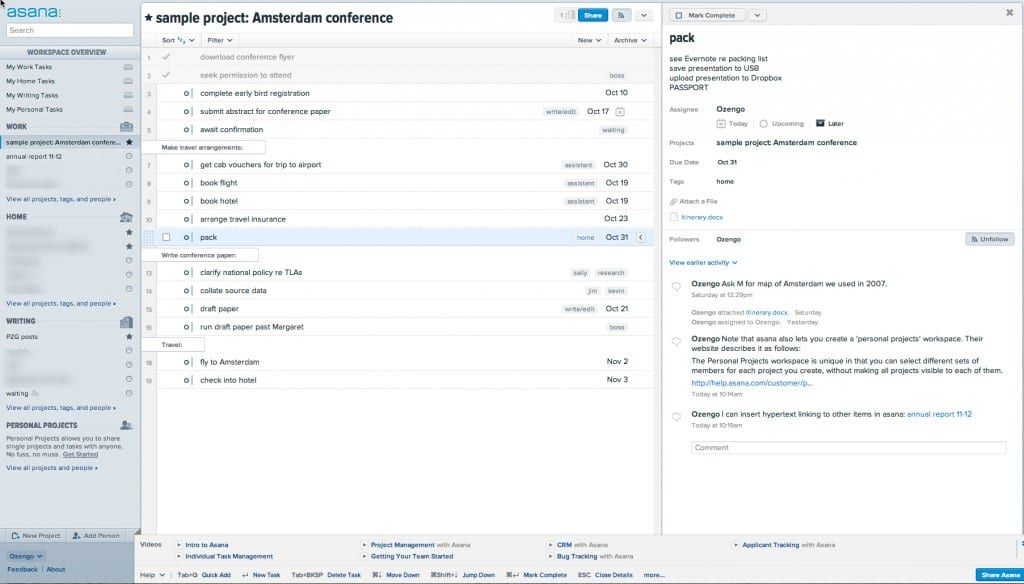
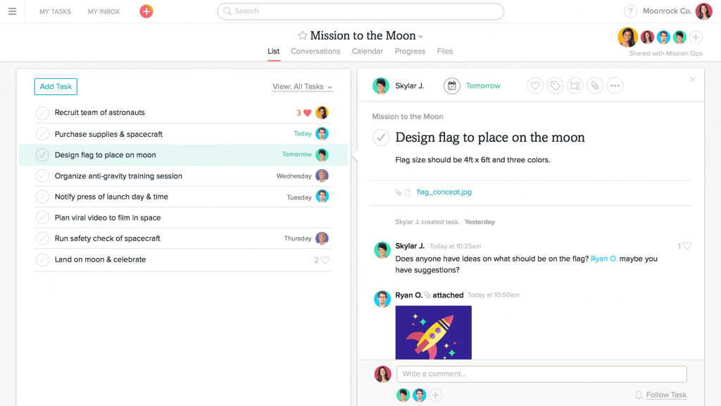
Asana before redesign.
They clarified this structure through simplified navigation, a unified set of components across the product, and made collaboration tools more prominent.
Design challenges:
Early on in the design process, we realized that making decisions was difficult. We knew we needed to redesign the product, but then realized a larger issue was at play. We needed to take a step back and define our brand first.
We then began our rebrand work so that we could clearly articulate our visual motif and give designers the framework needed to make choices.
New Asana branding.
Key decisions/insights:
One key learning for us was that a rebrand is more than a user-facing project, it’s an exercise in cultural transformation for your company.
It’s critical that everyone at the company internalize the revised brand so that we reflect a unified vision in everything we build. That meant that we needed to provide a lot of internal feedback loops and socialize decisions. We brought the design team together physically so that we could get natural collaboration between marketing, brand, web, and mobile teams.
Asana after redesign.
Another key decision with the redesign was to launch the UI improvements incrementally and separately from the visual changes. This gave the team clarity on which UI improvements were clear wins, and also made the process of rolling out the redesign more palatable for existing customers. The team established core collaboration metrics and tracked core actions (like commenting) to ensure that the redesign was succeeding for users.
Outcome:
- Less than 2% of existing users opt out of the new design.
- Increase of 5-10% on adoption funnel metrics.
- Collaboration rate for new domains has increased ~10%
Next Steps
When considering all the advice we’ve explored so far, remember that you still need to adhere to existing user interface standards, focusing your innovation on the parts of your product that are better than what’s already out there.
It’s not the easiest balance, but the payoff is an enterprise product that feels familiar yet is more efficient and satisfying.
If you found this post useful, check out The Future of Enterprise UX that I wrote with the team at UXPin. Across 47 pages, I dive deeper into best practices for enterprise products based on my experience at Asana, Wells Fargo, Intuit, and Yahoo.