A Hands-On Guide to Mobile-First Responsive Design

Mobile-first design is an approach to designing UIs that prioritizes small-screen experience. Given that different devices need different layouts based on their screen size and orientation, it makes sense to design multiple arrangements for your users. This article will show you how to create a mobile-first prototype of a product and transform it into tablet and desktop screens.
Make your own responsive or adaptive variations right in UXPin. Create a mobile-first design and scale it up for tablet and desktop views in UXPin – an advanced prototyping tool. Go ahead and create a free trial and follow along below.

What is Mobile-First Approach?
The mobile-first approach is designing for the smallest screen and working your way up. It is one of the best strategies to create either a responsive or adaptive design.
- The mobile-first approach is a tenet of progressive enhancement. It is the ideology that mobile design, as the hardest, should be done first. Once the mobile design questions are answered, designing for other devices will be easier. What it boils down to is that, the smallest of the designs will have only the essential features, so right away you have designed the heart of your UX.
- The opposite approach is graceful degradation. This incorporates all of the complexities right from the start, then strips them away later for smaller devices. The problem with graceful degradation is that when you build the all-inclusive design right from the start, the core and supplementary elements merge and become harder to distinguish and separate. The entire philosophy runs the risk of treating mobile design as more of an afterthought since you’re “cutting down” the experience.
We, along with others, strongly recommend progressive enhancement with a mobile-first approach. In this post, we’ll explain tips & techniques, then finish off with a hands-on lesson in which we build a hypothetical website with the mobile-first workflow.
Mobile-First means Content-First
If your site is good on a mobile device, it translates better to the rest of devices, be it tablet, desktop computer or laptop. More important, though, is that a mobile-first approach is also a content-first approach. Mobile has the most limitations, screen size, and bandwidth to name a few, and so designing within these parameters forces you to prioritize content ruthlessly.
The mobile-first approach organically leads to a design that’s more content-focused, and therefore user-focused. The heart of the site is content — that’s what the users are there for.
One caveat, though, is that mobile users sometimes require different content than desktop users. Device-specific content can be gauged by considering context — what, in a given situation and a given environment, will your user appreciate more. The best way to plan ahead for these is by creating user scenarios.
Another advantage to the mobile-first approach is that the small-screen breakpoints can better fit around the content. Again, the alternative is worse: having to squeeze an already plump design into a tiny framework. But with the mobile-first approach, the breakpoints develop naturally around content, so you don’t need any awkward edits.
What is mobile-first design framework?
We’ll describe a process that helps our designers at UXPin.
As usual, wireframing is a recommended early step to most efficiently structure your layout. When wireframing or prototyping, we use the responsive breakpoint menu to streamline the process of moving to different screen sizes, starting with the smallest.
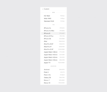
These presets layout the proper screen size for you, so you can wireframe keeping only the content in mind.
Our procedure follows these steps:
1. Content Inventory — This is a spreadsheet or equivalent document containing all the elements you want to include. Learn more about doing an inventory of content.
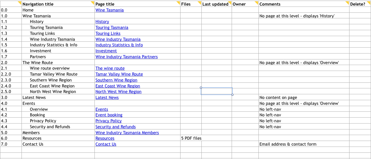
Source: Maadmob
2. Visual Hierarchy — Prioritize the elements in the content inventory and determine how to display the most important elements prominently. Learn more about visual hierarchy.
3. Design with the smallest breakpoints and then scale up — Build the mobile wireframe first, then use that as the model for larger breakpoints. Expand the screen until there’s too much negative space.
4. Enlarge touch targets — Fingers are much wider than pixel-precise mouse cursors, and so need larger elements on which to tap. At the time of this writing, Apple recommends 44 pixels square for touch targets (read about mobile design for iOS and Android). Give hyperlinks plenty of space, and slightly enlarge buttons, and make sure that there’s enough space around all the interactive elements.
5. Don’t count on hovers — It almost goes without saying, but designers often rely on hover and mouseover effects in their interactive work. If you’re thinking mobile-friendly, don’t do that.
6. Think “app” — Mobile users are accustomed to the motion and a modicum of control in their experience. Think about off-canvas navigation, expandible widgets, AJAX calls, or other elements on the screen with which users can interact without refreshing the page.
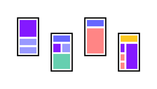
7. Avoid large graphics — Landscape photos and complex graphics don’t display well when your screen is only a few inches across. Cater to mobile users with images that are readable on handheld screens.
8. Test it in a real device — Nothing beats discovering for yourself how usable a website is (or isn’t). Step away from your desktop or laptop computer and load up your product on a real phone or tablet. Tap through pages. Is the site easy to navigate? Does it load in a timely fashion? Are the text and graphics easy to read?
This is just a basic outline. For the complete guide to our process, download the free Content Wireframing for Responsive Design.
How to Create Mobile-First Design
We prepared for you a tutorial that will explain how to create a mobile-first design. Our mobile-first design tutorial has four steps.
- Step 1: Set your content priorities.
- Step 2: Design smartphone view.
- Step 3: Work on tablet view.
- Step 4: Create desktop view.
Step 1: Set your content priorities
A “mobile-first approach” differs from “desktop-first” in that we add information to each progressively larger layout rather than cut away as we design smaller. Thinking mobile doesn’t mean eliminating information. It means sorting information into primary, secondary, and tertiary content.
In this example, we know that the home page should have certain elements, like the company’s name and links to products. A blog post wouldn’t hurt either. But like we said, not everything will fit into a smartphone view, so we set priorities based on what will achieve the site’s goal: selling bikes.
1. The newest model bike
2. The best-selling bike
3. “Find your perfect ride” CTA
4. Company name and hero image
5. Navigation
6. Search
7. The second-best-selling bike
8. Gift certificates
9. A testimonial
10. The latest blog post
Based on that ordered list, we can create with the confidence that our work will solve a design problem of getting sales.
Step 2: Design smartphone view

How much do users need?
Thinking mobile-first forces us to think about what’s really important. In this smartphone view, the top-selling bike and newest model will lead directly to sales, so can we leave other items — such as gift certificates, a less-popular model, the latest news — for inside pages. The final call to action is especially prominent and easy to hit with a single tap of the finger.
Step 3: Work on tablet view

As we design for a tablet-sized view, we’re better able to add secondary information like additional products (e.g. “The Capacitor”). We can also expand the navigation at the top of the page and add content that encourages sales without actually leading to them — namely, the testimonial.
Because more options are available, this can be surprisingly more difficult than deciding what to include in a smartphone UI. The difference between secondary and tertiary elements is a blurry line, and temptation is strong to include everything.
Resist the urge. Use the ordered content list. Like smartphones, space is still limited.
Step 4: Create desktop view

Finally, the desktop view can support as much information as you decide is important. This is where the home page can accommodate all of the information you see fit, whether or not it fits. Notice some of the additional content we’ve included:
- Gift certificates
- Customer testimonials
- Blog post exploring the newest Lightning Bolt bike
Design device-appropriate layouts yourself
If you’re using UXPin, it’s fairly easy to create different layouts for these views.
- Open a UXPin prototype.
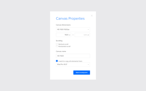
- Tap “Add new adaptive version” at the bottom right of the UXPin editor

- Choose a preset size or enter your own dimensions.
- You don’t have to recreate everything from scratch. Choose a size from which to copy your design’s elements.
And that’s it. Switch between breakpoints by tapping the different sizes above your canvas, and adjust each to suit your needs. If you’d like to try prototyping mobile-first yourself, go ahead. Start a free trial in UXPin.


