Accessibility UX Best Practices – 8 Tactics for Web Design
Designing for accessibility is a crucial part of modern web and app design. Designers must combine UX and accessibility best practices to build inclusive user experiences.
This article explores web accessibility, why it’s important, and eight essential best practices designers can apply to their workflows.
Table of contents
- What is Web Accessibility?
- Usability and Accessibility – Creating Experiences for All Users
- 8 Website Accessibility Best Practices to Improve UX
- 1. Execute the fundamentals flawlessly
- 2. Enable keyboard navigation for web design
- 3. Prioritize text clarity
- 4. Don’t rely on color exclusively
- 5. Order HTML content properly
- 6. Explicit link text
- 7. Use a 40×40 pixel target area for touch controls
- 8. Make media content accessible
- Bonus Tip: Use an Accessibility Checklist
- Interactive Prototyping for Accessibility in UXPin
Built-in accessibility means designers don’t need additional tools to test for color blindness and contrast in UXPin. Increase productivity while meeting WC3 guidelines for A, AA, or AAA on the fly without leaving UXPin. Sign up for a free trial today.
What is Web Accessibility?
Web accessibility is a set of guidelines designers and engineers use to build experiences that accommodate users with disabilities, including low vision, color blindness, blindness, cognitive disabilities, hearing impairments, and mobility issues.
The World Wide Web Consortium (W3C) compiles the web accessibility policies in collaboration with government bodies worldwide. Some countries treat these as guidelines, while others, including the US, Israel, Canada, and the United Kingdom, to name a few, require specific accessibility policies by law.
Types of Accessibility Challenges
Here is a list of accessibility challenges designers must consider when designing for usability and accessibility. Accessibility doesn’t always refer to a physical or mental challenge.

W3C’s guidelines also consider situational and environmental challenges that exclude certain users or groups–like slow internet or a parent with only one free hand.
- Visual impairments
- Auditory impairments
- Environmental challenges
- Mobility impairments
- Seizure risks
- Cognitive and learning disabilities
- Incidental or situational circumstances
Why does accessibility matter?
When we think of accessibility, we tend to think about disability, which isn’t always the case. The list above outlines a massive part of the global population left out when designers and engineers don’t adequately account for accessibility.
When we design for accessibility, we make websites and digital products easier to use for everyone. For example, captions on a video help deaf users follow a narrative, but it also allows users to absorb video content without sound.
Accessible design matters most for making everyone feel included. Designers must empathize with many types of users to understand how websites and products exclude them.
For example, you’re a blind student wanting to research a school assignment, but nearly every website, including Wikipedia, doesn’t accommodate assistive devices, and there are multiple “roadblocks” preventing you from navigating a web page.
Imagine the frustration of not being able to access information like everyone else. Information that could help change your life!
Usability and Accessibility – Creating Experiences for All Users
We love this Venn diagram from System Soft that shows how usability and accessibility intersect to create “enhanced user experiences for all users.”
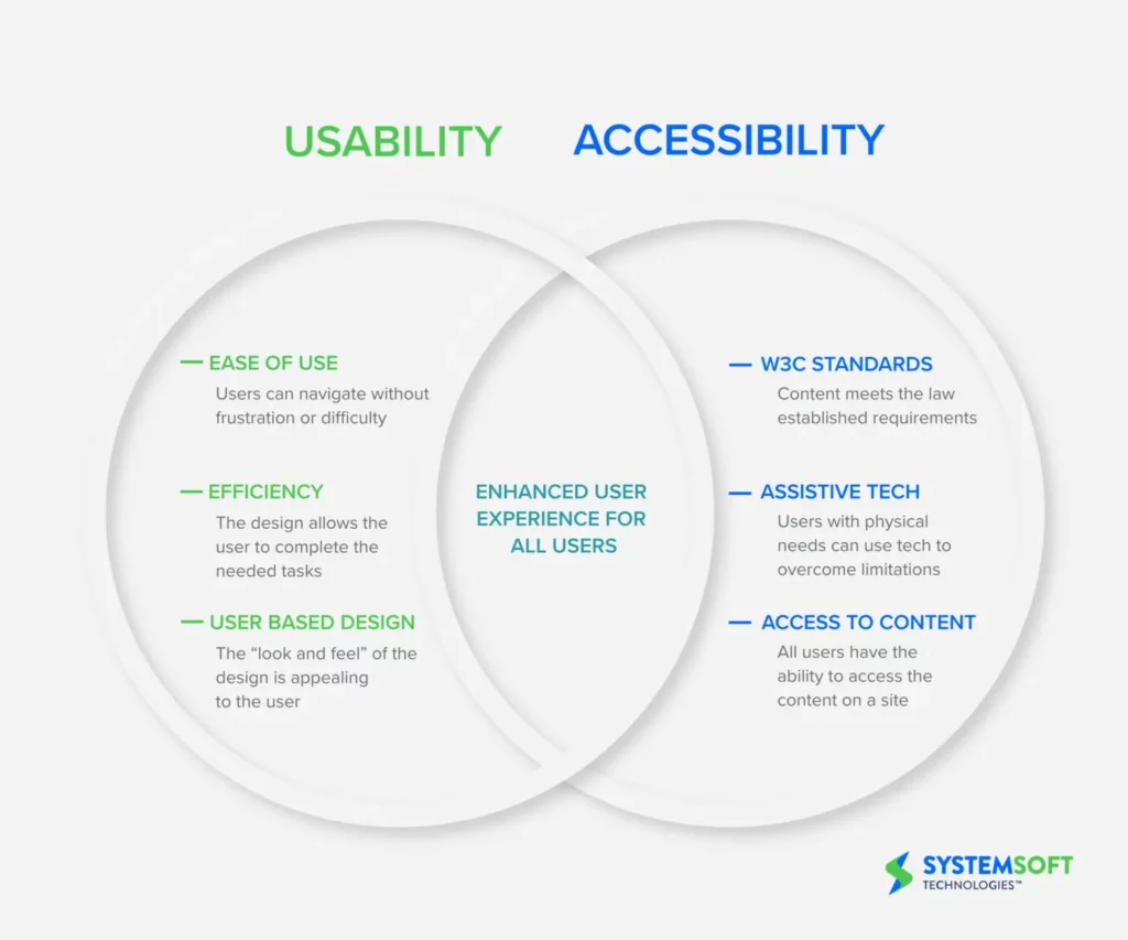
To achieve this balance, designers must go beyond UX principles to create more inclusive user experiences, including:
- Apply W3C standards: Use an accessibility checklist to verify that designs meet relevant guidelines for Level A, AA, or AAA, depending on the product or website.
- Design for assistive tech: Does your website or product provide a comparable user experience for keyboard navigation and assistive technologies?
- Access to content: Can anyone, including assistive technologies, access and digest your content? And, is the user experience comparable?
Applying these three principles to a project enables designers to think beyond usability and accommodate a broader userbase.
8 Website Accessibility Best Practices to Improve UX
Below are eight best practices from our 109-page free eBook, The Essential Elements of Successful UX Design.
1. Execute the fundamentals flawlessly
Most accessibility practices are executing UX principles and UI design fundamentals. Clear, logical designs, navigation, and architecture benefit everyone.

Designers who ignore these basics create usability and accessibility issues, causing significant obstacles for users with disabilities.
2. Enable keyboard navigation for web design
Many users, including those with disabilities, prefer keyboard navigation. Providing shortcuts and logical keyboard navigation allows more users to experience your website.
Keyboard navigation is far more than allowing users to “tab” their way through a web page. Wikipedia’s Table of keyboard shortcuts offers a comprehensive list to make websites keyboard navigable.
3. Prioritize text clarity
Readability is one of the biggest challenges for impaired users and screen readers. If someone can’t absorb your content, they’re at a disadvantage to other users–especially for crucial community, support, and government information.
Designers must ensure to increase legibility (letter clarity) and readability (text block clarity), so everyone can read and understand text content. Here are four simple design techniques for text clarity:
- The W3C cites a minimum contrast ratio between text and background as 4.5:1. A 3:1 ratio is acceptable for large and bold fonts.
- Use a minimum of 16 pixels for body text.
- Line spacing must be at least 1.5 times or 150% of the font size.
- Use adaptive/responsive font sizing in CSS (em, rem, %, etc.) rather than fixed pixels.
4. Don’t rely on color exclusively
Color blindness affects approximately 4.5% (350 million) of the global population. It’s significantly more prevalent among men, with 1 in 12 (8%) affected.
If designers use color, they must include a second indicator to allow color-blind users to differentiate content. For example, many message states use icons and colors for different types, like error, warning, success, etc.

Contrast is another color issue affecting users. Many people, particularly the elderly and visually impaired, battle with color contrast making it difficult to read text. For example, black text on a blue background is nearly impossible to read for these people.
Designers must always use accessibility tools to check these color issues. UXPin features built-in accessibility with a color blindness simulator and contrast checker so designers can check their work on the fly without leaving the canvas. Sign up for a free trial to try UXPin’s built-in accessibility and other advanced features.
5. Order HTML content properly
Most users can scan a web page to find what they need, while screen readers must read every element. Poor HTML practices, lack of labeling, etc., lead to poor screen reader experiences.
Designers must work with engineers to structure content properly and provide bypasses for “roadblocks.” For example, providing mechanisms to skip over repeated links and content (i.e., header navigation), separating content under header tags, and including a table of contents can help screen readers to read and navigate web pages faster.
6. Explicit link text
Screen reader users can list every link on a page to decide where they want to navigate next. However, this feature is meaningless if the text says “click here” or “learn more.” Out of context, it’s impossible to know where these links go.
Designers must also avoid using the complete URL as a link as screen readers have to read or spell the entire string, which can be especially problematic for long, ambiguous URLs with letters and numbers.
For example, Medium articles use randomly generated letters and numbers at the end of URLs to avoid duplication. Pasting this UXPin article URL would be a nightmare for screen readers: https://medium.com/@uxpin/have-you-tried-designing-with-code-introducing-mui-5-kit-in-uxpin-3a6d7f928dd4.
A better option would be to hyperlink the article’s title: Have You Tried Designing with Code? Introducing MUI 5 kit in UXPin.
This article from PluralSight provides more examples on how to make your web links screen-reader friendly.
7. Use a 40×40 pixel target area for touch controls
Have you ever tried to tap a link with your thumb and hit the one closest to it by mistake? It’s incredibly annoying and frustrating! Using a 40×40 pixel target area for touch controls makes sense for all users, but it’s especially helpful for users with disabilities.
8. Make media content accessible
Media, including images, video, and audio, adds a different dimension to a web page because it allows users to digest content in their preferred medium.

But media can also exclude many users. For example, deaf people can’t listen to audio or video content. Blind users can’t see images or videos. Here are some essential tips to make media content more accessible:
- Always use descriptive, relevant alt text for images, icons, and other still media.
- Include a transcript for audio and captions for video content.
- Caption every image in a carousel (and remember to allow keyboard navigation).
- Disable autoplay which may harm users with cognitive disabilities or seizure disorders.
- Don’t use any media with strobe or flashing effects as these could trigger seizures.
Bonus Tip: Use an Accessibility Checklist
There are loads of resources to help designers and engineers build accessible websites and digital products. UXPin has this web accessibility checklist for designers, but we also recommend following W3C’s official documentation.
Interactive Prototyping for Accessibility in UXPin
Designers must use accurate prototype models for accessibility testing. The prototype must look, function, and respond like the final product during testing so designers know whether their solution meets W3C requirements correctly.
With code-based design from UXPin, designers can build fully interactive websites and products that resemble code-like fidelity and functionality.
For example, this UXPin sign-up form features fully functional input fields allowing designers to test conditional logic, error messages, component states, and more to replicate a typical sign-up flow.
An interactive prototype like this sign-up form provides usability participants with an authentic user experience, so designers get meaningful, actionable results from testing with all users.
Sign up for a free trial to prototype, test, and iterate at greater speed and accuracy to deliver a superior user experience for your customers.

