In design school, I learned fundamental lessons that apply to much more than the “design” part of my job today. A large part of my success founding and running Brolik can be attributed to what I learned there.
That being said, a design degree is by no means necessary if you’d like a fulfilling and successful career. In fact, plenty of designers start out in another field, ranging from those closely related to design, to those that are entirely separate.
Everyone tends to learn something about type hierarchy and the “rules” concerning whitespace, but I’ve noticed several design practices that often seem to fall through the cracks.
Here are five web design tips that most people aren’t always formally taught—and each one is simple, practical, and universal.
Tip #1: Pay attention to horizontal line length
This may come straight from print design, but it’s just as relevant for screens.
If the reader has to move their head to read across a line of text, the line length is too long. Even something as simple as moving their eyes back and forth can result in cognitive strain. Studies show that going from the end of one line to the beginning of the next can be subconsciously energizing, but if that break is too long, it becomes taxing.
To ensure that text is comfortable to read, a good rule of thumb is 50–60 characters (including blank spaces between words) per line, according to Emil Ruder in “Typogaphie.” It’s fine to do more (70 or 75), and it’s fine to do less, just understand and accept the compromises that go along with using lines that are too long or too short.
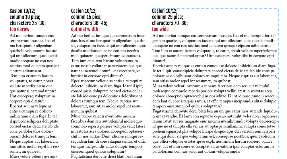
Credit: http://www.magazinedesigning.com/columns-pt-2-line-lengths-and-column-width/
This very concept is why newspapers use columns. We’d see more columns on the web if CSS had better support for them (which is on the way).
In the meantime, line lengths can be shortened to a comfortable size by centering a single column of text or using text and images side by side. For every column of text, you should at least set a maximum width.
Tip #2: Be flexible with images
As designers, we’re generally used to cropping and sizing images in careful detail. All that has changed with responsive design on the web; we don’t have the luxury of art directing down to the pixel.
As device size and shape changes, the size and proportion of images needs to change, too. This means that very same image on a desktop could be a full-screen background as well as a thin banner image on a mobile phone in landscape view.
Keep in mind that you’re designing for a changing environment. The focal point or subject matter should generally be toward the center of an image, with a healthy “safe area” around the edges to ensure it can be cropped without losing meaning. While not true in every case, horizontal images tend to be more versatile than vertical.
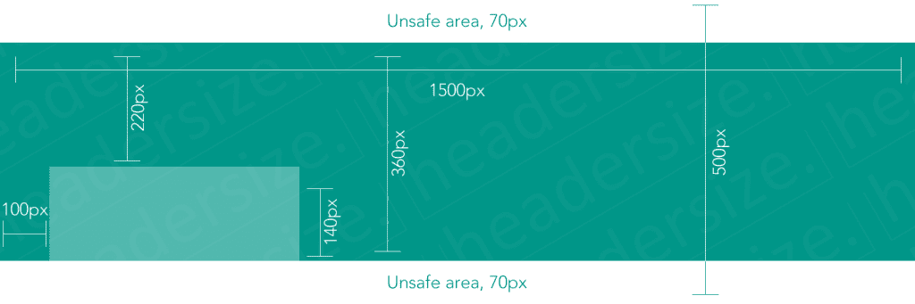
Credit: https://headersize.com/twitter-cover-dimensions/
A perfect example of this is Twitter’s profile cover photo. You can read how to create the perfect cover photo, but the point is that the image needs to be flexible.
Tip #3: Limit your fonts
Even after it’s coded, site performance and load times for a website or application can become a big concern for designers. When a project exceeds its performance budget (basically when it takes too long to load), carefully-selected fonts are often first on the chopping block.
However beautiful and thoughtful the design, your developer might have to make some drastic cuts to bring the performance back in line. In other words, entire families of beautifully considered fonts could get replaced with the baseline/default font if the design relies heavily on specific typefaces in multiple weights and sizes.
By designing with this in mind and sticking to one or two universal, “workhorse” fonts like Open Sans (sans-serif) or Lora (serif), designers can better ensure the ultimate success of a project, even if changes are required down the road.
Grab design ebooks created by best designers
All for free


Do you want to know more about UI Design?
Download 'The Definitive 2016 UX Design Trends Bundle' FOR FREE!
Download e-book for freeTip #4: Be careful with contrast
Too much contrast is detrimental on bright screens, but the opposite is also true—designers typically use too little contrast.
We celebrate subtlety, like using a lot of gray on white or visually separating sections with thin, delicate rules. Unfortunately, this doesn’t always translate well to a screen because designers tend to have nicer monitors than the general public.
On the other end, designs with super high contrast appear far more extreme on bright LED monitors than they do in print.
We may get away with this stuff, depending on our audience and brand, but you don’t want to neglect people viewing the web with low quality and/or old monitors, working on bright screens in dark rooms, or sitting too close or too far away. These environmental factors all affect how well and how quickly someone will understand a design.
Unfortunately for web designers, we need to work within the constraints of contrast.
When ambient light media queries are fully supported in CSS, we can make design adjustments based on environment, but for now, we need to stick to a “Goldilocks” contrast—not too much, not too little. Digital agency Huge manages contrast on their website really well. Everything feels bold and subtle at the same time.
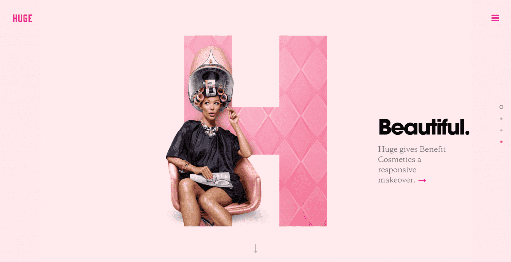
Credit: Huge
Tip #5: Break everything into separate, digestible pieces
Scannability is extremely important in web design.
Many designers have been taught Gestalt design theories about content grouping for clarity and understanding. These theories that are just as important on the the responsive web.
Content that is designed to be used, reused, shaped, and truncated is much easier to re-flow for responsive designs. If we focus on a versatile design system instead of a specific layout, we increase efficiency and portability.
This mentality helps in other ways, too, like adding content to a website once it’s live or reusing sections of content in multiple places.
An easy example of this is the hours on a restaurant’s website.
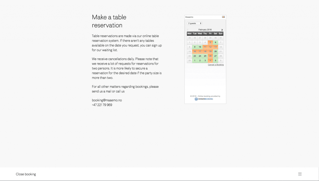
Photo credit: Maaemo
When designing for changing layouts, the hours may be in a side column on large screens and in a box that covers the main banner on small screens. In both cases, they’re repeated in the footer. If the hours are designed as their own, separate “module,” they’ll feel at home anywhere in any overall layout.
Once you’ve built out your first visual hierarchy, gauge its effectiveness with Rackspace Designer Lee Munroe’s blur test.
The whole is greater than the sum
Efficiency in the way we design and the way we think about design is more important than ever. Design processes and considerations go far beyond the final, visual piece, and web design success is judged by more than the client’s reaction.
Think big picture and try to understand how web design affects all team members and ultimately how your designs translate to different browsers and devices. Make sure reading is comfortable on any screen, images are flexible, fonts are performant, contrast is controlled, and everything is modular.
For more experience-based web design advice, check out the free e-book Web UI Design for the Human Eye: Colors, Space, Contrast.