Design isn’t just about what you put in it — it’s also about what you leave out.
White space (or “negative space,” or “empty space”) can be just as important to defining visual hierarchy as the actual elements involved.
In this article, we’ll talk about three techniques for using absence to strengthen substance: use grouping for comprehension, combine white space and contrast, and vary white space for navigation menus.
1. Use Grouping for Comprehension
The footer design of Lever is a perfect example of using white space to create groups of content. All footer links are split up into vertical columns aligned side-by-side.
Source: Lever
Let’s look at each individual column. Notice that the vertical spacing between each link in the footer (like Navigation and Features) is identical. The contrast from the white text, however, forces us to first look at the header before perusing any links.
The most interesting point here is the white space is found both vertically and horizontally. The horizontal space is much greater than vertical space found between the links.
The spacing combined with contrast draws our attention to the white links while preserving our understanding that all the links are related. No “Footer” label or any other effects are necessary, allowing us to maintain the minimalist design.
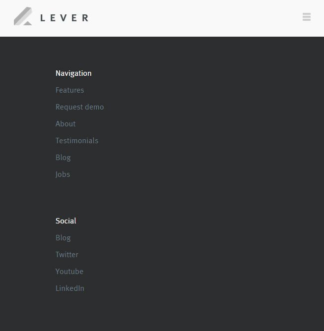
Source: Lever
As dictated by the Uniform Connectedness principle, elements that are closer together appear related.
Lever is a responsive website and when you resize the layout, these footer columns all drop vertically. When viewing the smaller responsive layout, the design adapts by creating more vertical space between the footer columns. As a result, the user can still see where one list ends and another begins.
2. Combine White Space and Contrast
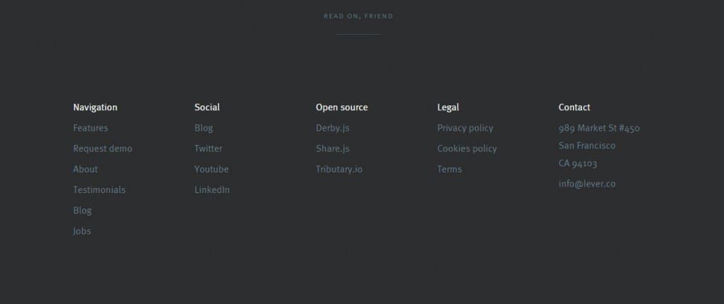
Another similar effect is visible in the footer area of Geckoboard’s website. It uses 3 link columns, but instead of giving headers more contrast, only the important links (like Product, Benefits, and Pricing) stand out in clear white text.
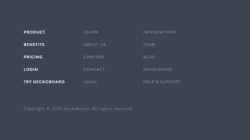
Source: Geckoboard
Negative space in the footer is both compositional and textual. The footer itself is quite large but the link text is spaced both horizontally and vertically. As a result, the generous space allows each link to almost feel like an individual block of text.
The link text style also uses all-caps with a bit of letter-spacing added via CSS. All this extra space between columns, links, and individual letters creates a spacious feeling. Contrast defines higher-level text and extra space conveys the relationship between groups of links.
Remember that white space is universal and footers are not the only areas which can benefit. Headers, sidebars, and even in-page content can use white space and high/low contrast to build contextual relationships.
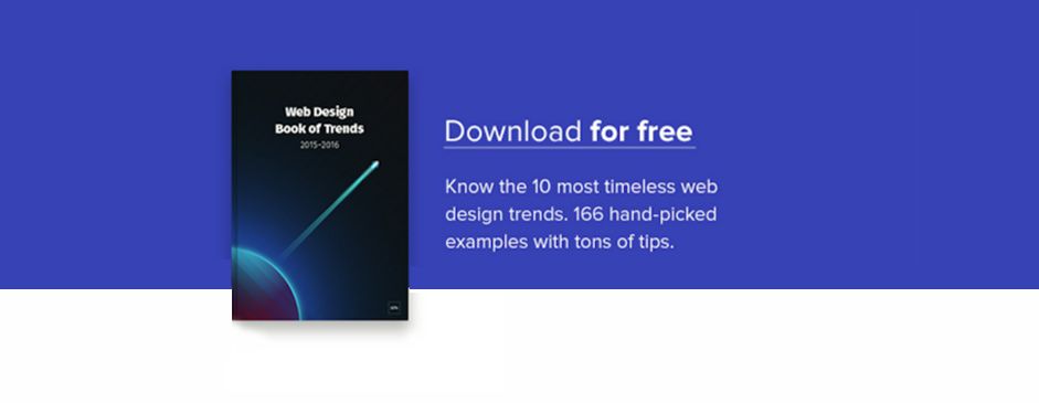
To learn more about leaving strong visual impressions, Check out the first volume of the free guide Web UI Design for the Human Eye .
3. Vary White Space in Navigation Menus
Almost all websites require some form of primary and secondary navigation unless they’re only single-page designs. In fact, as you can see in this excellent gallery, many single-page layouts still use some form of stripped-down navigation — whether it’s a simple top-level horizontal menu or a hamburger menu.
As described in the Web Design Trends 2016 ebook, the white space found in a navigation can vary wildly. It’s all based on content density and how many links must fit into a single navigation. Many of the examples shown earlier are just simple landing pages with a few links. The less content on the landing page, the more creative control you can exercise in the navigation layout — for example, designing navigation links as either large typography blocks or cramming them into a corner.
But when structuring a more complicated web UI, you’ll need a stricter plan of attack. Take for example Microsoft’s homepage, which supports links for all of their products. As we all know, the design of Microsoft’s site must account for its enormous breadth of products ranging from tablets to Xbox consoles and games. It’s a very delicate balancing act.
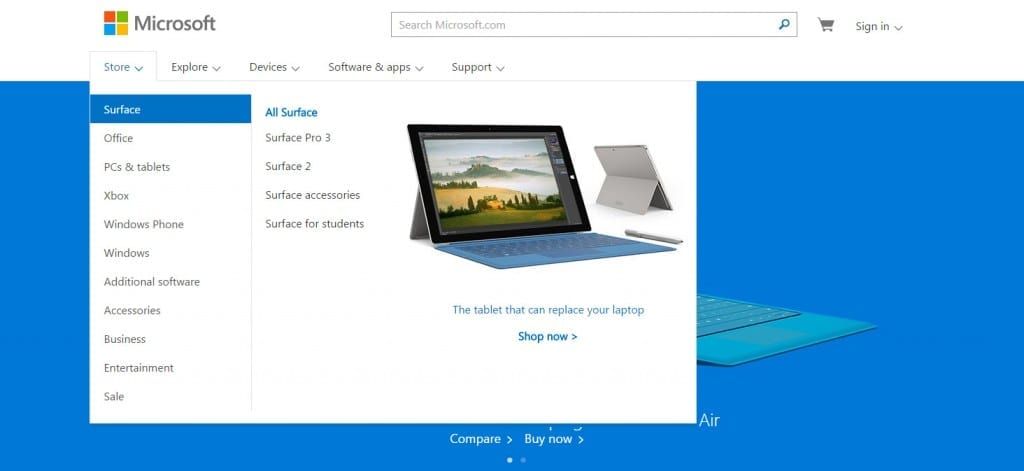
Source: Microsoft
Their navigation menu features a series of links with dropdown menus. Each dropdown list uses a flyout secondary menu with tertiary product links. Needless to say, Microsoft’s website has a lot of content.
The great part about their navigation is the exquisite use of white space. All of the links in their dropdown behave like block-level elements with plenty of padding. Visitors can hover anywhere over the link area and it will become clickable. By following Fitts’ Law in creating large targets for navigation links, the design makes navigating the site smooth and easy.
Readability tends to increase when adding more space between text, so err on the side of extra space when you place dozens of links together in the same menu. In this case, generous white space helps to offset the decision paralysis effects of too many interface objects as described by Hick’s Law.
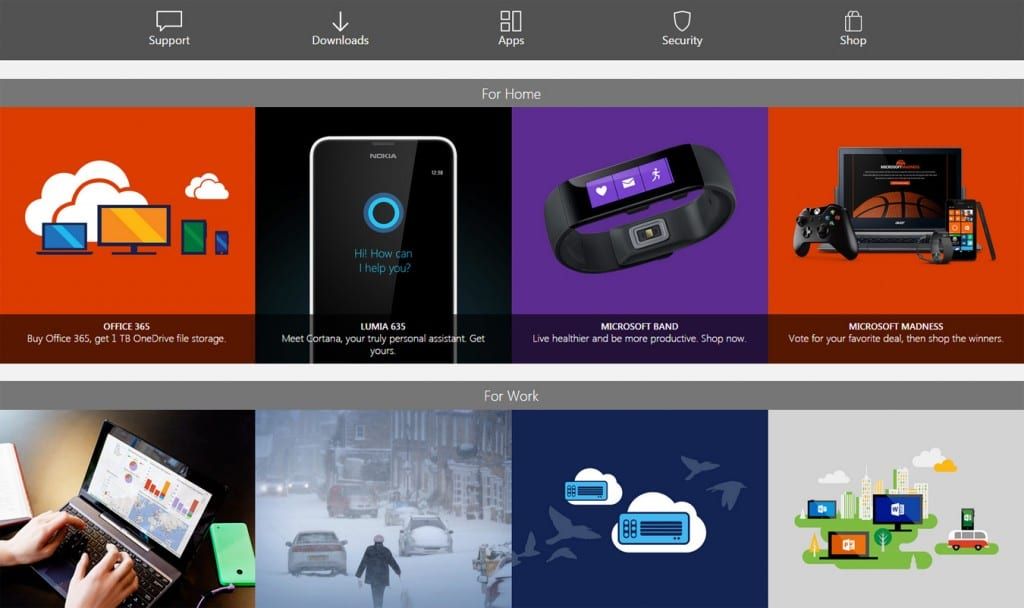
What’s even more interesting is that Microsoft includes a few other smaller menus further down the page. These are much simpler with just a few links and related icons, but they’re still a way to get visitors digging deeper into the site.
Source: Microsoft
Source: Microsoft
When designing a navigation menu, always think about content density. How much content needs to be available in this portion of the website? The answer will offer a glimpse into some of your options for navigation design, and thus how much white space must be available.
Here’s some tips for styling nav menus:
- Adjust font size & space according to the number of links.
- Smaller links can still draw attention through contrast or with a scrolling navbar.
- Extra space leaves more room for links to stand out. Consider space both vertically and horizontally to create “link blocks”.
- Different page sections call for different white space values. A website’s top navigation may be wildly dissimilar to the footer navigation.
If you’re interested in learning more about navigation best practices, we highly recommend this 5-part series on Smashing Magazine.
More Design Best Practices
You can learn more actionable design techniques in the free Web Design Trends 2016 ebook.
The 185-page guide explains 10 best practices in great detail. You’ll find 165 analyzed examples from today’s top companies.