Minimalism is a popular style now, both for its visual appeal and for its practical benefits (faster loading, better comprehension, etc.).
Below, we discuss the 3 techniques that most define the minimalist style, with practical tips on how to apply them. Add them to your design to create the perfect minimalist site.
1. Crazy Colors
Previously in design, we saw a focus on hero images and video — a trend that’s still going pretty strong — but the recent shift has been toward color as a dominant element. Big color replaces some of the more typical white space that we’re used to seeing with minimal designs.
Because minimalism involves stripping away elements that are unnecessary, a strong focal area is important. That’s where big, bold and even crazy color comes in.
The stunning result borrows some of the colors we’ve seen in flat and material design trends. This creates an overall look that’s simple, engaging and demands attention.
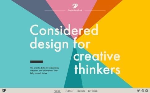
Photo credit: Studio Lovelock
Studio Lovelock uses a pinwheel of colors to create a full-screen header that draws users in. The text is simple and without any extra embellishment or words. Add an atypical bottom-screen navigation menu to keep the focus on the main image, but provide a cue to scroll. Below the scroll, the site uses the same big colors in card-style elements to move users through the design. This makes navigating the content both easy and visually appealing, yet simple and elegant.
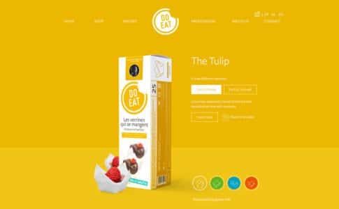
Photo credit: Do Eat
If the Do Eat website had a white background, we probably wouldn’t even guess if it could be considered minimal or not. And that’s precisely why the bright yellow background works. It create the right degree of surprise to entice users. The rest of the website design is simple and quite easy to use, with just the right balance of clickable elements and information.
Tips for Using Crazy Color
- Opt for bold hues with deep saturation
- Mix and match bright color with white or black typography
- Use a single color as the primary palette, including the background
- Plan “too much color” with care and mix up a rainbow-style color palette
- Let color be the only “trick” in the design and keep everything else streamlined
Using “crazy” color choices can be one of the most effective ways to give a project a facelift. This is a great option for a minimal design, because there’s still plenty of visual interest and color to add a freshness that a more stark black and white design might lack.
2. Trendy Typeface
When someone says “minimalist typography,” what typeface do you visualize?
Maybe it’s Helvetica. Or something that looks a lot like it, with plenty of medium width, and simple strokes that come together in a highly-readable sans serif.
Of course, this would be the textbook definition of typography for a minimalistic design. But it doesn’t have to be the only definition.
When the rest of the framework is stripped down to the most basic of designs, a more trendy typography option can serve as the dominant element, at the same time as delivering its textual message. Vintage or retro-grunge type and stacking type are time-honored designer favorites. When used right, they can add a spark to a minimal style.
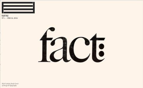
Photo credit: Flat File
Flat File uses a striking serif — ITC Caslon No. 224, to be precise. The type is roughed up, giving it a slight texture that feels artsy and like a critical component of the content. Simple scrolling effects contribute to this minimal aesthetic, because everything about the site is so easy and comfortable.
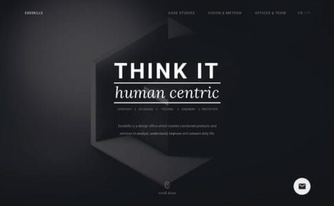
Photo credit: Exoskills
While Exoskills looks nothing like Flat File, it also combines a simple aesthetic, navigation and feel with bold typography as a dominant element. Multi-level stacked typography provides an interesting way to display information in readable way, one reason it’s becoming more and more common. As an added bonus, it also creates just the right hierarchy, telling users what’s important.
This combination of eye-catching typography and a minimal design is a great option for design projects that need to convey simplicity, harmony and organization. More importantly, minimalist typeface serves as a starting point for designs that lack other elements or that want users to focus on reading the message on the screen.
Be aware of size when it comes to this text-heavy style. On smaller devices, it’s important to watch the sizing of responsive typography – particularly with more complicated typefaces – to ensure readability remains intact.
Tips for Using Typeface Trends
- Use trendy typography for a specific purpose such as a logo or headline
- Complicated typefaces, such as vintage grunge, often need to be displayed at larger sizes
- Don’t grab a new typeface just because it’s cool; it should match the mood of the project
- Not all trending typefaces will work with minimal; styles that lack long tails, swashes and flourishes are the best options
Typeface trends can evolve and change quickly. Use this technique only if you are a constantly tweaking the design, because otherwise you would end up with something that looks dated. By applying a type trend to a very specific part of the design, such as in the hero image or main navigation, you can easily use a trend while it’s popular and change course when needed.
3. Compact Navigation Options
When you think about minimal design, navigation is not always one of the first things that comes to mind. This is partially due to the design itself. Many minimal designs actually hide some or all of the navigation to streamline the visuals.
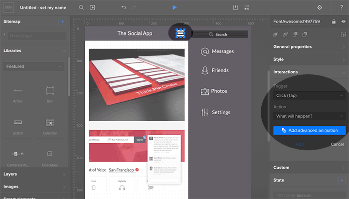
Photo credit: Prototyping a navigation drawer in UXPin
For example, the often-debated hamburger icon, and related hidden navigation. The stacked icon that expands to a full list of menu items remains a popular design choice, especially in minimal frameworks and mobile UI.
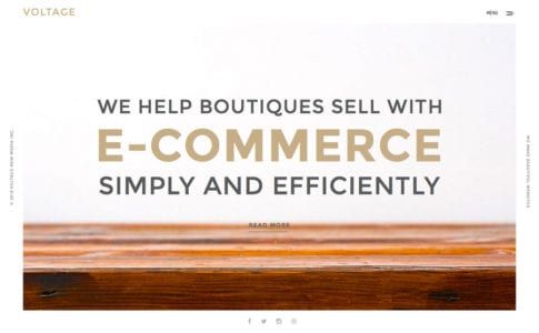
Photo credit: Voltage New Media
A slightly different take on this icon is employed by Voltage New Mkedia. Click the off-center hamburger icon, and it expands to a half-screen style navigation menu.
This style, which is often no more than a colored box containing a simple logo and list of link options, is extremely popular and growing. It works with the minimal style because you can strip plenty of “junky,” but necessary, elements from the main canvas in a way that users understand. (Love it or hate it, almost everyone understands how to use the hamburger menu.)
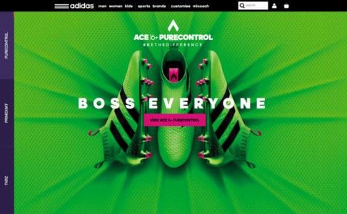
Photo credit: Adidas
The appearance of minimal navigation is growing in designs with more complex aesthetic patterns as well. Take the United Kingdom’s Adidas site, for example.
The homepage (minus the busy textured background) is sparse. There’s a simple row of top page navigation, a bouncing arrow at the bottom of the screen to help users scroll for more and hidden pop-out navigational elements on the left side of the screen. All of these techniques are commonly featured in minimal designs and are simple to understand and use, even with more complicated website designs.
Next Steps
The more popular minimalism becomes, the more frequently it evolves. To stay informed on what to expect from minimalism in 2016, read the free e-book Minimalist UI Design Trends 2016. There you’ll find even more techniques like these, plus specific advice for apply minimalism to sites with heavy content.