Many myths have been built up around responsive design. Arguments have been made that responsive design is too costly in times and resources. But building a responsive site doesn’t have to be a time suck. There are shortcuts you can take for effective responsive design.
In this post, we’ll show you 10 responsive design shortcuts that will speed up your design workflow and create responsive sites in no time.
1. Get Away from the Computer
This might be antithetical to a designer. And it may very well be the least popular piece of advice I give to web designers, because we designers love our shiny tools so much. But every once in awhile, you need to close photoshop, put down your fancy touch pen and trade those in for some old fashion designer tools.
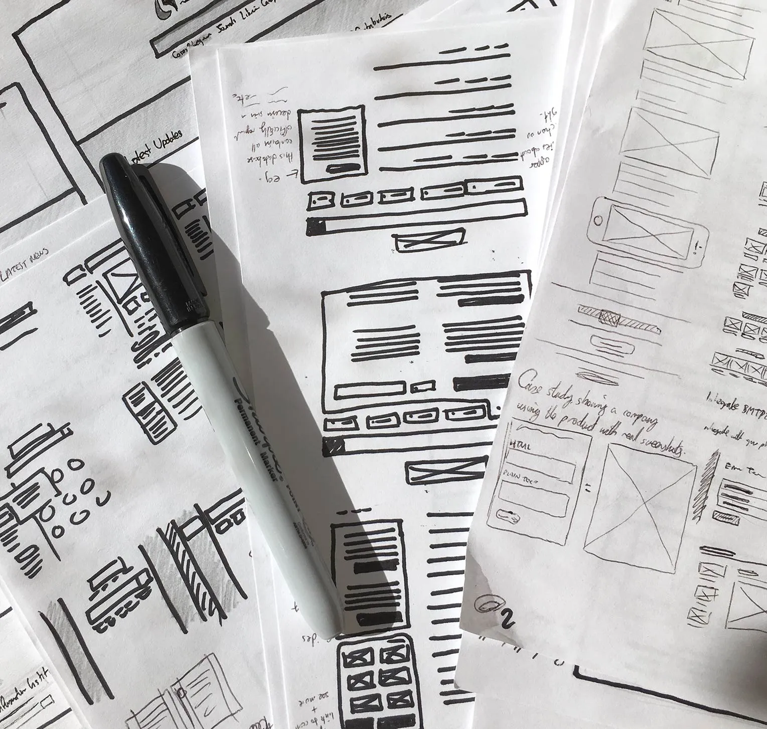
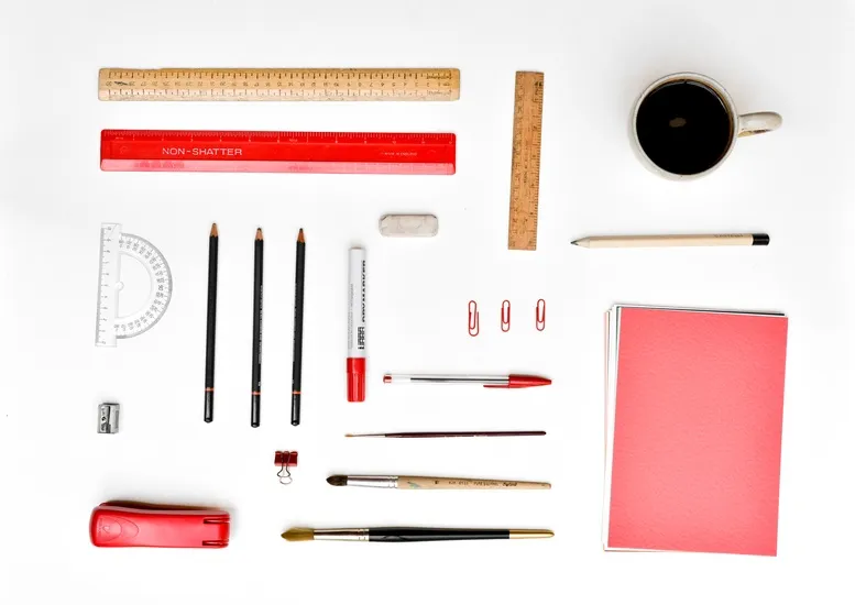
Photo Credit: Fairhead Creative
Try this: grab a Sharpie, and some plain printer paper. Nope, no Montblancs and Moleskines here. You’ll get precious about how you use those. Sketching allows you to burn through ideas quickly and relieves you from the pressure of getting everything pixel perfect. Which is why it’s important to do it on scratch paper than a treasured notebook.
Here’s the benefits to taking pen to paper:
- It’s faster. You can burn through ideas much more quickly than you can if you were pushing pixels around your screen.
- It leads to better designs. Brains are for having ideas, not for storing them. By visualizing your ideas as they come, you’ll be able to build upon previous ideas too, and find totally new avenues to explore. This often leads to more considered, tighter initial design.
- It focuses you on designing, not decorating. You can’t worry about border colors and font choices when your borders are wobbly and your fonts are lines. You’ll get the architecture right before worrying about the details.
By processing your ideas and options more quickly — by getting that pen moving — you’ll find that your sketches will flow from you much faster. Timid moments of pause, those “is that one worth drawing?” thoughts, will be history.
- Start by loosening up. Maybe you need to take a sheet of paper and scribble all over it. Or maybe you need to just start sketching out thoughts and ideas in your head as rapidly as you possibly can. Whatever works for you, start by loosening up. It’ll make your lines more confident, and your sketches stronger.
- Iterate as the ideas happen. Don’t question your ideas as they come – just let them out. You can question them all later. Remember, sometimes great ideas can come from a little detail within a terrible idea. Let them out, nobody’s judging you!
- Avoid feedback loops. Encourage liberal, actionable feedback to match your liberal sketches. But don’t let them take over: all feedback should either help you take a step forward, or it should be saved for a later stage in the process.
Save yourself some time with sketching by taking mobile into consideration. Because of the limited space on a mobile viewport, you’ll be forced to prioritize content. You’ll be able to suss out what content is pertinent on mobile and then sketch to scale for desktop.
2. Start Small, Go Big
Considering content first is practicing mobile-first design. Design for the small screen first and work your way up.
As UXPin outlined in the free ebook Responsive and Adaptive Design, mobile-first is a tenet progressive enhancement, which says you should design on the most constrained screen first. Once you design for that, you’ll be able to easily build up to larger screens.
By tackling the smallest screen-size first, you’re allowing yourself to focus on visualizing a 320px-width story of priorities, then taking advantage of all the extra space available, to your user’s advantage.
- Let content drive your design. Write the content first, before you design anything at all. Your design helps communicate the story of the content and, on smaller screens, you’re forced to focus on that content whether you want to or not. By forcing focusing on the content, your design will retain focus as viewports grow.
- Embrace the constraints. By starting with the laptop-sized screen you’re designing on first, you’re sacrificing many of the benefits of constraint. Creativity happens when you make those constraints work for you: start small, go big.
Your site will translate better to all devices once you get it looking good on a mobile device. One thing to keep in mind: what content works on mobile won’t necessarily work for desktop users. You’ll want to gauge context to determine what’s more appropriate for desktop users or what works best for mobile users.
3. Don’t Use Mockups of Every Single Page
Hi-fi mockups can be great when you get close to a finalized design. But when you’re trying to iterate quickly, learn what works and doesn’t work, they can be a hinderance.
Other than being able to change course swiftly, there are a few other reasons for not using hi-fi mockups when we’re in the early stages:
- Pixel-perfect designs only exist in a fixed-width world. The Photoshop document may look great, but they also tend to make everyone focus on one screen-size more than the rest. What about a Samsung Galaxy S? Or a Nexus 7? Or a landscape iPhone 5? All screen-sizes are important, and if you focus too heavily on one, you risk leaving others out cold.
- Design patterns and experiences, not pages. Patterns exist throughout the sites you design. So do the experiences you create. By designing those, rather than just pages, you’ll cut out the learning curve for users because they’ll already know what to do.
- It’s a huge waste of time and money. A high-fidelity mock always needs creating twice: once in Photoshop, once in code. Things are going to change anyway, so have the confidence in the design to let them change based on user feedback in code-form, rather than hiding it away in a PSD.
Once the base style is established, sketches become efficient blueprints for repeatable elements. Photo Credit: Fairhead Creative
With the base design established, time spent re-applying them to every additional page is time could be spent focusing on what makes them unique, rather than what makes them the same.
For additional pages, consider mocking up only what sets them apart – the unique assets, how content is placed into the base design – only what is essential for you to determine an effective layout, and for stakeholders to get a sense of that too.
This way, page mocks become blueprints, with which you and stakeholders can act quickly on.
4. Speed Up Medium-Fi Work With Tools Like UXPin
Now we’re considering doing away with high-fidelity mocks for every page, let’s talk about medium-fidelity.
Once your low-fidelity, sharpie-level imagery is a hit, consider going with a medium fidelity before high-fidelity or writing any code. Remember, as soon as you go high-fidelity, everyone’s going to be concerned with kerning, line heights and colors. The focus of the work will tend to shift toward micro details rather than the larger user experience problems.
Photo Credit: Fairhead Creative
Using a prototyping or wireframing tool, such as UXPin, allows you to stitch together pages of real content for clients to experience without those distractions.
- Quickly establish what goes where on each page. Following and updating your patterns is much quicker when they’re reflected by gray boxes, than it is when you have to replace numerous layers in Photoshop.
- Brings the focus back to the user flow. When you’re not thinking about how the typeface isn’t perfect, you’re able to dedicate all your attention on how to craft a solid user flow.
- Alternations from low-fidelity are easier to work though. When you scale up from the Sharpie work, the increase in fidelity can often require modifications you won’t have spotted first time around. By processing these in medium-fidelity, you can save yourself from hours of pixel-pushing.
Much like lo-fi mocks, you aren’t committed to the details in medium fidelity. There’s still an opportunity to change course. You can rearrange things without having to toss out a bunch of code or visuals. And you’ll keep everyone focused on the bigger picture rather than the minutia.
5. Don’t Try to Reinvent the Wheel
As I mentioned in my article on TheNextWeb called “5 UX mistakes that make users feel stupid”, new ideas are definitely worth exploring, but not when creativity loses sight of usability.
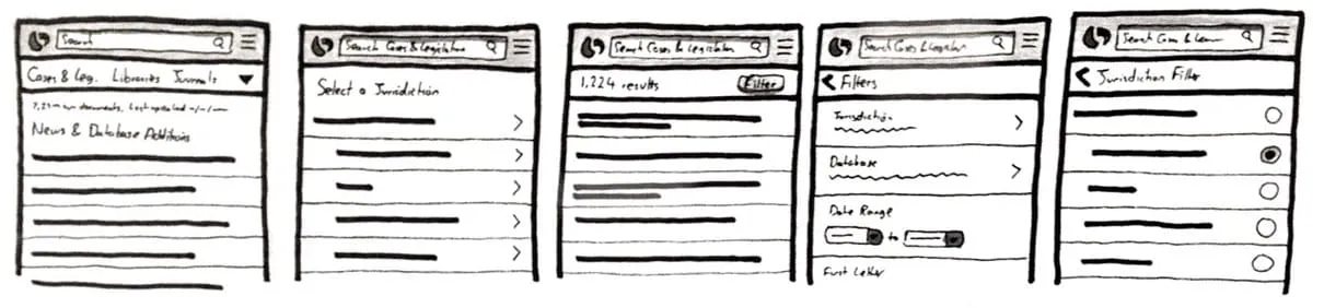
You can speed up your responsive design by using design patterns: solutions to common design problems that appear again and again that users are already familiar with. As shown in the quick prototype below built in UXPin, think about the hamburger icon that reveals a navigation drawer — that’s a common design pattern in responsive design .
Photo Credit: UXPin
The beauty of design patterns is that they give us many out-of-the-box solutions, such as a dropdown menu, checkboxes, radio buttons, and underlined hyperlinks, just to name a few. Extending these patterns to familiar navigational structures, iconography and scrolling behavior is a great way to speed up design while also making visitors feel right at home on the finished product.
You should strongly consider leveraging any standard patterns and elements that your site’s target audience is familiar with, rather than recreating them. More often than not, you’ll want users focused on things other than what your icons mean. Things that your design is supposed to shine light on, such as signing up, checking out, or registering interest.
- Identify patterns your audience understands. If there’s target-industry-specific iconography, leverage it. If there’s a heavy Android user base, don’t use iOS patterns just because you like them better.
- Help your audience focus. In any situation, try to identify what your audience resonates with so that you can make them comfortable using your design. The more comfortable they are, the more they’ll be able to focus on the reason they’re there.
If you want to see some of the more popular mobile UI patterns being used, check out the free e-book Mobile UI Design Patterns.
6. Look After Your Tools
And I don’t just mean staying up to date with Photoshop software updates. Really, that’s the least important part.
Make sure your tools are in good condition. Specifically, make sure you have the pens you need, that they aren’t running dry, that you have plenty of paper and post-its to hand, and so on. Whatever you need.
- Be ready. By making sure it’s all ready and to hand when it’s time to design, you can be sure you’re equipped to dive in. Otherwise, you might consider diving straight into Photoshop again. And there goes the rest of your day.
- Check your tools after each use. If you used the last sheet of paper in your last session, get more once you’re done. If your pens are running low on ink, take another out of your box and replace it so you can dive straight in next time.
- Invest in tools you enjoy using. Specifically, tools you’ll enjoy using. Things that you look forward to getting out, but don’t make you anxious about ‘using all up too quickly’. Fancy notebooks can sometimes cause this, as do novelty pens that use ink you can’t easily replace.
It may seem silly to think about replenishing your pen and paper supplies … that is until you reach for one of them to sketch an idea and find that you’re out.
7. See the World Through the Eyes of the End-User
Use different types of devices in real life. Specifically, the ones that your target audience is using.This varies from website to website, but Google Analytics will reveal the usage trends for your audience’s preferred device types.
The very latest iPhone is lovely. But the web is for everyone, and not everyone has your screen, your processor, your proficiency. This is especially true for web designers: your level of passion for technology may not be reflected in the audience you’re designing for.
- Use ‘the other’, older platform. Are you an iOS user? Consider picking up an old Android phone and testing it. Are you an Android user? Pick up an iPhone 3GS and use it every week.
- Watch them use your design. Are they struggling with some complexities you’d consider ‘normal’? Watching users use your designs in real time can reveal hesitations and confusion that may not come through in other forms of analysis.
One way to get into your users’ heads is to create personas. As outlined in The Guide to UX Design Process and Documentation, personas are a great way to understand how and why someone would use your product.
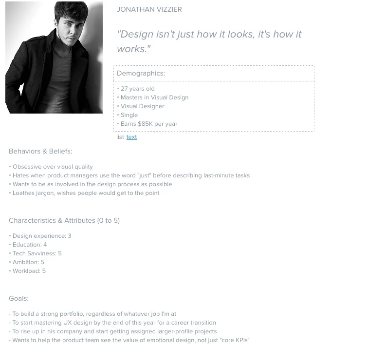
Photo Credit: UXPin
A persona can help frame your design decisions with their added real-world considerations. That being said, personas shouldn’t represent all audience or address all the needs of your product. Instead focus on the main needs of your most important user group.
8. Keep Your Finger on the Pulse of Modern Development
You might think that designing for a platform of unknown limits makes easy to push the limits. With the web, that’s not always true.
Users require that web development give them a balance of user empowerment and creative distinction in equal measure. Try to stay abreast of latest design trends and developments so that you can leverage them, such as cards.
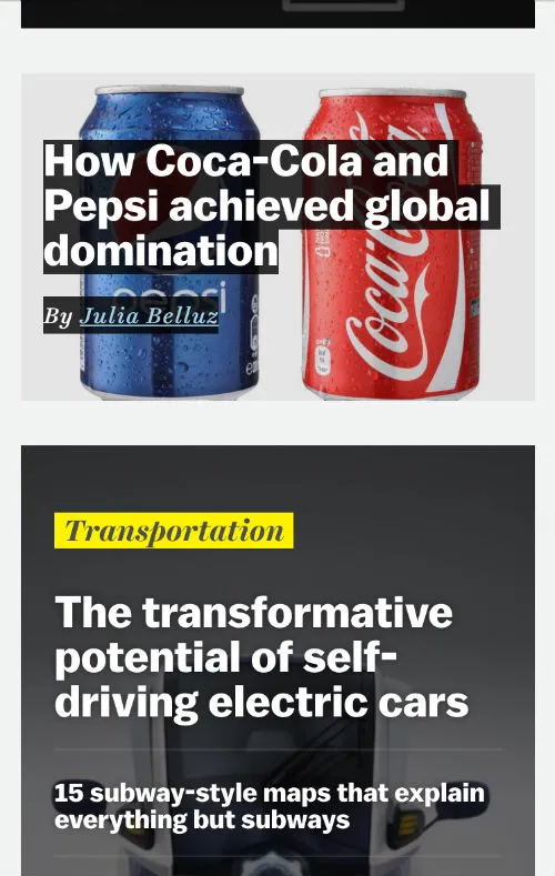
Photo Credit: Vox
A few things to keep in mind when using trend:
- If you stray too far, you could end up with an expensive and potentially slow/cumbersome experience. The best designs tend to play to the strengths of users and browsers, while also leveraging them for innovation.
- If you don’t go far enough, and you leave new innovations on the table, you may just look boring. Don’t reinvent the wheel, but leverage the opportunities on the table to your audience’s success.
You can catch up on all the latest UI trends in the e-book, Web Design Trends 2015-2016.
9. Use Vectors Where Appropriate
As I mentioned some previous articles, designers should stop chasing screen resolutions.

Photo Credit: Fairhead Creative
What this means is, your assets need to be prepared specifically for each use case. But some assets can scale naturally without load time penalties.
Logos, icons, light animations and simple background images can all benefit from SVG graphics over raster graphics. In most cases, a properly optimized SVG ends up being many times smaller than a conventional raster alternative.
Vector graphics, when presented inline, can even be animated and manipulated using CSS. Just be sure to provide raster fallbacks if your developer needs inline placement.
- Chop down load times. SVGO-compressed SVG graphics can often result in 60-80% file size reductions over their raster counterparts.
- Simplify asset prep. One SVG is easier and faster to prepare than multiple raster images. Developers can even show/hide certain elements in a SVG using CSS, if you prepare the SVG with all the variations inside.
- Engage with visuals. Animating paths or changing colors within SVG graphics is all possible if loaded inline. Keep this in mind as you prepare your visuals – now they can come alive!
10. Keep All Research Within 10 Seconds Of Reach
Your number may vary, but I like to think that any important data should be accessible within 10 seconds of me deciding I want it.
If it takes longer than that, it feels like it’s ‘away in the vault’, and I’ll be less likely to rummage through it unless it’s “important.”
Inspiration may strike when you’re not pro-actively seeking a very specific “important” piece, and so the closer you keep your research, the more you’ll use it, and the more effective it’ll be.
- Use Evernote. I use Notes.app, OneNote, Evernote, lots of note-taking apps that are supposedly competitors to one another. I use them for different purposes. For research, Evernote gets every last piece, whether it’s written on my iPhone or photographed from my notebooks or sheets of paper.
- Organize your research as you go. With proper tags and structure, everything you need to reference will be within 10 seconds of reach. Remember to do it as you go – you know what happens when “you’ll do it later”!
- Use it. When you design, reference your research. Search through it, browse through it, look at the minutiae of your previous problem-solving. Your current solution may be right under your nose.
Conclusion
There we have it – ten shortcuts to speed up your next responsive design project. Now, here’s a bonus step.
This bonus step may just save you more time in your responsive designs than all of the others combined.
And it’s also the simplest.
Here it is: stop your search for more responsive design shortcuts, and start designing more. The more you design, the better and faster you become. The more proficient you’ll become with your tools. The more ideas you’ll have to explore for each design. All of your work will benefit from your increased focus on the doing, rather than the reading-about-doing.
It’s time to go get started on that next responsive design.
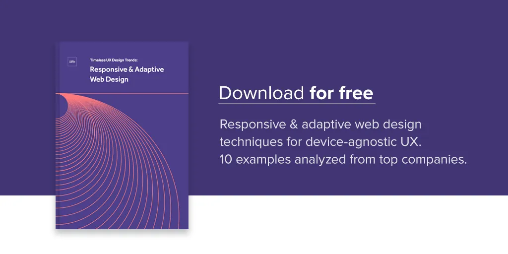
If you found this article helpful, check out our free e-book on Responsive and Adaptive Web Design that dives deep into mobile-first design and best practices.