Profile Page UI Design – How to Create User Profiles for Your App
The power of profile pages with UI design in mind may have been mastered by major platforms, but it can also be harnessed for applications of any size. With a comprehensive understanding of the core elements that make up a user profile, you can create engaging experiences.
Read on for expert insight and examples to inspire successful profile page UI designs.
Key takeaways:
- Profile page UI design is an app element that displays information and details about a specific user or account.
- The primary purpose of a profile page is to provide a personalized and easily accessible space for users to view and manage their own information, preferences, and activity.
- Key elements of a page like that are profile card, About me section, follow button, and more.
- To design a perfect profile page for your app, focus on your users’ needs, as well as design simplicity and consistency.
Design super interactive prototypes that can be quickly tested with real users – without switching to another app. Use UXPin to build wireframes, mockups, and advanced prototypes that look and behave like real products. Try UXPin for free.

Key profile page UI design elements
Profile pages can contain a myriad of information and interactive options depending on an application’s purpose. Regardless of what extras inspire your design, the following elements will provide a strong foundation that many users will instantly recognize as a profile page.
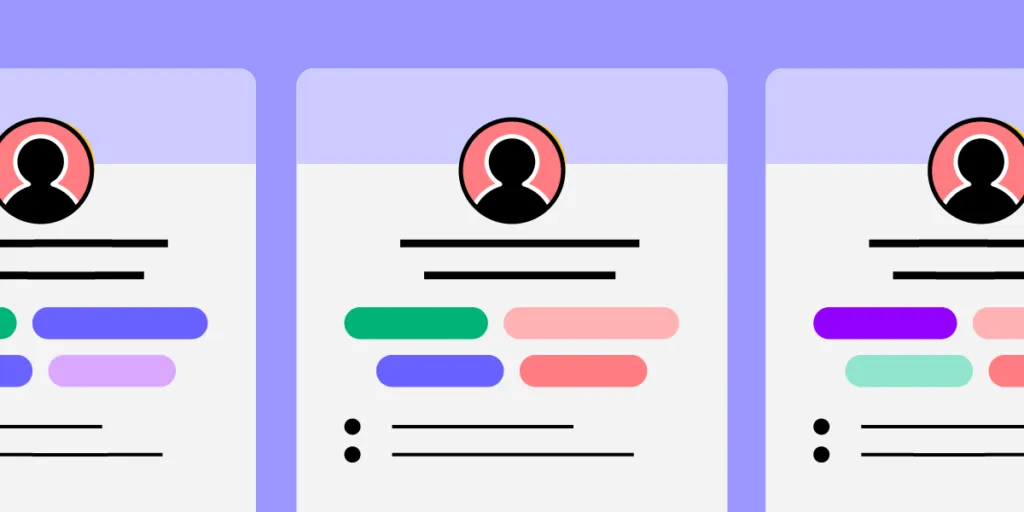
Profile card
A profile card is one of the first things users look to add. This page allows individuals on a platform to easily identify each other and stand out. One of the most notable aspects of profile cards are user images.
If you think of any major social or business profile, what is always present? A picture of course! Most people tend to remember information they see better than information they hear while pictures tend to be remembered better than text.
Profile pictures are a simple addition that should be kept simple. This means adding, changing, and customizing profile pictures should be as intuitive as possible for users. Depending on the purpose and audience for a given application, profile pictures may include avatars or more than one image.
A profile card would not be complete without a name. Providing users with an easy way to add and edit their name as needed offers a searchable source of identity. Names can change with marital status, legal cases, or personal preferences, so easy editing is crucial. Nicknames or preferred names are also common and should have a space on most profile cards.
About me section
While names and images make a person identifiable to others, there are many parts of an individual’s identity that cannot be seen in an image. These aspects are best displayed in an “About me” section in the user’s profile.
A well-designed section that users can fill out allows users to express who they are. This may include work experience, travel, cultural identities, pets, and whatever else is suitable for the platform the profile is being built on.
In networking apps, “About me” sections are expected to be a quick way to learn about applicants or colleagues. If this section is too cluttered or irrelevant, hiring teams may skip the profile altogether. This is why it is important for profile page user design to set users up for success with ideal formats and useful suggested content in their summary section.
Interests and achievements
A clean and concise summary section is useful, but it may leave users feeling as if they have more to say. This is where an interests and achievements section comes into play.
Interests are socially significant, offering users opportunities to find common topics of communication. This section should still have an intuitive and easily interpreted design, but it shouldn’t be as restrictive as a summary. The same applies to achievements, which are both professionally and personally significant.
While both interests and achievements are important for painting a full picture of an individual’s personality and life story, they are not mandatory. Some users may become frustrated if they are forced to fill out a multitude of questions to complete their profile.
Users can be gently guided to fill out their profile by requiring key information, like a name and summary, at the creation of their page, and leaving the extras to be completed later. This is progressive profiling, and it allows for the easy registry of users.
This area of a user profile opens up space for creativity, making it perfect for engaging additions like star ratings, icons, tags, and other design elements.
Follow button
To encourage social and networking behavior, profile pages require a follow button. Adding it may seem simple enough, but without proper care, this tool will not achieve its goal.
A well-placed follow button is always easy to identify, responds to interaction, and is within reach. For apps or mobile pages, this means the follow button should be placed within the area of the page that can be pressed with a thumb. If the follow button is out of this range, the extra effort required to shift a phone and reach the button may cause it to be ignored.
Examples of great profile page UI
It can be hard to imagine your ideal profile page UI without inspiration, so here are some prime examples.
Example #1: Personal page template by Monty Hayton

We will start out with a personal page template. The goal here is to highlight the individual on this page and who they are as a person.
The organized layout allows for multiple photos that hint at the person’s interests, but their profile photo still stands out due to its location and shape.
A short summary that encapsulates their view of the world along with a list of connections rounds out this profile. Overall, it is plenty of information with no clutter.
Example #2: Sports app by Rifayet Uday

Our next user profile is an excellent example of how UI can be themed to suit an app’s purpose.
The colors and shapes draw attention to the profile pictures displayed. Instead of building out the typical summary and interests section, modes of movement are emphasized. This layout highlights activity type, distance, calories, and routes taken to support the application’s purpose, encouraging exercise.
Example #3: Fashion profile page by Vijay Verma

If you are considering a more colorful profile screen, there are plenty of ways to create intrigue without encouraging clutter. This example contains many colors with an ombre theme, however, they are strategically placed to draw attention to the interactive aspects of the page.
Example #4: Healthcare professional profile by Mehedi Hasan Roni

It is always important to keep your audience in mind. This doctor profile page UI design is a unique example of two groups being catered to with one design. Here, the doctor can display their name, availability, and other important information that describes who they are.
At the same time, this page makes it easy for clients to read fellow patient reviews and learn about each doctor. This profile contains plenty of information for both parties while maintaining a clean and easy-to-navigate interface.
How to design a profile page
Tip #1: Listen to your users
It is hard to impress an audience if you don’t know who your audience is. Research should be an early step in all UI design. Even as a design develops and grows, user research should guide improvements and ideas.
The first step is identifying the demographic(s) your profile page is intended for. How and why will these groups of people interact with your platform? Designs should always prioritize their user’s goals and needs.
An example of this would be creating a dentistry application. Researching the most important aspects of choosing a dentist and highlighting those factors in your app will encourage users to skip internet searches in favor of your platform. Discovering and eliminating pain points, like calling to schedule an appointment, can make your design even more attractive to users.
Tip #2: Ensure design consistency across the entire digital product
A well-rounded digital product is designed in a manner that is cohesive enough for clients to navigate easily. This entails the color palette, patterns, fonts, and flow of information. Managing so many factors across multiple pages of information might seem daunting, but there are design systems to help with this exact task.
With libraries of design factors and design principles to work with, creating a cohesive product becomes simple. Design systems allow you to access and edit details to create consistency without making each page a copy of the last.
Tip #3: Use the right prototyping tool
Design templates are efficient, but you can’t always guarantee their effectiveness. The best way to test a design for its intended function is to use a prototyping tool. These tools allow for real-time interaction with designs, so you can ensure they function just as you had hoped.
UXPin is one such tool that allows you to experience an interactive prototypes. This is great for design iterations. Learn more and explore all the prototype possibilities that can benefit your designs in UXPin.
Tip #4: Collect feedback from team members and users alike
Platforms are created for users, but they could not exist without the efforts of a well-connected team. Designing and prototyping with a tool that allows for collaboration between teams is crucial. Insights can also come to light and be easily explored through organizing design critique sessions.
After considering team input, user feedback can also be included. Test groups from your target demographics can be given an opportunity to work with end-stage prototypes of your page to determine areas of improvement. This input can also be considered in real time, where feedback from users on a live app can be used to guide future updates in UI design.
Tip #5: Avoid clutter by prioritizing user information
The perfect balance of personality and clarity is dependent on your page’s purpose. An exercise profile can function with a name, image, and recent workout stats while a social media profile may spill over with hobbies and fun facts.
For the best of both worlds, consider the ways in which profile information can be condensed, such as drop-down menus or other interactive components that break information into palatable chunks.
Summary
In the end, profile pages are all about the users. Their design offers a chance to be seen and see others in a functional format. Your ideal balance of design elements may be hard to visualize, but that is what prototyping tools are for. UXPin offers you an opportunity to see and interact with your design through all stages of development. The result is a cohesive, well-rounded platform that can even be vetted through user testing and team critiques.
Refine your profile page UI design prototype by filling it with real user data at UXPin. Sign up for a free trial.