Designing for small screens means you have to set priorities.
As described in the free e-book Responsive & Adaptive Web Design, visual hierarchies take center stage when you’re designing for mobile devices. Not only that, but the elements you use need to provide a consistent and intuitive experience across multiple viewports.
Responsive design is still progressing, the techniques aren’t fully fleshed out and there’s no consensus as to what might constitute the “perfect pattern.”
Even so, there are some candidates slouching their way towards perfection. Let’s take a look at the pros and cons of the most popular responsive navigation patterns. We’ll then wrap up with thoughts on what might constitute a better mobile navigation pattern.
1. The Shrinking Sticky Bar
Likely the most common approach to responsive navigation, the navigation menu stays fixed to the top of the screen, centers and shrinks in response to the size of the viewport used.
Desktop Viewport
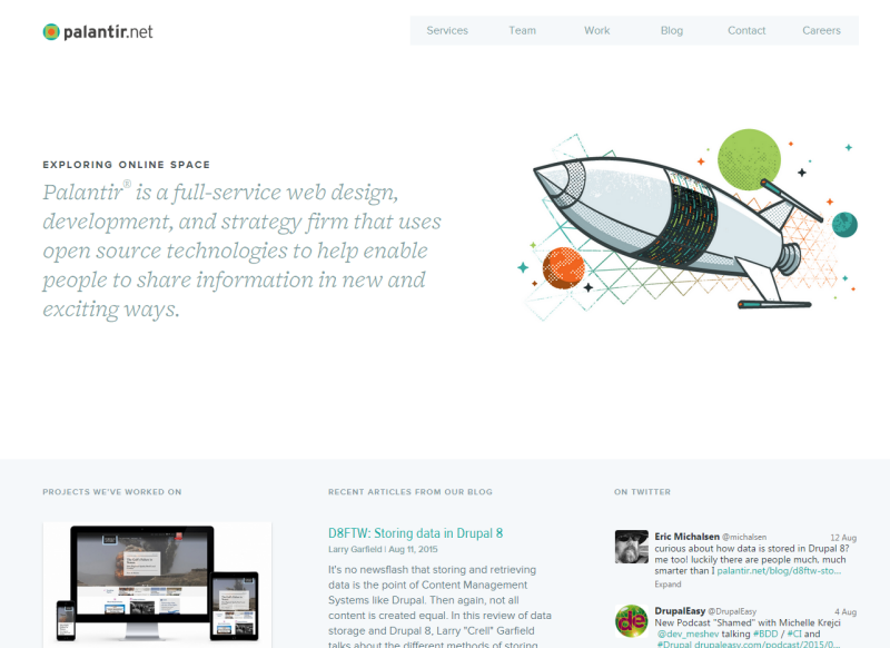
Photo credit: https://www.palantir.net/
Mobile Viewport

Photo credit: https://www.palantir.net/
- Common mostly because of the relative ease involved, this navigation pattern is often referred to as the “Do Nothing” approach.
- This is a decent start, but it requires you to sacrifice significant screen real estate above the fold for mobile devices.
- Your navigation options are prominently featured, but this shouldn’t come at the cost of content.
While it is simple, fast, and easy, the fixed top navigation menu has some additional problems. For example, it becomes difficult to add new navigable sections to your site and it can also cause problems with proximity clicks on touch screens. Additionally, the approach won’t consistently render attractively across different platforms.
So what do we do to avoid these issues?
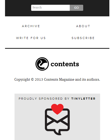
2. Anchor to the Footer
In order to alleviate the stresses of added scrolling and yet keep the footer navigation option alive, you can add a fixed anchor button to the footer somewhere on page. This is another simple solution that makes sense to any and all who decide to use it.
Mobile Viewport
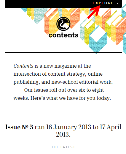
The example above, from Contentsmagazine.com, points out the footer anchor (red arrow). In this case, it’s a CTA labeled “Explore.” One click sends you straight to your navigation options. The only problem is it’s not exactly smooth. Being launched from one end of a webpage to the other with a single click can disorient and disturb a user—degrading the UX as a whole.
One way to improve fluidity are are multiple anchors which transition down the page at fixed intervals. These are usually featured on the right side of the page, and they scroll at a reasonable speed up or down the page. In the linked example, you can actually navigate from either the side anchors or the fixed menu up top, so it’s a bit redundant but still effective.
3. Navigation Menus (author’s top pick)
A big sticky nav bar works well on a big screen but as the display shrinks, so too does a user’s patience with larger text that gets in the way of their browsing:
- Footer navigation requires scrolling.
- An anchor to said footer is somewhat jarring.
- Hiding navigation options on mobile is unacceptable.
A list of links that condenses into a clickable drop down menu revealing navigation options, however, works a trick on a smaller screen. For my money, this is the most perfect solution.
Desktop Viewport

Photo credit: Five Simple Steps
Mobile Viewport
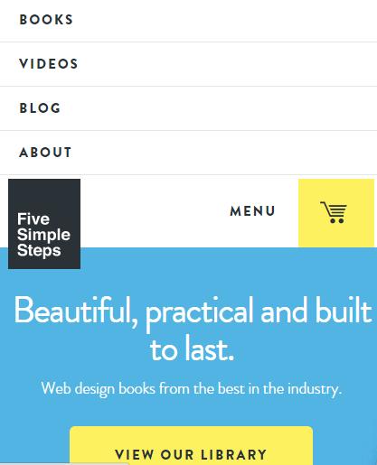
Photo credit: Five Simple Steps
The exciting part is the many methods of implementation. Menus can overlay, displace (as seen above in the smaller screenshot), slide out from the left, the right, or simply cover the screens content completely via a toggle button. Whatever suits the designer’s fancy.
The important thing to recognize is that when users are looking for content, they don’t need navigation in the way. When they’re trying to navigate, all they need are links to their desired destinations. A collapsible menu serves both purposes equally, efficiently, and intuitively.
A perennial favorite of mine, Mic.com, has a full screen toggle menu that renders nicely on both mobile and desktop. Observe:
Desktop Viewport

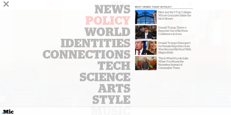
Here you see the desktop version of the homepage with menu icon prominently featured and easily accessible. Once you click the menu, you’re presented with a number of navigation options (second image).
A prioritized nav menu replaces the page’s content and shuffles you toward the various news categories and most popular stories of the day. It renders very nicely on a mobile device as well:
Mobile Viewport
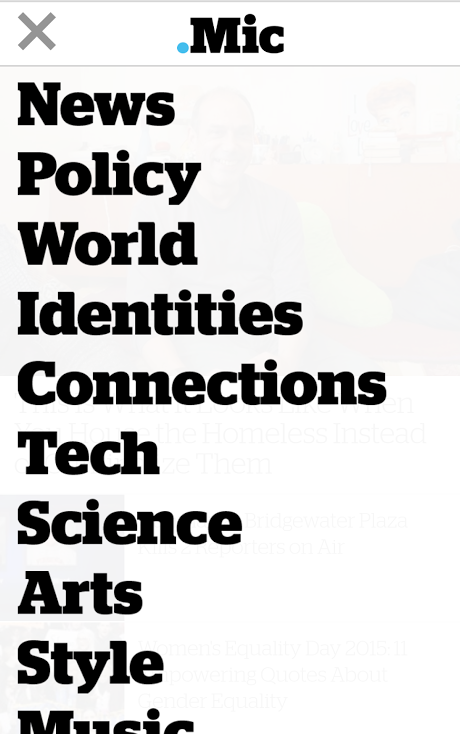
Everything is in its place according to priority, and nothing is sacrificed in terms of the site’s appearance when the screens shrink. One thing to note, however, is they keep their company info and associated links in the footer, along with a CTA for their newsletter subscription.
This says two things to me:
- First, their average user is more concerned about the content available than information about the publication itself. This isn’t exactly surprising considering how most American millennials consume news (at a very superficial level), nor is it too inconvenient as this sort of information is usually found in a footer anyway.
- Second, it strikes me as a good method to keep the menu minimalist and attractive. It shows good design sense, with the minimum in sacrifice regarding usability.
Overall, this is a great example of how to balance usability and aesthetics in a responsive setting. If you’re curious, you can learn how to create a very similar fade-in navigation drawer with this tutorial demonstrated using UXPin.
Photo credit: UXPin
There’s even a hybrid that combines this method and the header bar, where, once a viewport shrinks to a certain size, it triggers a breakpoint and the header bar is replaced with a menu. For an example of this, take a look at the website for a German film production company called First Frame. Shrink your browser’s window and watch as the navigation bar turns to a toggle switch for the menu.
Either way works fine, but I personally like a toggle button from the get go. It’s recognizable regardless of screen size and it helps a user with their more immediate needs, whatever they may be.
Conclusion
Responsive design is still in its relative infancy, the term itself only coming about in 2010. While it used to mean that a webpage had to fluidly respond to a set number of industry standardized screen sizes, the number of screens has increased exponentially. RWD now must be able to adapt to any size including wearables.
There is no perfect solution, but for the most common problems we encounter today, these are the best methods we’ve come up with so far.
What does the future hold? How can these methods be improved? Only time will tell.
If you found this post interesting, check out our free e-book Timeless UX Trends: Responsive & Adaptive Design. We describe step-by-step how to follow a mobile-first design approach with analysis of examples from Hulu, Change.org, and others.