The words we choose — as well as how and when we use them — are the foundation of all product interactions. While you can argue that touch might be the first sensation users experience with physical products, all users seek meaning and context for the experience through engaging with the text of a product.
Our choice of words not only determines whether or not we have a fluid conversation, but it also defines us and our personality. The same goes for brands and their products.
As explained in the free guide Interaction Design Best Practices, an interface consists of anything a user can see and touch in a product. Because text is part of the interface, product designers and their teams must understand its power as a design element.
Writers are very adept at using style, diction and tone to convey personality in their work. And if you aren’t a writer, let’s break down what each of those are so we’re all on the same page.
- Style is how something is written. It encapsulates both diction and tone to create something that doesn’t read like something else.
- Diction is word choice. A slight change in diction can alter the entire tone of a piece. For instance, a contracted word indicates a less formal tone and style.
- Tone is how something reads. This is the end result of both style and diction. But how you put the words together also contributes to tone (in writing circles this is know as syntax).
Word choice and sentence structure all contributes to the tone of your product design. That, in turn, creates your product’s personality.
Let’s see this in action with some web services and web apps.
Shaping Your Product’s Personality
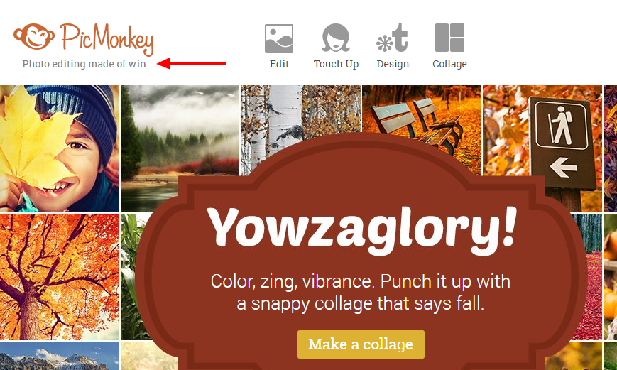
The photo editing website PicMonkey showcases the extent to which language defines a brand and shapes a user’s experience.
Everything from their tagline (“Photo editing made of win”) to the team members’ job titles (Capital Kahuna i.e. CFO ; Droid Mechanic i.e. Android Engineer) gives PicMonkey a playful, tongue-in-cheek personality.
And it doesn’t stop there.
When a user is editing pictures, the feedback messages and tooltips are also presented in that same playful tone. The icing on the cake comes when the user is saving their edited image. Instead of the standard “Low, Medium, High” options for the image quality, the brand uses the names of 3 actors who’ve portrayed James Bond on the silver screen.
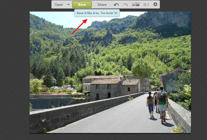

If you’re a Bond geek, you’ll likely appreciate this little inside joke. If you’re not a Bond fan, the nearby tooltip immediately clarifies the labels.
Of course this is a very specific example and it’s not necessary to go to such extremes in order to create a light and fun experience. Online banking service Simple, for example, keeps its feedback messages simple and to the point.
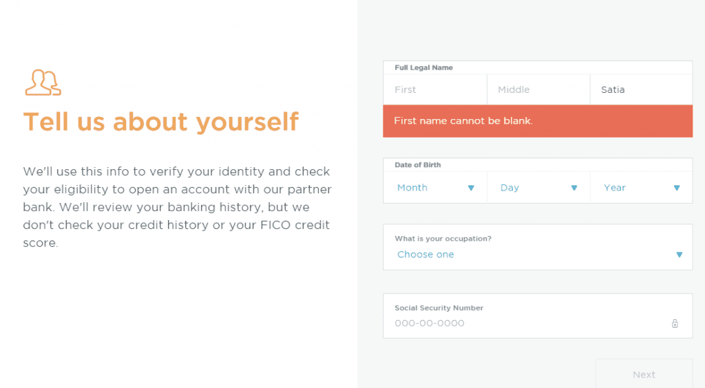
Photo Credit: Simple
Hints given to users, such as during the account creation process are relatable and practical, yet still light and informal.
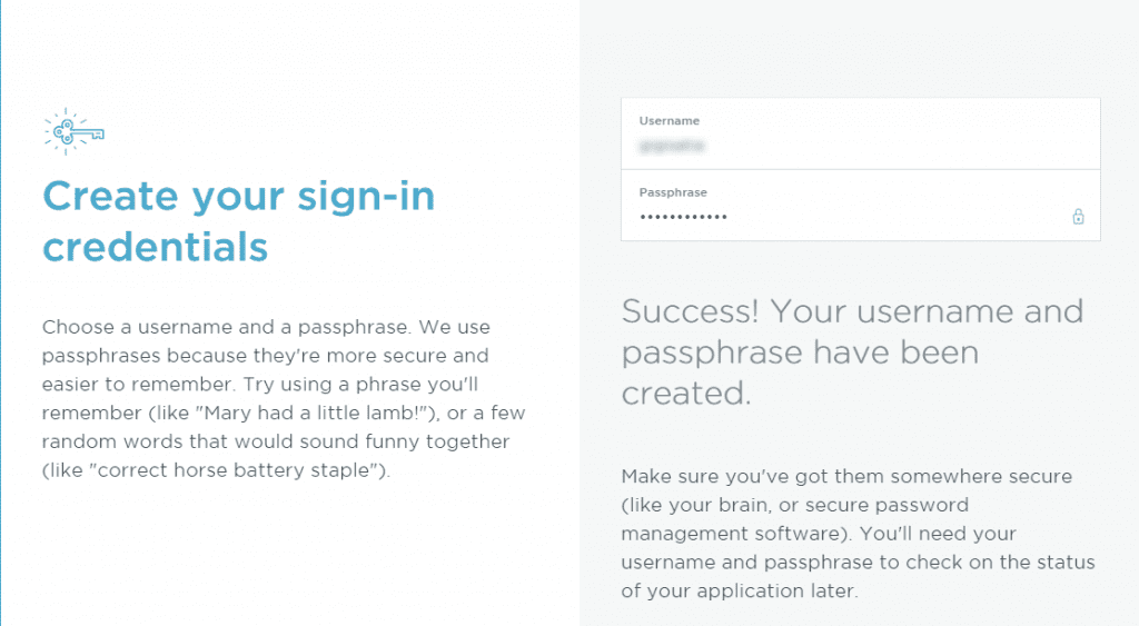
Photo Credit: Simple
Every brand must decide what their personality is, who they’re talking to and how they will talk to those people.
Once this has been defined, the next step is integrating it into the fabric every product:
- What type of person does the product sound like? If you’re designing an online banking service, you might want the product to feel like an intelligent yet friendly bank teller who is available 24/7.
- How is the tone reflected visually? Typeface selection, colors, and of course image selection all impact how users interpret the the digital conversation.
In many of my past experiences, I’ve taken on the responsibility of managing the language and voice in web and mobile apps. In other companies, it’s the UX Designer who does this (solo or in collaboration with the PM). And in other cases it’s the technical writer or the UX Writer who takes this on alongside a product designer.
Whatever the case may be, as guarantors of user and business needs, designers must be more involved in their team when it comes to all things related to product voice. This way they can collaborate more efficiently with the copywriters (and marketing folks) in producing content that is in harmony with the design personality.
Grab design ebooks created by best designers
All for free


Do you want to know more about UI Design?
Download 'Interaction Design & Complex Animations' FOR FREE!
Download e-book for freePractical Tips
1. Design content-first together
Content is the heart of every product.
When you know the type of content you’re delivering to users, you can better ensure the visual treatment remains faithful to the core material. While it’s unrealistic to assume that designers will always work with finalized copy, make sure you involve copywriters in the early stages of design. Rough copy is always better than lorem ipsum since it gives designers a more accurate understanding of true size constraints.
2. Clarity first
Even though MailChimp is cheeky, the design never sacrifices communication for the sake of humor.
On the other hand, the PicMonkey example we examined is right on the edge of balancing tone with usability. If not for the backup labels, the James Bond references would surely confuse users. Regardless of whatever tone you select, remember the design must always feel intelligent.
If it does not first guide users clearly or provide intuitive feedback, you’ve gone overboard.
3. Respect the power of headlines
Whether you’re designing a web app or mobile app, the h2 text on the screen will probably be one of the first items a user interprets. The headline sits right at the top of an interface’s visual hierarchy, so everyone on the team needs to understand its power as a design element.
Focus on the single message you want to imprint on the user for the rest of their interactions.
Conclusion
Two factors influence how a user evaluates their experience with a product:
- Feelings
- Perception/Interpretation
Both of these are intricately linked and very subjective. The correct tone in your product copy creates the emotional context for your visual design (and vice versa). If you look at some of the most successfully products today, you’ll notice each one represents harmony between text and visual elements.
Design is not a pure visual exercise. Design is a perceptive exercise in which we must carefully craft everything a user may interpret from a product.
If you found this post useful, check out the free guide Interaction Design Best Practices. Based on 33 case studies, you’ll find advice for designing space, visuals, and copy for products.