
If individual interactions are the cells that make up the UX, then microinteractions are the atoms within the cells. As technology continues to develop, designers are able to delve deeper into the tinier interactions of a UI, and so microinteractions are the new frontier.
While miniscule on their own, these tiny moments add up to substantial enhancements to your UX. Microinteractions provide delightful visual feedback, making the interface feel weightless thanks to the smooth transitions. In this chapter, we’ll explain useful techniques for microinteractions and dissect some great examples.
Defining Microinteractions
Microinteractions might be easily overlooked in the greater design scheme, but they actually hold the entire experience together. They are single moments of communication that help users flow through your design.
What Microinteractions Do
As first described in Dan Saffer’s fantastic book Microinteractions, these tiny details typically serve these essential functions:
- Communicating feedback or the result of an action
- Accomplishing an isolated, individual task (i.e., connecting one device to another, liking a friend’s post)
- Manipulating a setting
- Preventing user error
Some examples of specific microinteractions include:
- The vibration notification when you switch an iPhone to mute.
- A warm greeting before diving into more straightforward copy
- The pull-to-refresh UI pattern
- Interface animation that either shows clickability (a card that changes color when hovered over) or confirms an action (an icon that changes after clicking)
- An animation confirming an item is added to cart, like with “+1” from Photojojo below.

Photo credit: Photojojo
However, the most well-known example of a microinteraction, and a good standard to base all others on, has existed long before the Internet was ever invented. The best microinteraction is pushing a button: gratifying in completing the action, and irreplaceable in activating a function.
For more microinteraction examples, read this Econsultancy piece on 15 mobile microinteractions (some of which we mentioned above).
Why Microinteractions Work
In a nutshell, microinteractions work because they appeal to the user’s natural desire for acknowledgement. Microinteractions fine-tune human-centered design by:
- More control through immediate feedback — The user instantly knows their action was accepted, giving them more confidence in further usability.
- Instructions — Whether blatant or subtle, microinteractions can guide users in how to work the system.
- Visual rewards — Small but satisfying effects enhance the UX, and can facilitate a habit loop.
- Meeting expectations — In today’s web design landscape, microinteractions are the norm — their absence makes a site seem bland.
In short, microinteractions improve the UX by making the UI less machine and more human. As a result, the design is more usable and enjoyable.
Identifying Opportunities
Part of the beauty of microinteractions is that, because they’re brief, they can be inserted in a variety of places, around any potential action, really. In general, though, they tend to come up in the following areas:
- Switching on/off (features, functions, or the entire UI itself)
- Adjusting setting preferences or continual elements (i.e., volume)
- Viewing or writing a small piece of content (i.e., status message, comment)
- Connecting one device to another (i.e., computer to phone)
- Uploading and downloading
- Notifications
- Social media sharing
- Pull-down and hidden menus
- Showing changes (i.e., an animation to show the Play button changed to a Pause)
- Highlighting calls-to-action
Of course, there are a lot of potential opportunities for microinteractions. Where and how you implement them should be determined by the specific needs of your interface.
In the below example created in UXPin, we’ve prototyped a hypothetical model talent website. Each model is represented by a card, which overlays metric measurements and contact information upon hover. In this case, the microinteraction helps reveal information. The animation, however, adds a level of discoverability, making the otherwise mundane task feel a bit more fun.

4 Steps of Microinteractions
No discussion about microinteractions would be complete without mentioning Dan Saffer, the interaction designer who literally wrote the book on the subject. He explains that an effective microinteraction follows a four-step process, described with an elevator example:
- Trigger — The visual cue or impetus that initiates the action. The numbered floor button is a clear visual signifier. Pushing the button is the trigger.
- Rules — The parameters the microinteraction follows — basically, what it does. In this case, when you push the button, the elevator will move to that floor.
- Feedback — Verification for the user about the result of the microinteraction. When the button lights up, people know the elevator will respond accordingly.
- Loops & Modes — Considerations about how the microinteraction is reused, including how long it lasts and how it changes for subsequent uses, as well as if the user can change aspects of it in the settings/preferences. For an elevator, the loop is that the button is recognizable enough that the user will understand the function immediately for different elevators, and that the pushing process is not very difficult. Because microinteractions are brief in nature, they must be designed for repeated use. Modes might be the color of the feedback light, or the typography of the number, all subject to variation.
Deconstructing the 4 Steps of Microinteractions
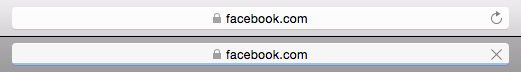
Now, let’s see how these four factors work together in a digital microinteraction, the browser refresh button.
![]()
Source: Mozilla Firefox
Let’s say you’re browsing Facebook and you want to see if anything new was posted since you first opened the site. Naturally, you refresh.
- First, you locate the familiar arrow-in-a-circle icon, the trigger of the microinteraction.
- Clicking on the icon starts the action. The loading of the new page is the microinteraction’s rule: that’s what it does and why you engaged it.
- After clicking, the icon turn to an X. This is one of the key elements of the microinteraction, as it provides the user with feedback that their action is being performed. That extra acknowledgement makes performing the refresh function more assuring. Imagine if such feedback were not there: the user might mistake the computer screen for being frozen, and click needlessly over and over.
![]()
Source: Mozilla Firefox
Once the new page is loaded, this is the validation for using the microinteraction in the first place. If this action is rewarding enough (in this case, with something as useful as a refresh function, it is), then this incentivizes the user to continue exploiting the microinteraction in the future. This microinteraction is so useful, it’s become a UI pattern. Safari does the exact same thing. However, they add a blue loading bar at the bottom for even more feedback in case the page takes longer than usual to load.
Best Practices for Microinteractions
Here, we’ve collected the top expert advice about using microinteractions:
- Fast response time — A near-immediate response time, within 0.1 second ideally, keeps the user feeling in control.
- Keep the user informed — A loading bar or status icon engages the user and prevents confusion.
- Unify in a single theme — If you can, create a unifying theme to tie together all interactions, micro or otherwise. In the site for the movie Amy (below), the pink line, which every time is animated to “grow,” is used in a variety of different microinteractions
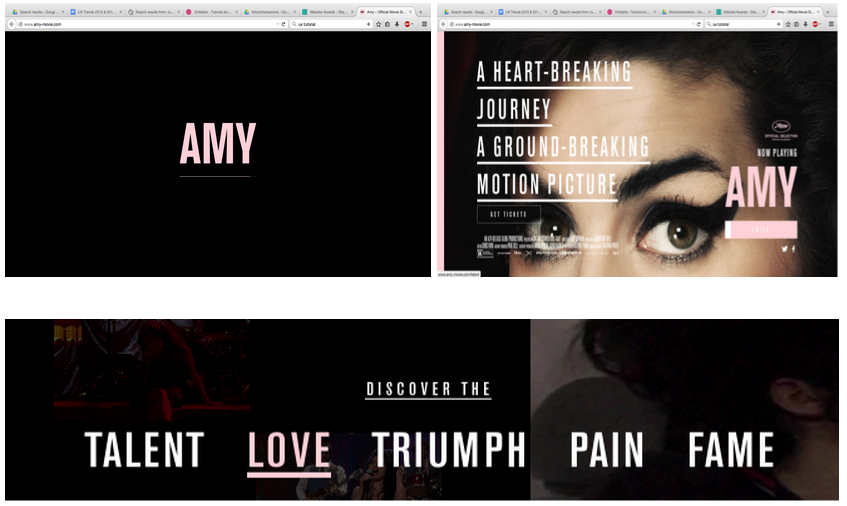
Source: Amy – Movie
- Draw from context and user research — Knowing your users and the context behind the microinteractions will make them more precise and effective. Make sure the visual cues and animations are appropriate.
- Use what’s available — Don’t add more than necessary: use existing elements to deliver feedback if you can.
- Design for repeated use — Keep longevity in mind. Will the microinteraction get annoying on the 100th use, or is it universally clear and unobtrusive?
- Use a human voice — A quick way to make your UI warmer and less mechanical is a human tone in the copy, especially for microinteractions with their emphasis on feedback and need-to-know information.
- Keep It simple, stupid — Don’t turn your microinteraction into a macrointeraction. It’s supposed to be small and simple, so don’t get too clever.
- Follow the rules of animations — Although a key component of microinteractions, animation is still a field with its own set of rules. Because the two often go together, brush up on the best practices for animation before incorporating them. Disney’s classic 12 rules are a good place to start, which we explain in terms of web design in our Interaction Design Best Practices: Book II.
You can learn more about the principles of interaction design (which apply to all microinteractions) in the free Interaction Design Best Practices: Books I and II.
Takeaway
Remember what we discussed above about why microinteractions are significant and how to apply them:
- Microinteractions act as facilitators for interactions, with feedback, notifications, instructions, and sometimes even a little entertainment.
- They save time by instantly communicating information in a way that doesn’t bore or distract the user.
- According to Dan Saffer, all microinteractions should have a trigger, rules, feedback, and loops/modes.
If you’ve found this article helpful, go ahead and download the free guide UX Design Trends 2015 & 2016. We deconstruct 71 examples of great UX design into techniques for everyday design.

