Photo Credit: George, Creative Commons 2.0
Fast-food websites are an interesting mix of user experiences. They aren’t hard to land upon since fast-food joints register every domain name imaginable that relates to their name and menu items. This assures you’ll be enticed — brainwashed to run right out for a meal. A perfect mix of UI and UX, images are bold and navigation is obvious to the user.
In this piece, we’ll discuss how you can look at fast-food sites to supersize your UX and UI.
Build Trust With Consistency and Familiarity
McDonald’s has been serving up hamburgers longer than they’ve been serving up a website. However, the fast-food chain’s website is a powerhouse of UX and UI design.
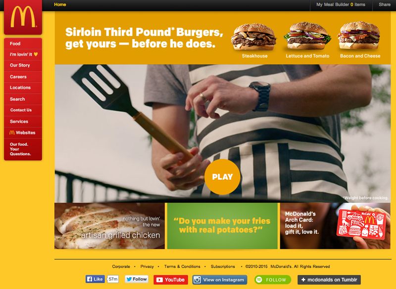
Photo Credit: McDonald’s
The site may always be changing — depending on campaigns, etc. — but the UI is always consistent. Same look, same place, same function. This consistency helps to build trust and familiarity. That consistency is carried throughout Mickey Dee’s site as you delve deeper into it.
The interior food pages continue to sell the product as well as tease with other products available. At the same time, they maintain a similar look and feel to the main landing page.
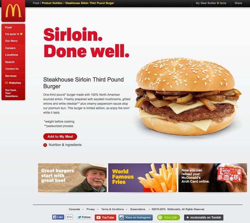
Photo Credit: McDonald’s
With familiarity, users are more likely to come back. According to ZURB’s Design Triggers entry on “familiarity,” research shows that the more times users are exposed to something, they more they’ll like and trust it.
Meet a User’s Desired Need
But maintaining visual consistency isn’t all that’s happening here. McDonald’s demonstrates that it understands its users and their needs, baking that into the user experience.
At the click of a button, a user can call up the nutritional information on any McDonald’s menu item.
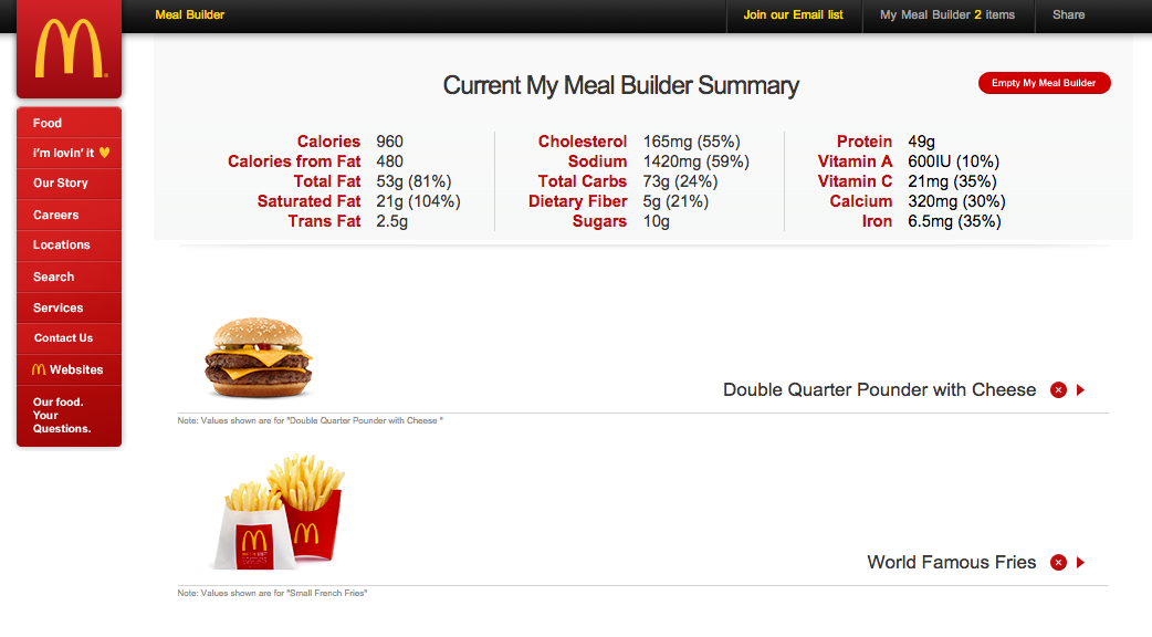
Photo Credit: McDonald’s
Being transparent about their nutritional information also mimics the experience in McDonald’s brick-and-mortar restaurants. A user can then add any item into a “meal builder,” which will tally the nutritional numbers so that he or she can know what exactly how many calories, salt, etc. they are about to down.
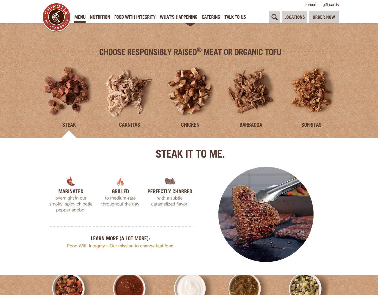
Photo Credit: Chipotle
Anticipating user needs starts with having an understanding of who will actually come to the site. McDonald’s isn’t the only fast-food chain to grasp this. Chipotle also presents nutritional information to users. However, they take it a step further and use storytelling and clever copywriting to showcase how their food is actually made, from marinade to grill. If a user wanted more information on the quality of Chipotle’s food, there’s a link that’ll whisk them away to another page, which future satiates a user’s desire to understand what it is they’re putting in their mouths.
You can anticipate your user needs in a few ways:
- Create user personas. Figure out who the core audience is and who the fringe audience is. Then outline who the ideal user is in those groups, trying to figure out what their motivations are in using your site. In this case, fast-food joints have determined that their users may want to know the ingredients and nutritional facts about what they’re eating.
- Craft user stories. Map out how your persona will actually use your site. In the case of these fast-food sites, they created a flow knowing their users’ desire to learn more about what’s on the menu. It walks users from seeing the menu items, drilling down to those items, selecting them and acquiring nutritional information on them.
We delve more into creating personas and user stories in our free e-book, The Guide to UX Design and Process Documentation.
Both fast-food chains serve a user experience based on keen insights into its users and their needs. And that’s something every designer can do by outlining who their users are and what they’re goals are.
Conclusion
Really an electronic menu, these fast-food websites sell a product only available in certain locations. While some franchises allow for e-commerce, allowing the user to order and pay through a mobile app, most fast food websites are solely informational.
The user experience focuses on finding a location, menu items, specials or coupons, then visiting the store for a cheap and satisfying meal. There is also a small usage of contact forms for suggestions or complaints. If you click through different fast food websites, you’ll see the obvious user experience right away in the interface design. Usually fun and friendly, some website interfaces play on emotional, down-home feelings. It all depends on the brand.
Understanding who might be using your site and what they want to accomplish will allow you to craft a user experience and interface that satisfies their needs.
For more other practical design tips based on analysis of live websites, check out the free e-book Web UI Best Practices.