The most successful mobile apps are the easiest to use. They do not require much time to learn functionality, nor do they require much effort to maintain usage. People like simplicity – nobody wants to spend an hour trying to figure out how an app works. Yet at the same time, you also want an app that delivers useful value to some aspect of your life. How can you balance these two qualities in the design of a mobile application?
One way to do this is through the lens of UI design patterns. Design patterns are formalized best practices that designers, developers, and product managers often use to solve common design problems. Understanding what the various mobile design patterns are will help you recognize when certain patterns can make your design most useful and intuitive for users.
This article shows you several design patterns that are commonly used for the purpose of getting input from the user on a mobile application (photo credits: Flickr.com)
1. Action Bars
Action bars give users quick access to frequently used actions, such as search, share, and creating new content within the app. While navigation bars have been popular on the web and on earlier mobile applications, today’s newest design patterns have allowed for greater focus on simple app views and more primary vs. secondary actions, paving the way for use of the action bar pattern. Action bars draw the user’s attention to the most important and relevant actions on the app, clearing away clutter and immediately helping users to become more familiar with the mobile UI.
2. Social Login
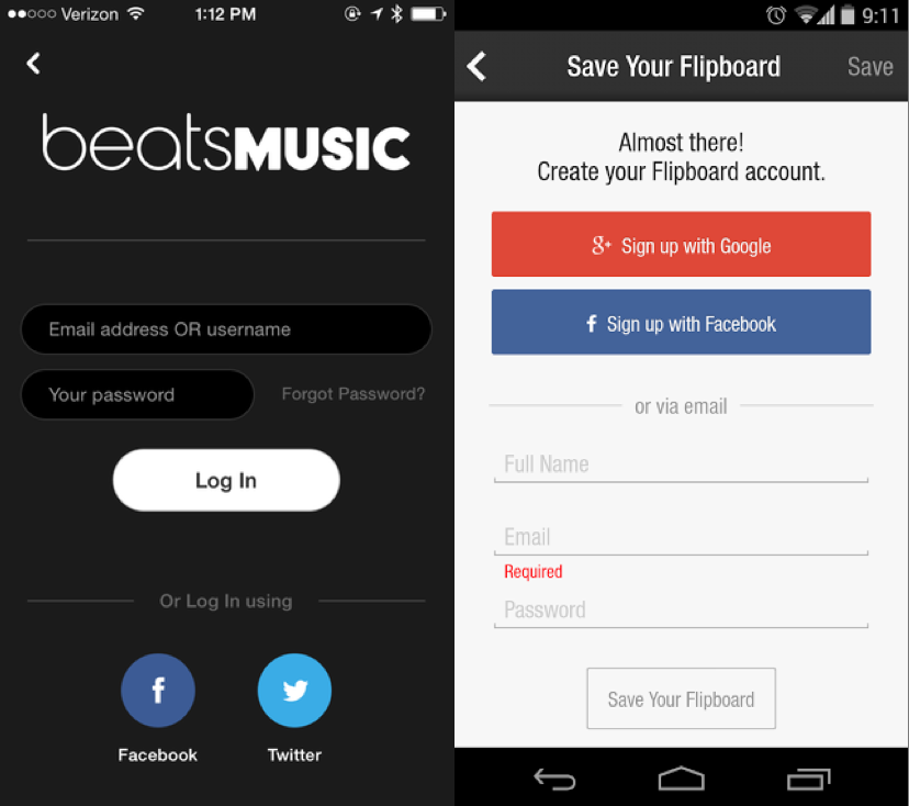
This UI design pattern provides users with a very quick and easy way of logging in. It is now almost an expected design pattern to incorporate into a mobile application – several reasons for this include:
- Signing up through an existing social network account means the user has one less username/password combination to worry about, not to mention concerns about password security decline dramatically.
- Users don’t have to set up another account that they may or may not end up using the future. Instead they can sign up through their existing Facebook, Twitter, and/or google accounts.
- Users aren’t forced to type their details into an unfamiliar new app they just downloaded, making the signing up process much easier on them.
- By allowing users to sign up through an existing social network account like Facebook Login, you automatically get some basic data about your users, which you can use to more effectively tailor your mobile application to your users’ needs.
3. Huge Buttons
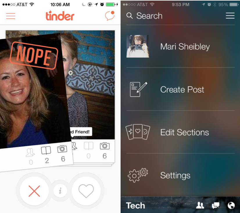
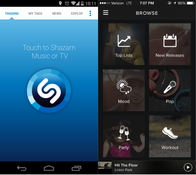
Nothing says simplicity as much as a single giant button on the user interface. The ideal touch screen tap target size is 72 pixels, but certain apps like Tinder utilize the huge button pattern to emphasize one specific action. This pattern allows users to know exactly what to do and to be able to do it quickly, no matter where you are or what you are doing. Huge buttons are ideal for applications that serve a limited number of purposes. For example, Shazam really only does one thing: recognize the music and media playing around you at any time. Thus the app consists of a screen with a single gigantic button. Easy, simple, effective.
4. Notifications
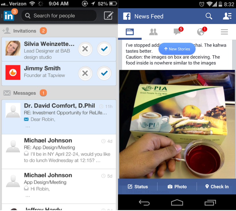
People consume lots of information every day, as evidenced by the use of Facebook, Reddit, Gmail, etc. At the same time however, people are busy – they can’t be on their mobile phones all the time. People want to be able to take things in and know about new activity or actions they should take at a glance – which is why good understanding and implementation of the design patterns for notifications is so important. Notifications highlight recent activity by visually marking new content. Several implementations of this pattern include:
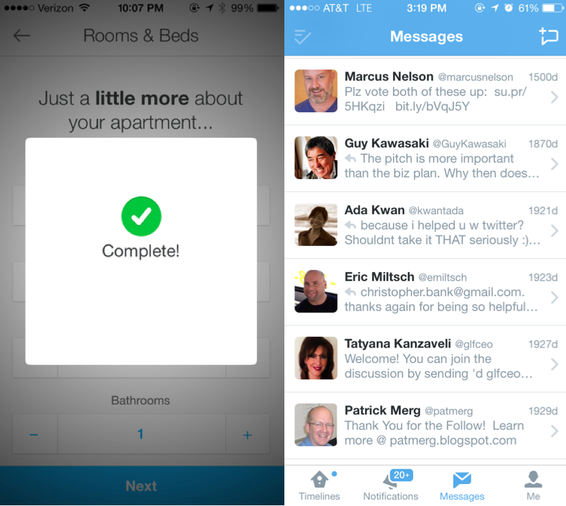
- LinkedIn and Quora place a numbered badge on labels with new content
- Twitter indicates new activity in a more subtle way by placing a small dot at the top of the timeline icon.
- Facebook displays notifications about new items in the newsfeed with a popup banner that drops down within the app.
5. Discoverable Controls
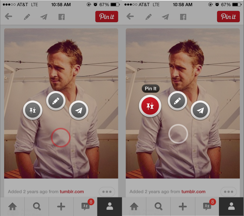
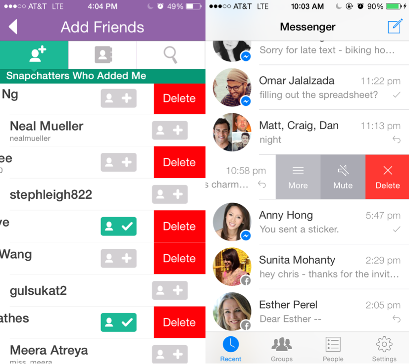
Sometimes mobile applications have controls that are relevant to only a specific part of the app. In order to minimize clutter yet allow quick access to these secondary controls, these mobile applications utilize a “discoverable controls” design pattern that lets users “discover” actions via gestures such as swipe, tap, double-tap, long-press, etc.
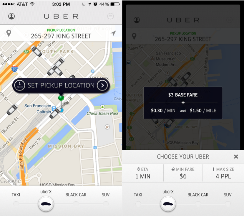
For example, when creating content in Secret, users can slide their finger vertically across the background to change color, pattern, brightness, saturation, and blur. Long-pressing on an image in Pinterest reveals buttons that allow you to pin or comment by dragging the pop-up control to the button. Uber incorporates a slider button so that you can easily toggle between booking a ride and seeing the fare estimation, and Snapchat and Facebook Messenger allow for easy access to additional features by swiping left.
This information is borrowed from one section of a longer, free ebook by UXPin – Mobile UI Design Patterns 2014: A Deeper Look at the Hottest Apps Today. Be sure to grab your own copy to learn about all the other major design patterns permeating the most successful mobile applications of today.