
The direction UX design is moving is in the details, and that means more attention on microinteractions. These miniscule moments may be negligible on their own, but they add up to make huge impacts on the user’s mood and opinion.
Source: Duolingo
So what exactly is a microinteraction?
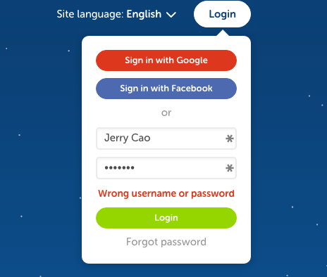
Imagine a login, a basic interaction found on most sites.
Is the “login” button grayed out until the user inputs their screen name? How does the UI respond if the screen name or password don’t work? Is the copy requesting the login casual or formal? These are all examples of microinteraction choices that exist within a single login interaction.
Below, we talk about 11 of the best examples of microinteraction, to demonstrate how useful they are, and maybe inspire your own interaction design.
Translate this page — Google
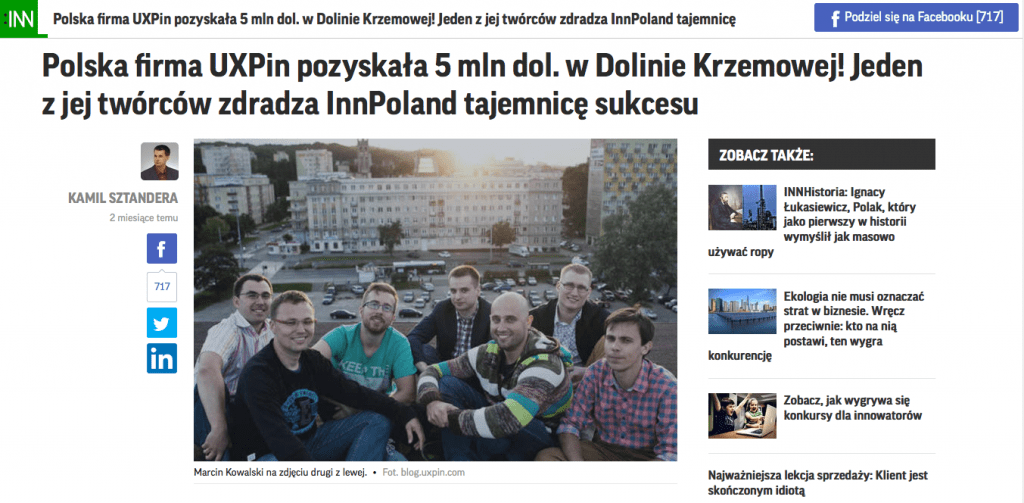
Our first microinteraction is a small feature that goes a long way: Google’s Translate this page.
This small option tucked into the second line of a Google search essentially opens up the possibility to read every website from all over the world, regardless of language. Which a simple click, Google Translate automatically translates the entire page, without losing fundamentals in the layout.
Before:
After:
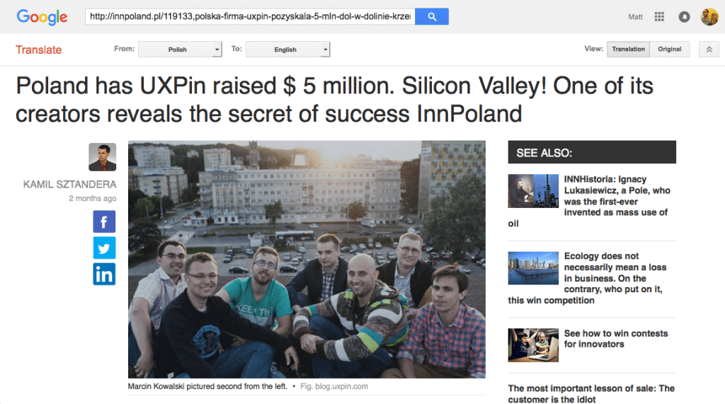
Of course the translation isn’t exact — but no online translator is perfect. The translation is good enough to glean the meaning and read a foreign page in as close to one’s native language as possible.
Furthermore, notice how the microinteraction goes beyond simply the body text. Titles, subtitles, by-lines, captions, dates, and sidebar text are all translated. Even more useful is that the format remains almost identical to the original. This makes the microinteraction seem like magic, fostering the illusion that the foreign site isn’t foreign at all.
The feature exemplifies how powerful microinteractions can be. Such a tiny interaction — a small amount of text, a simple click — leads to such a huge gain in allowing access to sites previously thought unattainable. All microinteractions should follow this lead, offering more for less.
Swiping Actions — Tinder
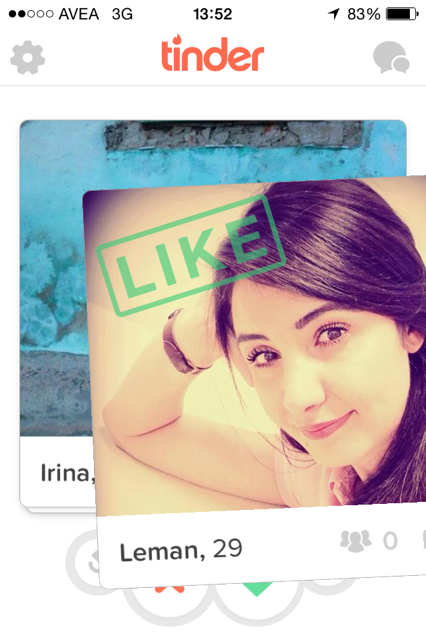
Source: Tinder
One of the most easily recognizable microinteractions is Tinder’s swiping actions. As explained in UX Trends 2015 & 2016, this interface choice is about as good as it gets — simple and easy to understand, fun, quick, and original (they were the first to create the dating service in this format). It’s even becoming part of our culture with opinion articles and even songs dedicated to the action.
Moreover, their looping capabilities are phenomenal — using Tinder becomes addictively fun, with rewarding habit loops in place that keep users on the app “for just five more minutes.”
Customized Like — Facebook Messenger
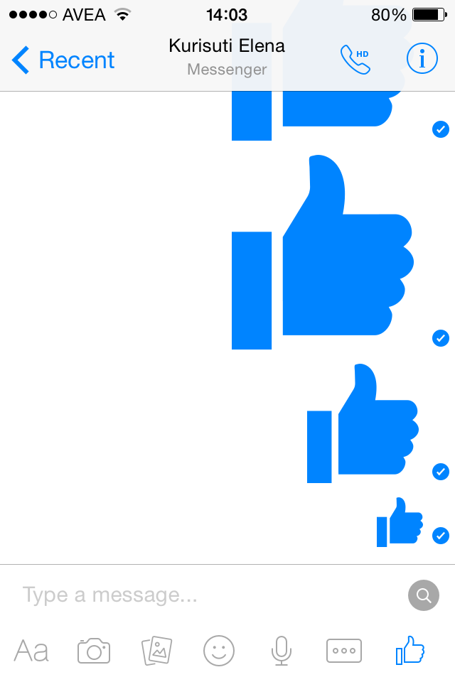
Source: Facebook Messenger
Facebook’s free texting service Messenger demonstrates how good microinteractions have a sense of fun and wonder along with their utility. Holding the Like button down for longer increases the size of the stamp, allowing creative customization for the user.
This detail may be superfluous, but it makes using the app more fun and gives it a personalized magic. Additionally, the animation mimics a balloon inflating, and holding down the emoji for too long negates it, making it almost a game.
Hemingway Mode — Draft
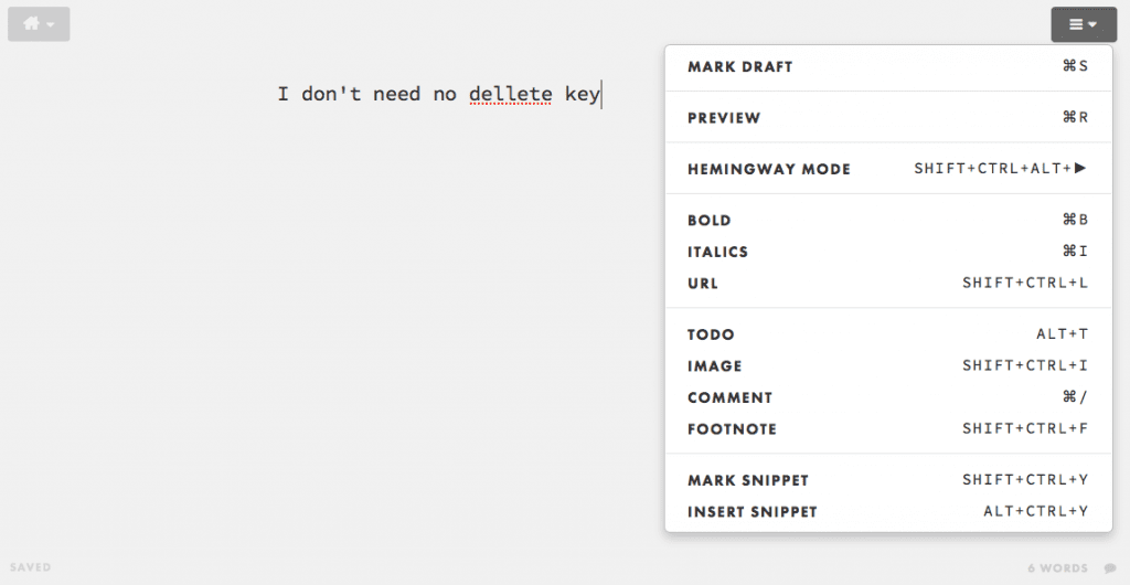
Source: Draft
Chances are, users of the online word document maker Draft will appreciate this Hemingway reference: Hemingway Mode disables editing and deleting, which encourages a brisk, stream-of-consciousness style in your writing (you can turn it off an edit later).
This microinteraction is a good example of knowing your user. An option like this — especially with its clever name — would be out of place for an email service targeting a broad audience. However, the site is targeting literary writers who find this option not only an enjoyable novelty, but actually quite useful in improving their writing process.
Hover Animations — Path
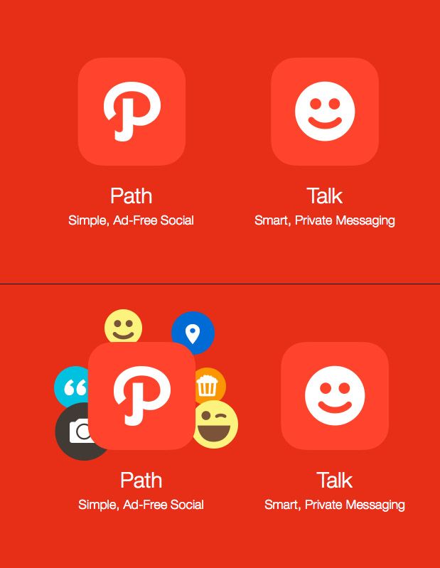
Source: Path
Some microinteractions are just for fun. When hovering over the entrance button on Path’s landing page, a cute animation of icons pop out from behind the button. On a useful level this signifies clickability and provides feedback, but really it’s there as just a source of delight.
Hover animations are one of the most popular microinteractions. On sites like Path they may be just for fun, but on sites that intermix interactive and non-interactive elements, this type of microinteraction can go a long way in communicating usability.
Customized Header Background and Icon — Reddit
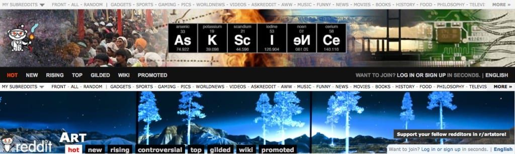
Source: Reddit
The header background and Reddit mascot change depending on which subreddit (category) users visit. It’s a small touch, but creates a more unique identity for each subreddit (which deepens the feeling of community).
Themed Captcha — Letterboxd
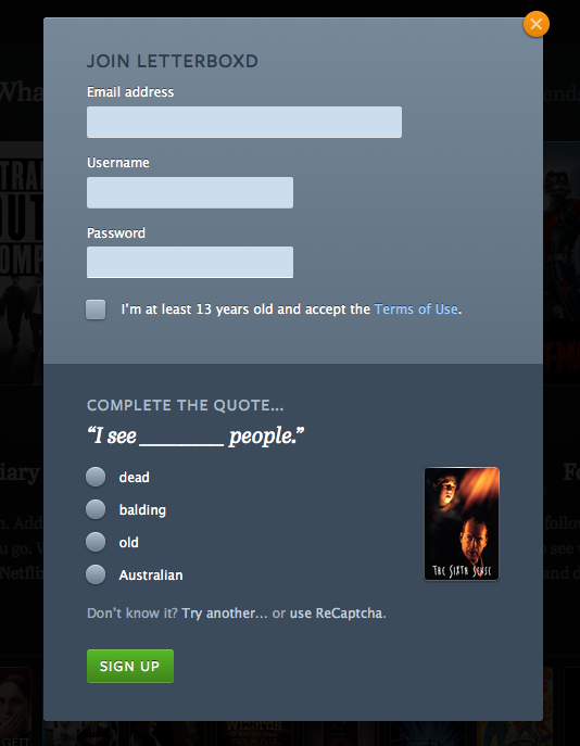
Source: Letterboxd
In keeping with their site’s movie theme, Letterboxd illustrates a good point with their captchas from famous movie quotes. The clever microinteraction transforms an otherwise annoying task into a task that feels a little more fun.
Real Time — iOS Clock App
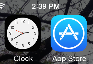
A quick time-saver, the iOS Clock App shows the real time right in the display. While not necessary, it’s certainly more useful than a static image that could confuse users if it doesn’t match the actual time.
Unexpectedly Useful Feedback — Geeklist
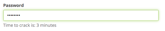
Source: Geeklist
Geeklist goes above and beyond the common “password strength” to calculate how long the password will take to hack. Interesting, original, and keeping on the site’s geek theme. It’s also quite useful since it communicates password strength in terms that a user instantly understands.
Sensitive Profile Options — Instructables
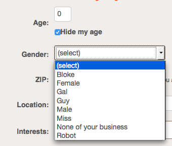
With information like age and gender somewhat sensitive, Instructables relieves the tension by offering several options for gender, and the option to hide one’s age on the profile.
Quirky Format Changes — IMDb
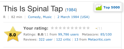
Source: IMDb: This Is Spinal Tap
An in-movie reference, the rating for This Is Spinal Tap on IMDb breaks form and goes up to 11 instead of 10. This subtle joke within the interface will, when discovered, endear the site to the movie’s die-hard fans, and make an experience they’ll better remember.
Conclusion: Humanizing a Computerized System
Microinteractions, at their best, provide a utility as good as their enjoyment factor. But, when you view all successful microinteractions together, the one thing they all have in common is that they add a little personality to the site or app. This of course changes depending on the personality of the site itself — microinteractions can be cartoony, or strictly business in streamlining a task.
But in every case, microinteractions are a way to take a dull, negligible aspect of an interface and make it enjoyable and memorable. This is their greatest impact on the UX.
If you’ve found this article helpful, go ahead and download the free guide UX Design Trends 2015 & 2016. We deconstruct 71 examples of great UX design into techniques for everyday design.

Feature image credit: Fast Co. Design.

