You’ve seen patterns before. You’re probably looking at some now. And you’re inundated with them every day: Layouts and icons, symbols and workflows. The bulk of web design is built on patterns.
Sometimes they’re obvious. Design agency sites tend to mimic each other, following broad trends as technology advances and trends change. News sites that experiment with article teasers’ formats still use them. And shopping carts tend to work the same way.
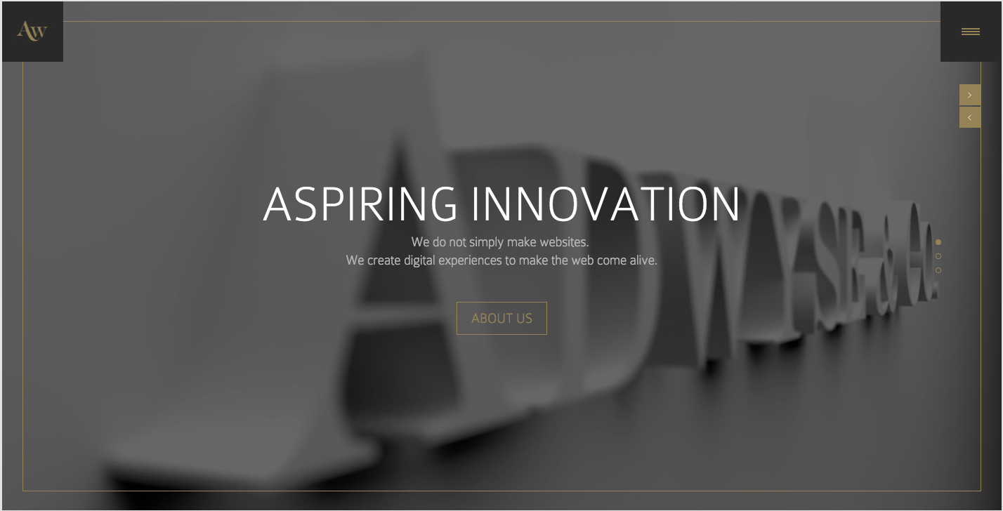
Photo credit: http://adwyse.de/
Other times they’re more subtle, like variations in sites’ footers, or the (growing) use of “hamburger” icons which, at the time of this writing, most readers don’t quite get. Or scrolling sideways instead of down through a website. It’s technically possible, but unexpected.
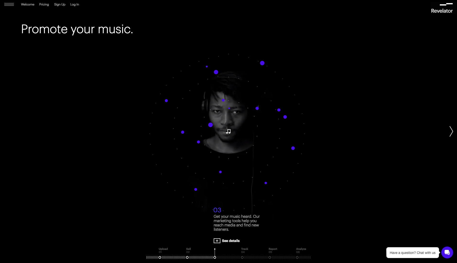
Photo credit: http://revelator.com/tour/promote
Whether they’re easy or not, it’s important to recognize when you’re using patterns in prototypes. Knowing conventions that users expect — and knowing when to break them — will make your designs easier to use and stronger overall.
In this post, we’ll describe a few techniques for finding and customizing the right UI patterns.
Building a Pattern Library
Unfortunately, keeping patterns in your head isn’t a great way to manage ideas. Assumptions creep in, and not having a visual reference makes patterns difficult to share.
Creating a pattern library is so important that entire sites like UI-Patterns and PatternTap exist as design references. But you can also make your own. Let’s look at the process described in the free Web UI Pattern Handbook.
Step 1: Look for design patterns in the wild. Here’s one way how.
- Go to any website and look at the “big picture.” Notice its overall layout: Do you see columns and sidebars?
- Set yourself a goal in a website that requires several steps. Jot down the steps you took to get to that goal.
- Look back at patterns involved in each step.
- Examine macros, shortcuts, templates and other techniques you’ve used across multiple projects. Take one of each and archive them.
That last item underscores the point. The key to pattern-hunting is to start with a running list of patterns: a repository of ideas from which you can pull as needed.
Common patterns include:
- Tabbed menus
- Off-canvas navigation
- Dominant headers above columns
- Pagination links
- Breadcrumbs
- Clickable logos in the upper left corner of a page
- Footers with navigation links
- Name/email fields above message text areas in contact forms
- Search fields at the top of a screen
- Horizontal navigation links
- Blue text, often with underlines, are clickable
- Large text is more important than small text
But don’t stop there. Keep records of anything you see repeated across websites — on paper, or digitally with UXPin (by creating a “Pattern Library” project and dropping in screenshots) or even in a Dropbox folder.
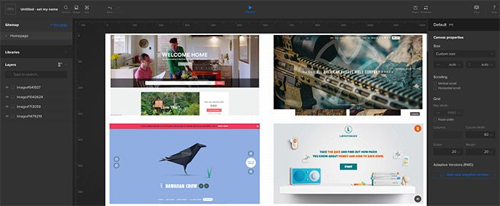
Photo credit: UXPin via Airbnb, Noveske, Species in Pieces, Laerepenger
Step 2: Start to use them in your work. Not the examples themselves, but the patterns behind them.
It’s OK to use breadcrumbs. It’s less OK to use red breadcrumbs separated by a particular icon that you especially liked somewhere on the web. Remember that patterns are ideas upon which you build your unique aesthetics. (That’s not to say you must avoid every look-and-feel you’ve ever seen. Creating something totally original is nearly impossible today, so seek inspiration from your project’s branding and don’t worry if “it’s been done.”)
Step 3: Share your findings with your team. This resource you’re creating benefits everyone. Fellow designers can use patterns for the same reasons you do. Developers will come to recognize the spirit of your designs, not just the surface details. Stakeholders can better understand your design rationale by recognizing similar examples.
Finally, keep at it. Libraries don’t happen overnight. As styles and trends change, so will your collection of examples — though we bet that the ideas will remain largely the same. It takes a game-changing UI to invent new patterns.
Getting Creative With UI Design Patterns
A pattern library is more than a scrapbook of interesting aesthetics. It’s also a foundation on which to create your own.
As an example, let’s look at a common pattern for search results. When people browse search results, they mentally eliminate choices that aren’t compatible as they zero in on the perfect match. Normally, that means the primary CTA is to click on the link.
If you were building a results page for a hotel, you need to filter that pattern through user behavior. Instead of browsing down a list linearly, comparative shoppers might move back and forth between options (evaluating based on price, location, decor, etc.).
In the below example built in the prototyping tool UXPin, what if you flipped the pattern around so the primary CTA was to remove links that users didn’t want?
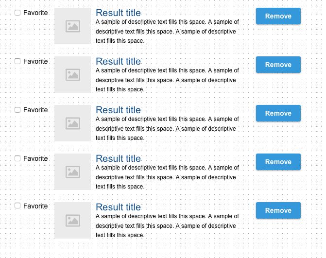
Photo credit: UXPin
You don’t break the idea behind search results, but you riff on the idea, implementing new solutions based on the user context. You can’t think sideways unless you fully understand the solution a pattern represents.
Of course, we don’t know yet if this new pattern will work, but perhaps it’s worth testing alongside the original pattern. It might fail horribly, or it might work better than expected because it’s so unconventional.
Let’s adopt a similar experimental mindset with breadcrumbs. They seem like a simple pattern without much room to grow … unless you get a little creative. What if:
- Their links were listed vertically, in a column of their own?
- We used icons instead of words?
- We put breadcrumbs at the bottom of the page instead of the top
- Breadcrumbs included the next most likely link?
- Each link included a drop-down menu of its siblings?
Not every brainstormed idea is a winner, but may eventually lead to something great. Don’t be afraid to think outside the pattern – just make sure you test it with at least 5 users before you fall in love with it.
Tweaking Pattern Styles
You’ve chosen a pattern. You’ve tested it out. Now it’s time to give it a look. How does that work?
Falling into a rut is easy with patterns when they’re thorough. But if we use good reasons to change them — when necessary — then our design will come out ahead. We’ll describe a couple ways below.
Incorporate brand colors and typography
Every project has certain attributes that make it seem like a coherent whole. Color and type choices are frequent tools to accomplish that, and easy to apply to patterns. You can use patterns to reinforce that brand:
- Colors, like we said, but especially shades of the same hues to reinforce the overall look.
- Distinctive shapes and geometry.
- Type families and various weights.
- Follows the page’s layout grid as much as possible.
- Illustration style

Give it a little flair
As we mentioned before, breaking patterns (or at least bending them) will make certain use cases stand out from the rest. The more you use regular patterns, the more differences will stand out. The trick is to identify and question assumptions. For example:
- Must dates in a calendar reside in boxes? Or would circles work as well?
- When would you use serif typefaces in a sans-serif dominated design, or vice-versa?
- What if buttons had alternating round and sharp corners?
- What if testimonial quotes substituted for headlines?
- Should switches be horizontal or vertical?
- Do star ratings have to use stars?
Use them as-is
Alternatively, sometimes the simplest solution is best. Patterns that solve a problem do so because they’re well-designed.
Photo credit: UI Patterns
Buttons, for example, may not need extra frills and colors. Users are accustomed to certain patterns looking a certain way, and if there’s no good reason to change them, then you’d be smart to leave them alone. Good reasons include:
- Drawing attention to areas you want users to notice, like calls to action.
- Indicating that something is less important by making it resemble the background.
- Make something contextual.
Bad reasons include:
- Because it’s “artistic.” We should not break our own rules for the sake of art, but for communication.
- We just want to stand out. Don’t waste energy satisfying your designer ego.
The most important reason to apply your project’s style to a pattern is also the trickiest: not to look like a pattern while retaining its spirit. A table can look like anything, as long as it works like a table. Buttons still need a tappable quality about them. Links need to stand out from text. Otherwise you have free rein to riff on patterns with your own creative ideas.
Going forward
The web’s history is full of patterns, from clickable corner logos to vertical scrolling to underlined links. Designers have learned to take advantage of how people recognize trends in visuals and interactions, and users have come to expect certain conventions in web UI design. It’s a win-win situation that only gets better over time — even as it evolves.
If you found this post helpful, go ahead and check out the free Web UI Design Best Practices. Find in-depth explanation of techniques spanning visual design, interface design and UX design with examples from LivingSocial, Spotify, Apple, Skullcandy and more.