When it comes to user experience and user interface design, Google and Yahoo both do a decent job (granted, in different ways).
In this piece, we’ll quickly explain some practical takeaways from the UI and UX design of each site.
Instead of debating which is better, let’s look at how Google and Yahoo’s interface decisions suit the needs for different user goals (and thus experiences). Google is very straightforward with their interface in helping users easily search the entire web. Yahoo while viewed as similar, has separated itself with a more comprehensive interface that hopes to deliver an experience for entertainment, information retrieval and aggregation.
Google: The UI of its search homepage is simple, clean and offers many options right from the home page. As a result, the experience is extremely smooth since it takes very little time for users to type in their query and find desired results. The user experience is also fun when special occasions are noted with animations on the home page (adding a bit of delightful personality to the design).
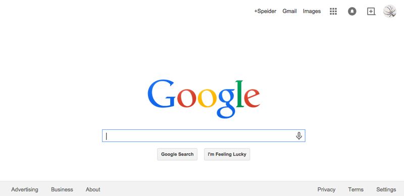
Photo Credit: Google
As a user, you’ll note that everything is easy to access, easy to find, easy to use, intuitive and fast. Google certainly knows the basic 3 rules of UI and UX:
- Make it simple. Never underestimate or overestimate your users. Believe it or not, most people are digital illiterates or slightly better. Part of the “U” in UX and UI is the user. Always put yourself in their place when designing a website.
- Fast, faster. fastest! Don’t load up your home page with too much because people will click off slow loading sites. As Jakob Nielsen suggests, response times beyond 1 second start dissolving the illusion that the user controls the experience.
- Make it fun! Sites that provide entertainment (or emotional fulfillment) as a bonus to satisfying user needs seem to be most popular.
If you believe in awards as a mark of distinction, Google has certainly won a few. In addition to the basic search engine, Google+ Hangouts, Google Maps and even the ideas flowing out of Google Creative Labs are all great examples of well-designed and well-executed interfaces and overall experiences.
Yahoo: The old, once most popular search engine has gotten used to the number 2 spot and has branched off. But like Google, Yahoo is looking to its own version of the future.
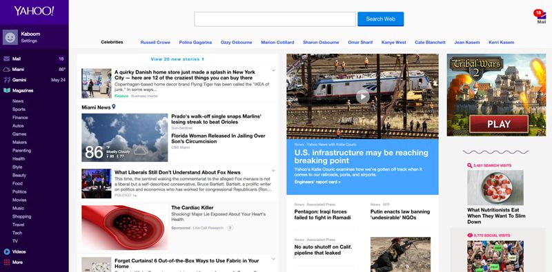
Photo credit: Yahoo
A popular aggregator, the UI of the Yahoo home page allows the user to create their own experience by building their own home page. More importantly, the homepage then adapts over time by filtering content based on how users engage.
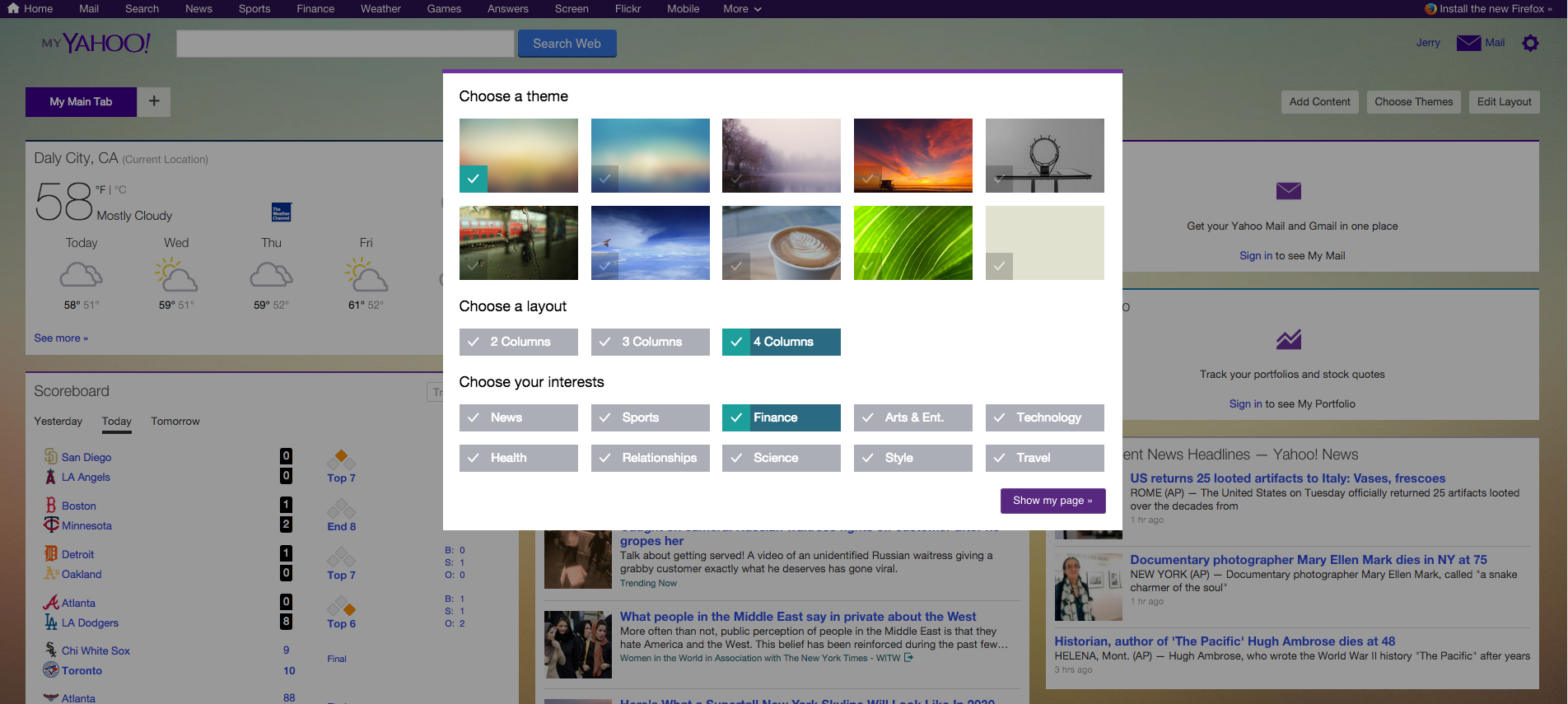
Photo credit: Yahoo
It’s always the same, familiar, friendly page for the user – except when it’s not. Yahoo seems to like to change the interface – a lot! While technology will always force changes in user interface and other user experience issues, it’s important to remember the user experience of the human brain – too much, too soon, too overwhelming. You weren’t taught the simple formula of Algebra in one day.
More often than not, the overall experience shouldn’t change just because the interface changes. When users need to search to find the new functions, they will start slowly and cautiously . Yes, there are pop ups offering video tours of new functions (and onboarding methods), but be truthful – what percentage of users actually view them?
Button pop ups remain popular because they point to the exact spot upon hover to clearly explain function. The practice of redesign for a branded website is a big step and one companies should use sparingly. It’s much better to introduce many little UI improvements over a period of time than to dump it in the lap of the user, expecting them to catch up with your entire web team’s output in just one day.
If you think about it, the user experience starts the minute someone clicks onto your UI. How much time do you want them spending going “where’d that favorites button go?”
Different from Google in many ways, here’s some of the takeaways from Yahoo user experience and interface design:
- Allow users to personalize their experience whether through user actions or contextual technology. This combination has been one of the differentiators keeping Yahoo alive despite Google’s improved search functionality. Yahoo did what every business should consider against competition – they took other parts of the market and provided solutions and experiences.
- Improve the user experience gradually (known as the MAYA principle) so you don’t overwhelm people who’ve already built up habits with certain features. Change is hard enough but the emotional toll on the user from the anxiety of a new learning curve can be a very negative experience.
- The more elements that are added, the user interface must become simpler or at least become friendlier to the human brain. Technology can’t exceed the human ability to interact with it.
- Respect the users. If you don’t give them what they want, they will go elsewhere to get it. Websites don’t stay at the top by accident, or forever.
- Change for need and not just for the sake of change. Unless you’ll be better able to meet user goals, then resist the redesign.
For more everyday design tips based on analysis of live websites, check out the free e-book Web UI Best Practices.