
Arguably the most popular type of mobile navigation is the type that appears on demand: Tap an icon and site-wide links appear. But just making them suddenly appear is boring. It lacks panache. Great navigation has a hint of animation that gives the links context — they’re not just things that appear out of nowhere. They’re hidden just out of sight, ready to help users get around when the need arises.
Today we’re going to show you how to build a fading navigation that flies in and out on mobile without writing a single line of code that’s sure to wow stakeholders.
1. Build the framework
Log in to your UXPin account (or start a free trial) and let’s get started. Then find and drag out the following elements:
- iPhone bezel, black
- FontAwesome “reorder” icon
- FontAwesome “remove” icon
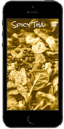
- Page title (36pt Rock Salt)
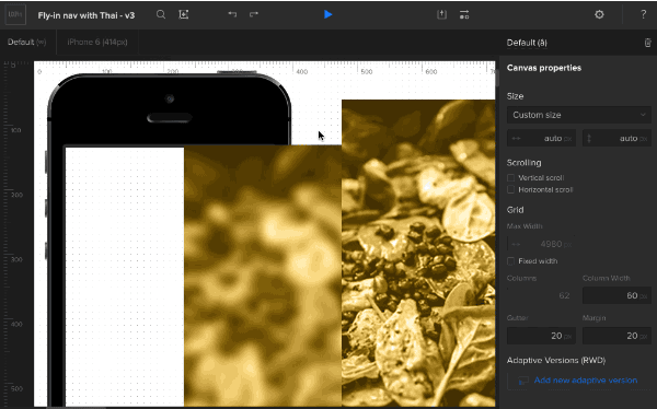
- Background image (in focus)
- Background image (blurred)
We suggest you name each element as you create it — you’ll thank yourself later. To do so, tap the “i” icon at the top of the options menu whenever you tap an icon.
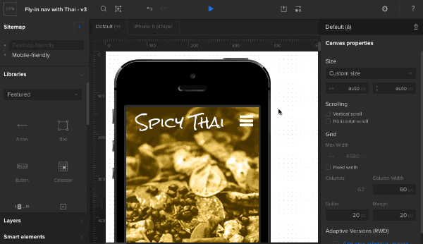
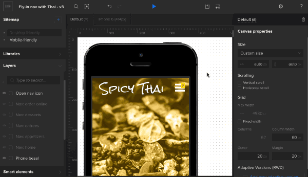
2. Create the background
This prototype uses the background images in smart elements so we can reuse them later. Whether you choose to follow suit or not, drag in two versions of the background image: one in focus, and one blurred. Arrange them in the canvas so the in-focus image is on top of the blurred one. Finally, select the phone bezel and move it to the front.
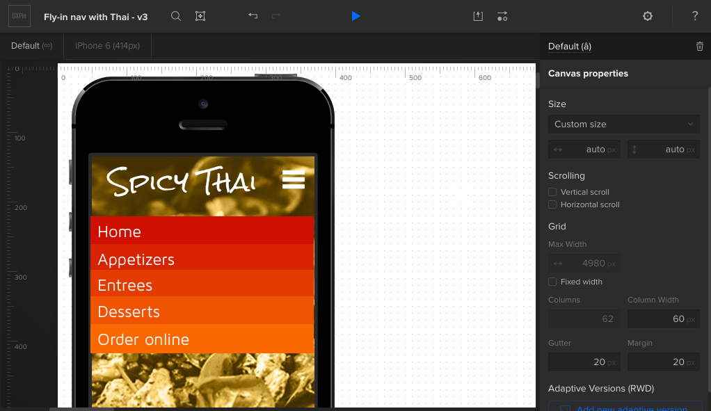
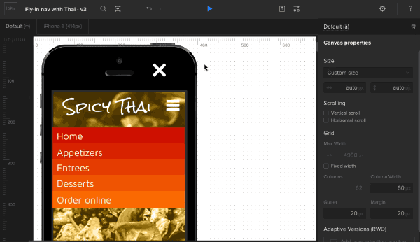
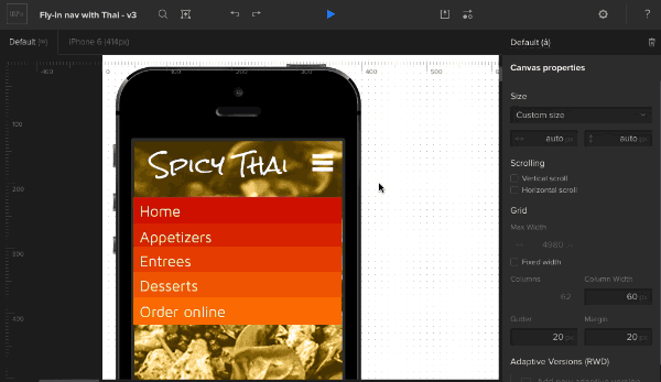
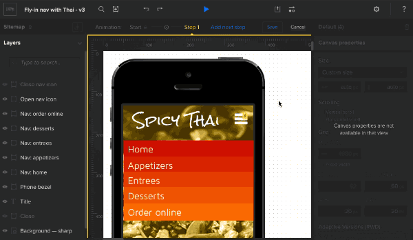
3. Create the navigation links
Add navigation links (home, appetizers, entrees, etc). To add text to a box, double-click on its center and start typing.
Color each box and add a little padding. Change the typeface and size as you see fit — in this demo we used 24px Maven Pro. You can make each link the same color, but in this demo we used:
- #cf1000
- #d82300
- #e43b00
- #f05301
- #fa6801
4. Finish the interface
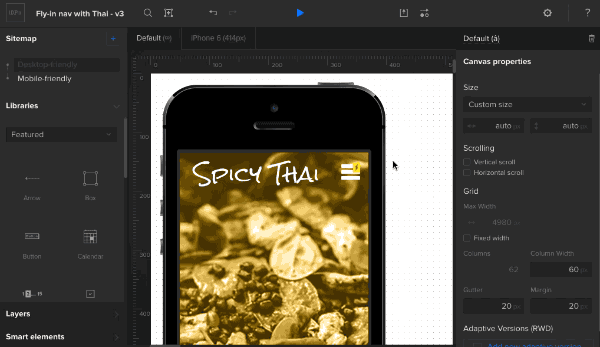
Add the title (36pt Rock Salt, in this case) and the open-navigation “hamburger” icon.
Place the close-nav icon on top of the open-nav icon, then hide it with the layers palette.
Shrink the navigation links to fit under the phone bezel’s right edge, and use the “eye” icons in the layers palette to hide them.
5. Create an advanced animation
The fun begins with the custom animations editor. Add an action to the navigation trigger: advanced animation. “Step 1” represents the state that the animation will reach upon completion. This is the point at which the navigation should be fully revealed, the background blurry, and the “hamburger” icon changed to a “X”. To start all that, reveal and expand the navigation.
Set each navigation link to appear 50ms after the last. For example, “Appetizers” begins at 50ms and “Entrees” begins at 100ms.
Now for a little switcheroo. Hide the open-nav icon and show the close-nav icon. Then hide the focused background and show the blurred background.
6. Fix the order
Finally, make sure the phone bezel is the above the navigation links, but below the open/close icons. This ensures that the navigation links only appear in the app’s working area, not over the phone itself.
Then try it out! Advanced animations are a powerful way to give interactions a little pizzazz. To set yourself up for success, though, we suggest that you name elements as you go, pay attention to their layer orders, and don’t be afraid to experiment. Hope you enjoyed this tutorial. Now play with UXPin on your own!

