Responsive Design: Best Practices & Examples
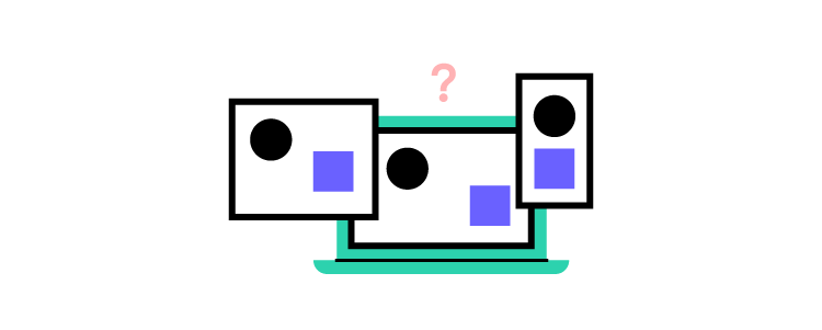
Designing a mobile-friendly website is a critical factor for modern website design. The highest priority for designers is to maintain consistency across multiple viewports.
Speed up responsive web design with code to design approach. Bring UI coded component to UXPin and enjoy full interactivity of prototyping. Learn more about Merge technology that makes it possible.

What is Responsive Web Design?
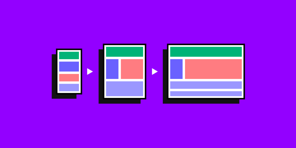
Responsive web design is the process of designing a mobile-friendly website that adapts depending on the visitor’s device–desktop, tablet, smartphone. Developers use CSS media queries to set breakpoints for each screen size so that users can browse a website within the constraints of their device.
These media queries change column layout, typography sizes, image sizes, or hiding and revealing content. The website’s functionality remains the same, but the content and structures adjust to different screen sizes.
Why is Responsive Web Design important?
UX design is about creating the best user experiences; this includes optimizing interfaces to adapt to someone’s device. Designers must create a consistent experience across different devices and viewports.
Responsive web design is essential if you want search engines to index and rank your website. Google’s mobile-first indexing prioritizes responsive websites for mobile search results.
According to Google Search Central, “In the USA, 94% of people with smartphones search for local information on their phones. Interestingly, 77% of mobile searches occur at home or at work, places where desktop computers are likely to be present.”
In short, most people use their mobile devices to search the web. They’re also shopping for products and services, so your website must be mobile optimized to take advantage of these customers.
Designing great website experiences starts with ensuring you and your team have the right tools. UXPin is an end-to-end design, prototyping, and testing tool for organizations to build responsive websites and applications. Sign up for a free trial today!
Google offers a free Mobile-Friendly Test that evaluates whether your website is optimized for mobile devices.
The Responsive-Design Approach
There are two essential factors designers must consider for responsive web design:
- Breakpoints
- Visual Content
Breakpoints
Designers must identify these breakpoints and optimize layouts to match multiple devices during the UX design process. In most cases, designers only have to consider three viewports:
- Smartphone/mobile
- Tablet
- Desktop
But, for a website to be fully responsive, designers should also consider both portrait and landscape layouts for mobile and tablet for a total of five breakpoints:
- Smartphone/mobile–portrait
- Smartphone/mobile–landscape
- Tablet–portrait
- Tablet–landscape
- Desktop
Visual Content
Visual content includes images, videos, and GIFs. These visuals take up a lot of resources and can take a long time to load on mobile devices, so designers must compress and optimize visual content to reduce the file size.
10 Best Practices for Responsive Web Design
1) Flexible Everything
Flexibility is crucial for responsive website design. Layouts, images, text blocks, components, everything must all be responsive.
2) Modify Images
Responsive images are essential for mobile-friendly design, including sizing and cropping. Smaller screens might require you to crop certain images to retain their impact. For example, creating square versions of landscape images for mobile devices.
Mozilla has an excellent article on responsive images, including considerations for designers and developers.
3) Use Scalar Vector Graphics (SVGs)
Try to use SVGs in place of raster graphics, especially for icons and logos. Unlike raster graphics, SVGs alter their resolution based on image paths, not pixels, so they remain the same at any size.
4) Pay Attention to Breakpoints
Each web page should have a minimum of three breakpoints (mobile, tablet, and desktop). As mentioned above, we recommend five breakpoints for maximum device flexibility. In rare circumstances, designers might also need to consider how websites perform on iOS vs. Android devices.
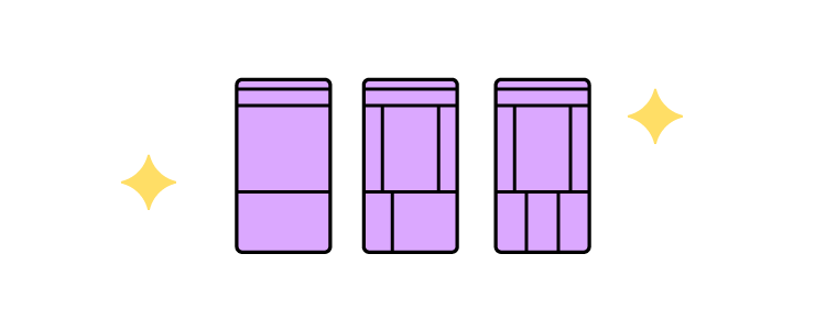
5) Consider Card Interfaces
Card UI patterns act as content containers that are easier to move around, saving you a lot of time. With UXPin’s Auto Layout, you can automatically resize, fit, and fill designs to make cards and other components more responsive. UXPin’s auto-layout works on flexbox principles, making it easy for engineers to copy/paste CSS during design handoffs.
6) Minimalism Matters
Here are three reasons why minimalism is an essential best practice for responsive web design.
- Reducing content creates less clutter making it easier for users to read and digest.
- A minimalist UI design makes it easier to create consistency across multiple devices and different screen sizes.
- Web pages with less content, HTML, CSS, and Javascript load fast, creating a positive user experience for your website visitors and enhancing your SEO.
7) Mobile-First Design Approach
Mobile-first design means you start with the smallest screen size and scale to your largest viewport. Designers who start with the largest screen first often have to delete elements or make compromises as they scale down.
Learn more about this approach in our free eBook, Responsive & Adaptive Web Design, where we analyze ten major companies, including Facebook and Hulu.
8) Prioritize and Hide Content Appropriately
With limited space on smaller screen sizes, designers must identify which content is always visible and what they can hide. The most common example is using a navigational drawer for the main navigation on mobile devices.
Designers can also use progressive disclosure to hide non-critical content and information for a cleaner, more minimalist user interface on all devices and screen sizes.
For example, most eCommerce websites hide size guides using modals, tabs, or accordions to reduce visible content and create cleaner layouts. Shoppers can still access these guides by clicking a link.
9) Large Clickable Area for Buttons
Fitts’s Law (explained in Interaction Design Best Practices: Book I) states that buttons with large clickable areas make it easier for user interaction. Designers must also create enough whitespace between links and buttons, so users don’t accidentally click the wrong one–which can be frustrating!
10) Research Competitors & Industry Leaders
One of the best ways to learn and stay on top of the latest responsive web design trends is by researching competitors and industry leaders. For example, if you’re designing an eCommerce website, look at how major global brands Nike, Asos, H&M, and others design their stores. These brands spend millions researching and testing best practices, so why not leverage that R&D to your advantage.
Responsive Web Design Examples
We’re going to deconstruct three globally recognized websites that do responsive web design right! Keep in mind that some of these websites might look different from the screenshots below, as brands continuously update their UI design. But, the principles of responsive web design are still relevant.
The Guardian
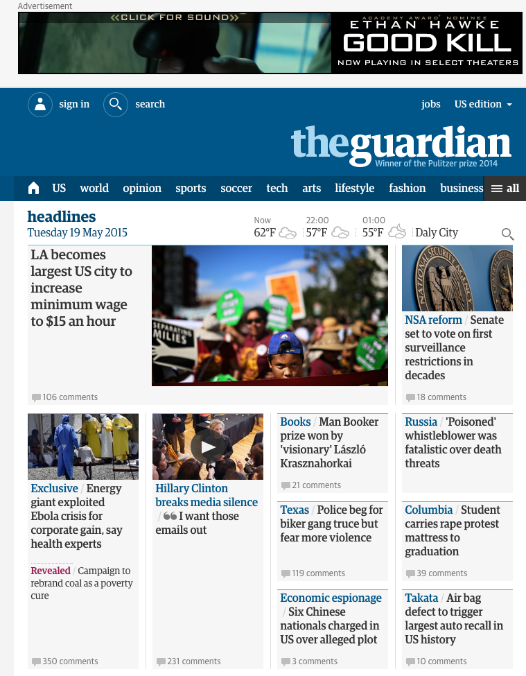
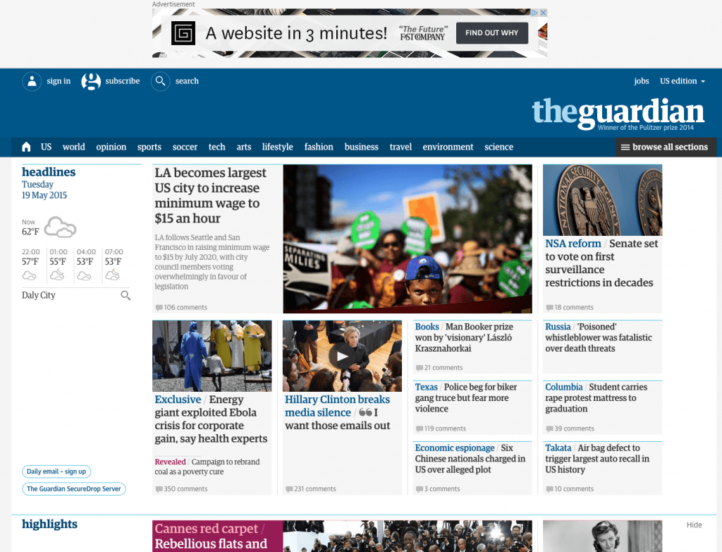
The Guardian is a famous British newspaper with a strong online presence and an excellent example of mobile-first design consistency.
In keeping with our mobile-first approach, let’s start the Guardian’s analysis with the smallest screen:
Smartphone View

The smartphone view is cohesive and inviting, with all the essential elements presented in a clear visual hierarchy.
- At the top, the necessities are in the banner, with login, search, and the site’s title.
- Directly below are the most popular navigation categories (home, “US,” “world,” etc.) for easy access. The Guardian hides additional navigation links behind the hamburger menu (following the principle of progressive disclosure).
- The features story takes up most of the room with its enticing image, showing that it’s the most important element.
- The user can access multiple secondary stories making headlines with a quick scroll, thus facilitating browsing and giving users control.
No space is wasted on the mobile version, too–even the whitespace opposite the “headlines” title features weather information, providing extra value to mobile users.
Tablet View
- Above the user interface on the tablet view, the Guardian includes an ad for business value.
- At the top, the banner remains the same, but the tablet view offers more room for additional elements (“jobs” and the country edition), labels for the icons, and the Guardian’s subheading below the logo.
- The hamburger menu remains, but there are more visible categories than the mobile version.
- The most significant difference is that the tablet shows more stories and increases from a single column to four. This creative use of the card UI pattern allows the designers to prioritize stories using a size hierarchy.
Desktop View
The desktop view reveals the true mastery of the Guardian’s website. The site is consistent across all three screen sizes, giving readers the same user experience no matter what device they’re using.
Each version is scroll-based, uses the same card components with similar header navigation and branding. The only significant difference is the number of stories per screen size.
Smashing Magazine
Smashing Magazine does well to follow its own advice on creating better mobile experiences with a fully responsive website.
Smartphone View
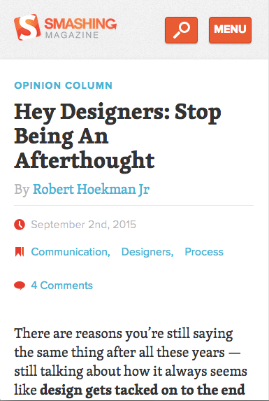
- The header is simple with the brand’s logo, search icon, and clearly labeled menu to open the navigational drawer.
- Smashing Magazine shows its latest article with relevant metadata, and except.
- Smashing Magazine makes it obvious that you must scroll to see more content on the home page.
Tablet View
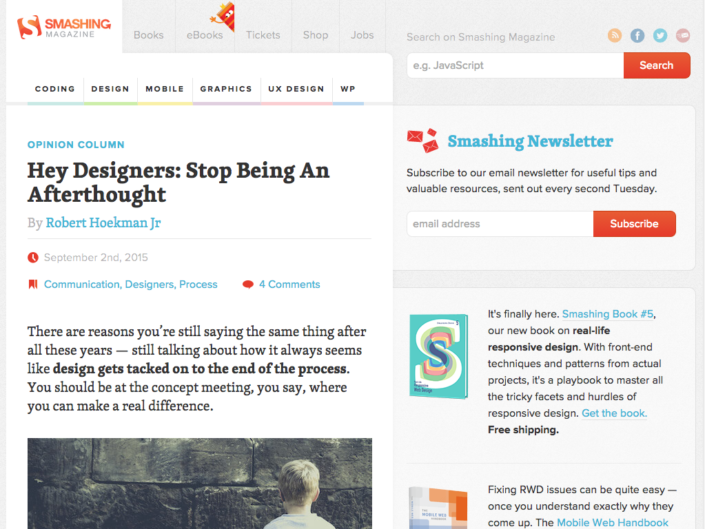
Smashing Magazine’s content remains the same, but the menu icon disappears, revealing the site’s full navigational links. Smashing Magazine also displays content categories for quick access to related content. The tablet view also includes a sidebar with search, newsletter signup, and promotional lead magnets–thus increasing the design’s business value.
Desktop View
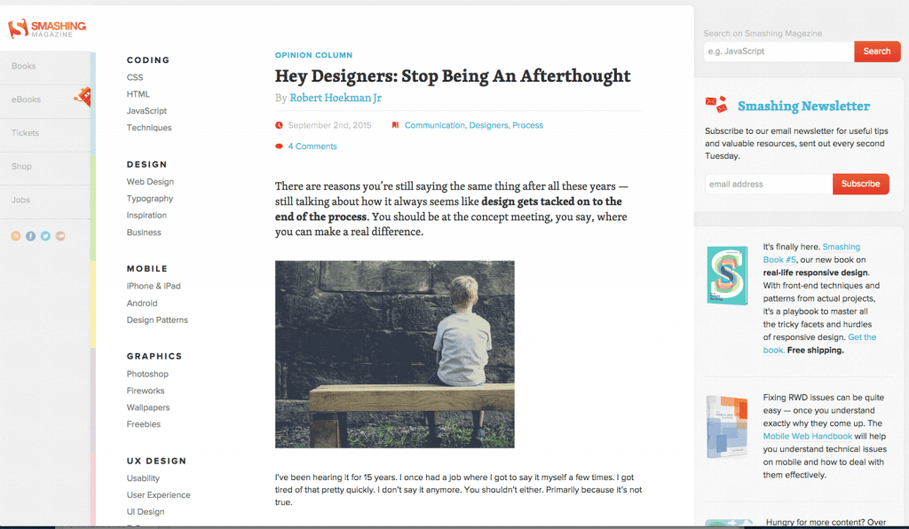
Smashing Magazine’s desktop view is almost identical to the tablet view, but the main navigation and content categories move to the left.
One thing that remains consistent across all devices is the content. As a leading blog, Smashing Magazine wants its content to be the hero, no matter what device the visitor is using.
Lookout
Unlike our first two examples, Lookout is a service-based website that wants to onboard new customers. This time we’ll explore the website from desktop down to mobile.
Desktop View & Tablet
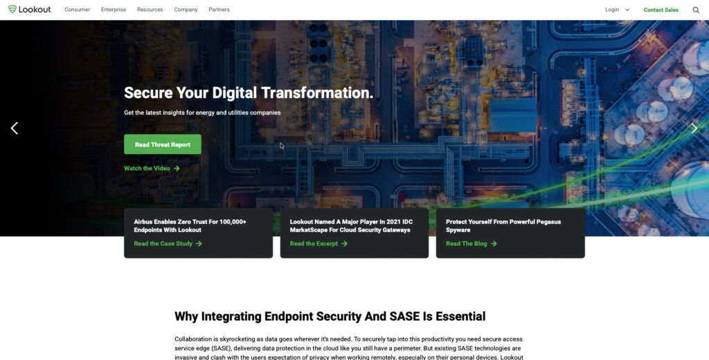
Lookout maintains the same view for tablet and desktop users. The navigation, login, sales CTA, and search icon are all visible, albeit more whitespace, on the desktop viewport.
Lookout wants to generate more leads, so they use an eye-catching green CTA for multiple lead magnets.
Smartphone View

- Lookout hides the main navigation behind a standard hamburger icon with login, sales CTA, and search still visible and accessible for users.
- Lookout maintains the same design strategy for its mobile website with a prominent, eye-catching CTA to the company’s lead magnet.
All three of these websites are excellent examples of UI design consistency and prioritizing content as you scale from desktop down to mobile.
Summary
Responsive web design is no longer something designers “should consider,” you must embed it in your standard best practices and workflow.
In fact, you should prioritize mobile over your desktop experience with a mobile-first or progressive enhancement design approach.
Consistency in the design itself and design drift are also challenges designers must overcome–a problem UXPin Merge can solve!
Merge allows you to sync code components to UXPin’s design editor from a repository. Designers can simply drag and drop these fully functioning code components to build user interfaces that look and work like the final website or application.
The result? Designers can use high-fidelity prototypes to improve usability testing and design better customer experiences. By using code components, engineers have less coding to develop the final website, thus reducing errors and time-to-market.
Find out more about UXPin Merge and how you can request access to this revolutionary technology.


