Nowadays to sell goods and services, you don’t need a traditional brick-and-mortar storefront. All you need to set up shop is a good internet connection, a domain and a site. However, that doesn’t guarantee success. There’s more to an e-commerce site than throwing up a few items and a credit card form. You’ve got to have a solid user interface and user experience to get your customers to open their wallets.
If you want to look at the UI and UX of an e-commerce site, then Amazon is one of the best around.
In this article, let’s take a quick look at the practical takeaways from the UI and UX of the popular e-commerce site.
When you choose an item on Amazon, you’re presented with an interface delivering incredible aggregated information. In addition to the Amazon price, you also see options for other vendors carrying new and used items. What was once built to become an online department store has instead become a network of sellers that offer the user many positive options for their shopping experience.
The amount of choices available in the interface, along with the aforementioned aggregation of links and the algorithm that customizes each registered user’s needs makes Amazon one of the most complicated websites you’ll see on the internet today. And yet the front-end experience is surprisingly simple because of the nested interface.
Just take a look below, which represents a solid grasp of Hick’s Law (e.g. limiting amount of user choices, as described in Interaction Design Best Practices):
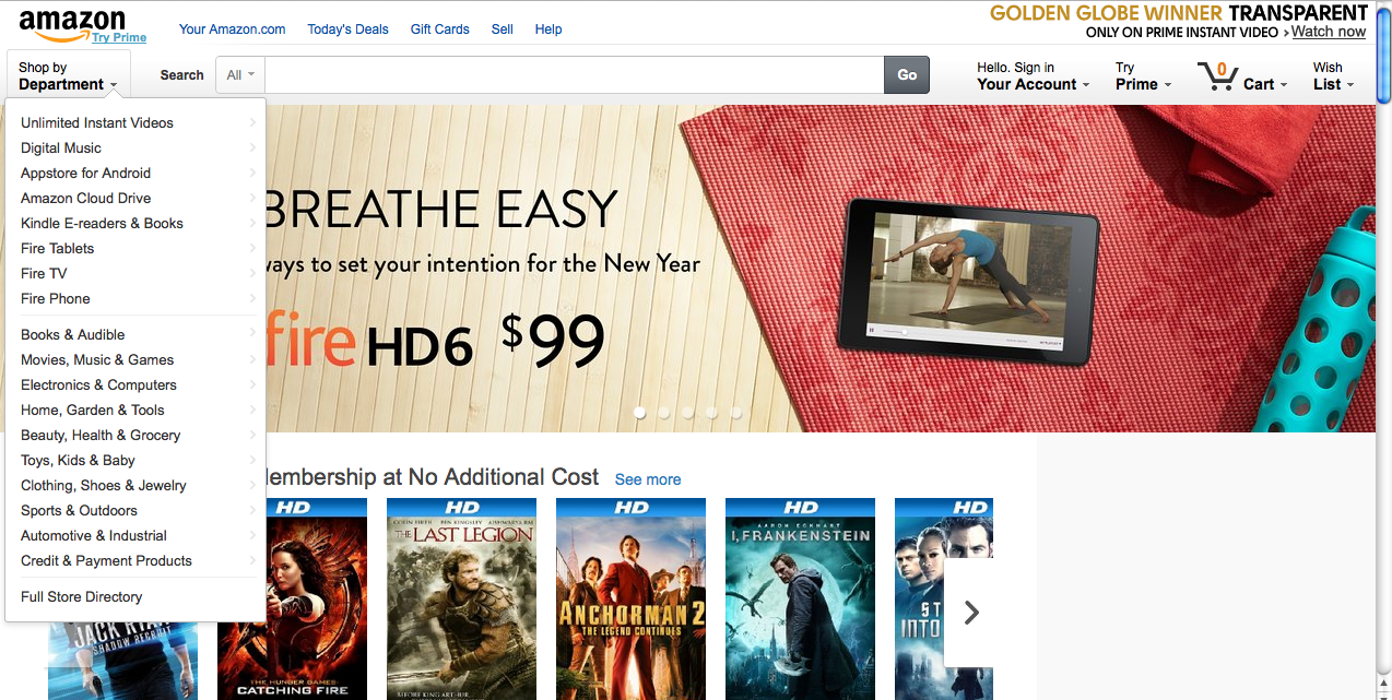
Photo Credit: Amazon
The amount of choices available in the interface, along with the aforementioned aggregation of links and the algorithm that customizes each registered user’s needs makes Amazon one of the most complicated websites you’ll see on the internet today. And yet the front-end experience is surprisingly simple because of the nested interface.
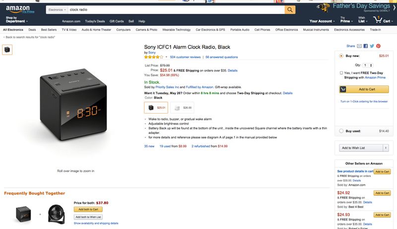
Photo Credit: Amazon
As a consumer, users appreciate the buying and paying options Amazon displays prominently on each product page.
If you’re building an e-commerce site chances are you’re not building the next Amazon, but there are great examples of what a smaller, less involved site should have.
- The more complicated the site and the greater availability of choices, the simpler the UI must be. Instead of jamming in top-level navigation items, nest and layer the information.
- Build trust and loyalty in the experience through smart UI decisions. In the context of e-commerce, reviews are the natural choice. On a broader level, you can build trust by displaying logos of top brands you work with, featuring testimonials (either with photos of customers or through video), and following the rules for a confident UI design.
- Give buyers a chance to change their purchase at different stages of the checkout process. On a higher level, build forgiving interfaces to reduce the likelihood of frustrating experiences. As described in Interaction Design Best Practices, create humane feedback by notifying users of potential consequences of their actions. Then, as remedial measures, explain through clear feedback messages how to fix errors and create forgiving formats for user input.
- Big images sell the product! While Amazon takes more of a utilitarian approach by featuring a carousel of on-sale products at the top of the page, you can certainly take a more elegant approach with hero images if you’re a smaller e-commerce store (or even if you aren’t in e-commerce at all).
For more practical UI design tips based on an in-depth analysis of 33 companies, check out our free e-book, Web UI Design Best Practices.