In a word, users want a UX that’s empowering. They want it to be valuable to their lives, transforming them into a better version of themselves. Creating a product that the user “can’t live without” should be the goal of any UX design, but that’s easier said than done.
Transformative design is difficult because it must feel invisible. Like a good illusion, the design must not draw attention to its own power.
Since empowerment is such an abstract concept, we’ve deconstructed the 7 best ways to making your design feel like a good magic trick.
1. Ease the Pain
First and foremost, an empowering UX should make the user’s life easier — in fact, notable designer Paul Boag calls it the secret to any successful UX design. This is why your site or app exists in the first place.
Photo Credit: Buffer
Designing a product to enhance your user’s life involves:
- Knowing your users’ problems
- Knowing your users’ preferences for solutions
- Knowing how your competitors are solving the problems and where their methods can be improved
At the end of the day, a product must solve some core user problem. Before beginning the design, ask yourself, “How is this improving the user’s life? What problems is this solving?” To ensure you’re designing the right product, first follow the advice in The Guide to Usability Testing.
2. Shorten the Distance to Goal Completion
After answering “What problems will this solve,” you want to ask yourself “how will this solve them best?”
The alternative is when designers get hung up on features or a newer version, forgetting the product’s original purpose in the first place. A shiny new feature can’t mask a poor UX.

Photo Credit: Google Drive
The design must reflect the product’s commitment to the user. You can design a goal-focused interface by:
- Stripping away divergent paths in your user flows
- Drawing attention the right elements through visual hierarchy
- Organizing a cohesive information architecture
- Using an intuitive system of controls (e.g., navigation, menus, etc.) that matches your page layout.
- Ensuring text labels and instructions are clear. For headings, be descriptive (“Your contact information”). For button labels and command links, use verb-noun pairs (“Create new prototype”) and verb phrases (“Start over”).
It’s not enough that the plane flies — an aerodynamic shape makes it fly better.
3. Present An Invisible UI (Slippy UX)
Design as little interface as possible. No hurdles, no distractions, and no unnecessary involvement from the interface.
You want to create the illusion that the user’s efficiency is due to their own abilities, not because of your great design.

Photo credit: Nanamee

Photo credit: Carbonmade
Creating what’s referred to as “Slippy UX”, an invisible UI doesn’t mean that every site needs to be minimalist and devoid of interface objects. Slippy UX is simply about reducing all distractions and potential obstacles, creating a smooth (“slippery”) experience that guides the user quickly to their goal.
4. Forgive Mistakes Generously
User errors are inevitable, so incorporate some foresight into the design. In keeping with the Slippy UX philosophy, if a user error derails their efforts to accomplish a task, it will disrupt their immersion.
Large warnings or technical error messages seem to “punish” the users, which certainly don’t improve the UX. These make users blame themselves for easily avoidable faults (quite the opposite effect of rewarding habit loops).
- In clear yet friendly language, remind users of actions with potentially severe consequences, such as losing information.
Photo credit: Chrome via Google Docs
Photo credit: Carbonmade
- In case your users still make a mistake, a subtle and polite message explaining the fix or offering the opportunity to undo it can give them the confidence to continue onwards.
Photo credit: Google Docs
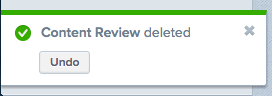
Photo Credit: Asana
- To reduce unintentional errors, hide certain actions until the prerequisite action is completed. For example, in Medium, you first need to write something before the “Publish” button activates.
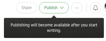
Photo credit: Medium
- At the subtlest level, use forgiving formats so that your interface responds naturally to how users prefer to input data. For example, Google Calendar allows for multiple input styles when scheduling with the “Quick Create” function. You can write the information as an instruction like “Dinner next Tuesday at 2PM”, or as simple as “Dinner 12/15 2:00PM”.
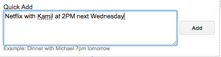
Photo credit: Google Calendar
5. Stay Consistent
Consistency is always important because it cultivates security and trust, which are essential to empowerment. Small details like keeping the navigation in the same place on different pages or using a color-code to differentiate topics leave your users with less things to worry about.
The less they need to think, the smarter your users feel.
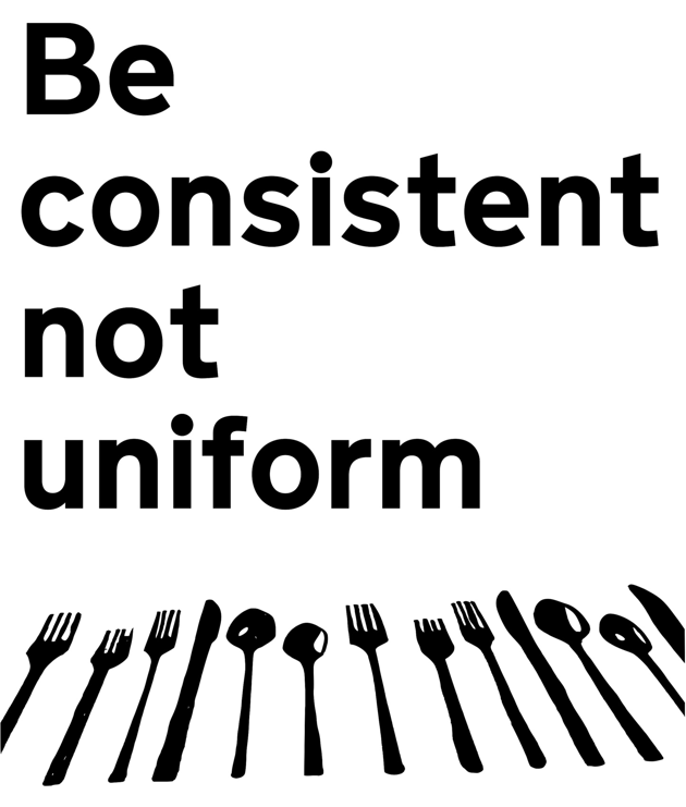
Photo Credit: “Be consistent not uniform.” Paul Downey. Creative Commons.
Consistency eliminates the surprises and confusion that disrupt the user’s immersion. A consistent UI lulls the user into a trance where they can focus on achieving their goal — and nothing else.
6. Provide Useful Onboarding
The onboarding phase can make or break your user’s opinion of and commitment to the product. Handling this with care will create an environment in which your user can confidently, and enthusiastically, explore everything your site or app has to offer.
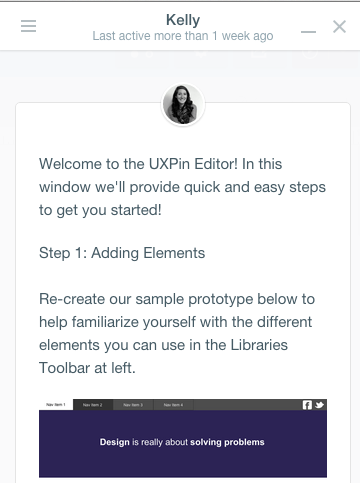
Photo credit: UXPin
In general, this phase should:
- Instruct the user on the controls
- Familiarize the user with the layout and features
- Point out aspects the user might not discover on their own
- Entice the user to upgrade their plan, or at least excite them about returning to user the product.
The method of onboarding should vary according to the product. A site with complex and unfamiliar features may need to spoon-feed their users at first with a comprehensive tutorial, whereas a simple app with recognizable features can get away with letting their users dive in head first, pointing out features here and there. Sometimes its good to engage your user by presenting them tasks as they set up their profile, while other times its better to cut the cord and let them have fun.
Don’t feel limited to one or the other. You can combine approaches to create a hybrid unique to your product’s needs. No matter which method you choose, though, these best practices should be applied:
- Don’t draw it out — Avoid wordy explanations and unnecessary steps so the user can get to actually using the product as soon as possible.
- Use images — Images can explain functions faster and more clearly than text, plus provide the opportunity to show your product’s style.
- Completeness meters — Outline the total number of steps or percentage of completeness so the user can gauge how long it will take.
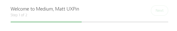
Photo Credit: Medium
- Progressive disclosure — A helpful time-saver is progressive disclosure, allowing your users to choose which and when to read certain explanations. Don’t apply these to the essentials, though, as there’s a chance the user will ignore them.
- Make it enjoyable — Playful graphics and light joking can make the learning process as painless as possible.
To see how successful companies handle onboarding, check out User Onboard.
7. Create Meaningful Delight
Delightful design isn’t just for show — the more a user enjoys a design, the more they perceive it as being functional. Therefore, delightful design can actually increase usability.
But delightful design isn’t just cutesy mascots and throwaway jokes. Delightful design that’s useful follows these 3 principles:
- Polished aesthetics — Sites and products, too, must dress their best for success. Regardless of the style, the aesthetics should be at their best. Read our Web UI Design for the Human Eye: Books I and II for specific instructions.
- Human voice — Make your product personable by giving a human tone to the copy. Address the user as an individual and adopt a casual tone if your field of business allows it. When used correctly, jokes can break tension and even facilitate actions, such as MailChimp alleviating the stress of sending a mass email.
- Discoverables — Users expect a certain degree of delightful design, so surprising them will maximize the effect. Adding a animated microinteraction or a clever bit of copy in an untraditional place will leave a more memorable impression.
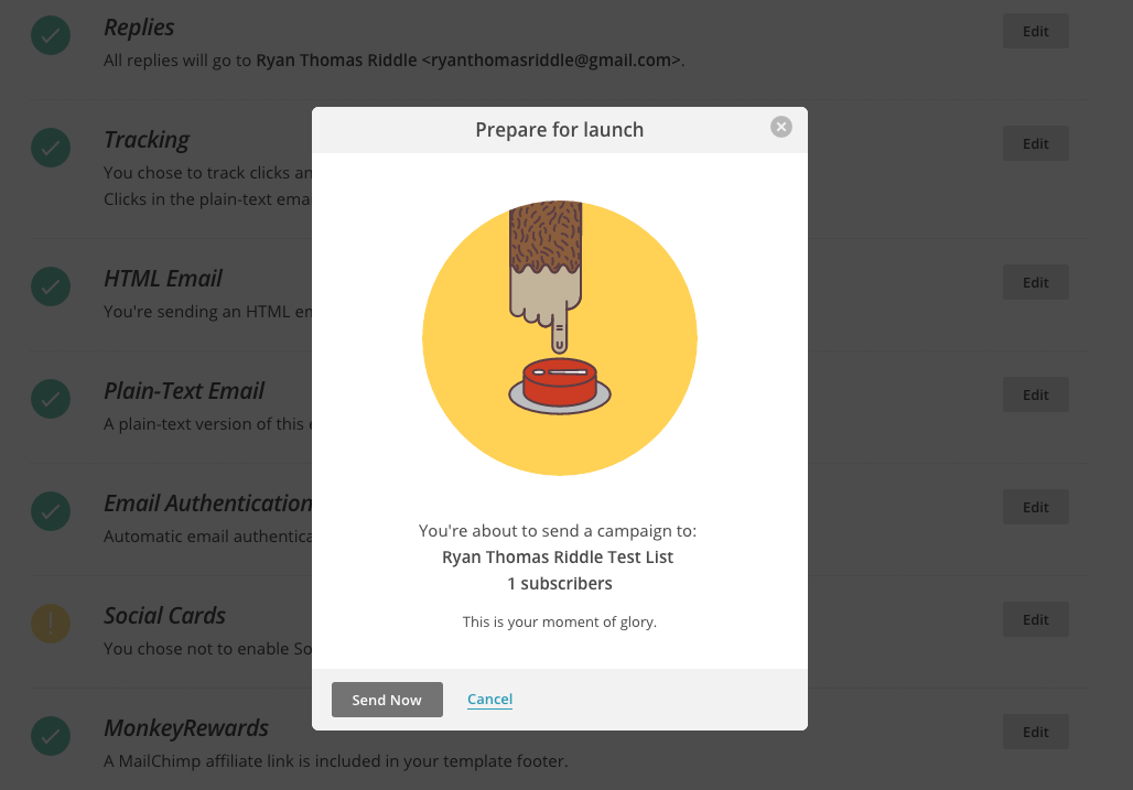
Photo Credit: MailChimp
Delightful design should never take priority over the function or usability, but when used together can complement the UI well.
Takeaway: Just Good Design
An empowering UX design is not just some trend that will fall out of fashion in a few years. It is the backbone of good product design. Don’t fall into the trap of trying to fix UX with a new gimmick. Unless a new feature will improve the user’s life, it’s just a band-aid. Designers who discover ways to make their users happier — and then design a UI to bring that quality out — will always win out over purely cosmetic tactics.
If you’ve found this article helpful, go ahead and download the free guide UX Design Trends 2015 & 2016. We deconstruct 71 examples of great UX design into techniques for everyday design.