Google Product Director Luke Wroblewski recently described five broad categories of responsive layouts. Reiterated in a Google Developers post, these patterns give designers a head start when deciding how and why to set elements on a page. Remember that an “ultimate responsive layout” doesn’t exist. Each of these options comes with its own merits, and the best choice all depends on the type of site you’re designing.
1. Mostly fluid
Luke’s “mostly fluid” pattern reflows content dynamically within a fixed parent container instead of the browser’s viewport. Parent containers — those that hold other elements — frequently use the CSS max-width property to keep from expanding beyond a certain width while fitting within narrow viewports. According to Google, this pattern only requires one breakpoint, assigned to the parent element, while the elements inside them reflow automatically as the parent resizes. This pattern works well on sites with a diverse set of layouts among its many pages like marketing sites, ecommerce sites, news sites — anything with more than one type of content. The site for UXPin actually follows the mostly fluid pattern. 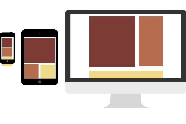
2. Column drops
Thinking mobile-first, Luke’s “column drop” pattern turns a stack of columns on its side to take advantage of additional horizontal space in tablet and desktop-sized viewports. Unlike other patterns, this one tends to fill the available viewport regardless of size. This is ideal for responsively designed sites that users will view on a very wide range of displays. 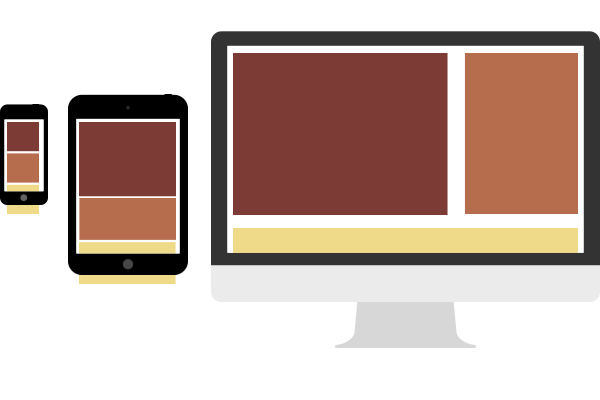
3. Layout shifter
Unlike the column drop pattern, Luke’s “layout shifter” uses many breakpoints. 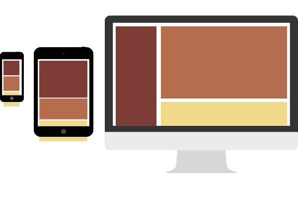 Smartphone and tablet-sized viewports see a typical stacked layout, and the design grows more complex with wider browsers by rearranging content with a specific plan. This requires designers to consider each breakpoint range as if it were an independent design, but works well for visual-heavy sites like portfolios, agency sites, and photo galleries.
4. Tiny tweaks
Luke’s “tiny tweaks” pattern is the most straightforward strategy: content, margins and padding all subtly increase with viewport size while using the same layout. This low-maintenance approach best serves simple, single-column designs — or designers on tight deadlines with little budget for later adjustments. 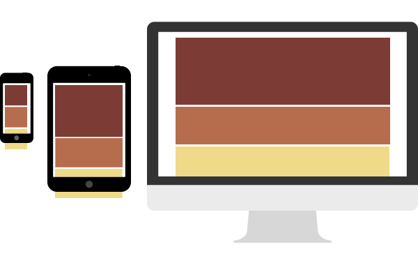
5. Off-canvas
Luke’s “off-canvas” pattern pushes secondary content out of sight, literally outside of the viewport until called upon. Rather than stacking content vertically on small viewports, this pattern places them side by side with a trigger — typically JavaScript — that “shifts” adjacent panels into and out of the viewport. This is a real boon not only to navigation, but also to blogs that need to focus on large amounts of text and keep asides literally to the side. 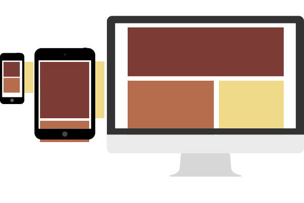
Conclusion
When Luke Wroblewski researched these at the Media Queries website, he looked for broad, repeating trends among many different sites. He found that there is no one quick design solution that covers every situation. And while exceptions to the above patterns may exist, these cover most situations that occur across the web. Designers can choose from these five patterns to give their layouts direction before they design — a real head start in their work. To learn more about current web design trends and techniques, check out the free guide Web Design Trends 2015 & 2016.