5 Creative Mobile UI Patterns for Navigation
There’s no one way to design your mobile navigation… but some ways work better than others.
In this piece, we’ll examine 5 creative yet highly usable navigation patterns.
The point of UI patterns is to save users time in learning your interface. But this can also be a drawback since it’s harder to stand out if your design just looks like everyone else’s. Like we explored in the free e-book Mobile UI Design Patterns, it’s definitely not easy to balance the two needs.
This is the criteria we based the below patterns on: familiar enough that the controls are recognizable, but flexible enough that you can customize them as needed.
First, let’s start with a quick overview of mobile navigation fundamentals.
The Principles of Mobile Navigation
While we’d like to think of design as a sandbox where anything goes, there are rules – or at least logical practices – that keeps everything sensible. Think of these as universal guidelines.
For starters, the obvious difference between mobile and desktop design is the screen size. Mobile screens are smaller, so all parts of the screen become more valuable. For this reason, mobile navigation systems should be minimal: the site’s content needs to stand front-and-center, while the navigation feels almost invisible.
But because designers are thinking of new ways to minimize the navigation controls, the solutions are sometimes confusing and misunderstood. That’s why mobile navigation must also be coherent. As stated in Interaction Design Best Practices, use the proper signifiers (e.g. correct visual metaphors)so that the navigation doesn’t require any explanation.
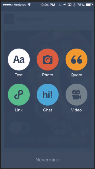
Photo credit: Tumblr via Capptivate
Finally, the mobile navigation must be consistent for the entire site. Don’t move the navigation controls to a new location on different pages. This will just disorient the user. Take a look at the patterns below and pick the one that will work best for you – but once you pick one, stick with it.
1. Sliders
Sliders take advantage of one of the most popular features of mobile devices, the touch screen. However, as a navigation method, they are relatively underused.
If you have only a few elements to go through, sliders are a great navigation tool. With their gesturing controls, they feel natural, as well as fun. At this point, the slide bar is recognizable enough that users know its function, so it’s also a practical choice as well.
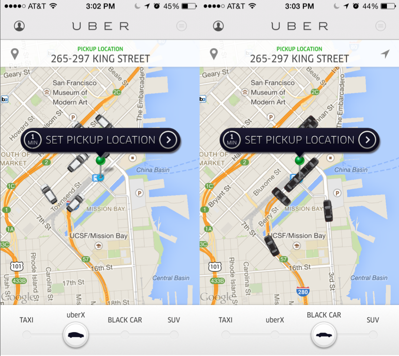
Photo credit: Uber
Sliders work especially well for progressive or closely related pages. For example, the Uber app above allows users to navigate between four different types of services. The beauty of Uber’s slider is that users can use the same map view for each of the four pages. For them, the slider isn’t just a creative alternative to the norm, it’s also the most practical solution.
However, sliders have a limited range. If you’re navigating between more than 6 or 7 pages, the slider will become harder to navigate.
2. Pictorial Icons
The idea of a pictorial icon is not new. It is one of the most logical solutions to the problem of saving mobile screenspace. The picture on the icon explains where it will take you, making them more space-efficient than text descriptions.
Sure, this satisfies the familiarity requirement, but what makes them creative? The picture itself.
The style of the picture can be anything you want, allowing you to showcase your site’s unique personality. Even if every site had the same icons, each one could still look different based on how they depict the image.
Everyone knows that an envelope icon represents email, but how you choose to draw the envelope is up to you. Realistic or cartoony, simplistic or detailed – as long as it looks like an envelope, you can do anything.
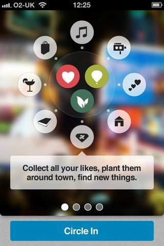
Photo credit: CircleMe via Mobile Tuxedo
The CircleMe app uses a lot of familiar icons: hearts, music notes, books, house, etc. However, they modify them in a way that’s unique to the app. This makes navigation simple and easy-to-use, but still with enough freedom to separate them from others.
Compare the CircleMe icons to another app…
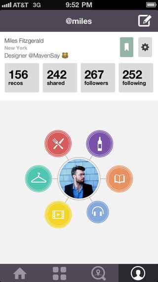
Photo credit: iTunes
… MavenSay. The icons from these two apps represent a lot of the same fields, and yet use different pictures. CircleMe uses a camera to represent video, while MavenSay uses a play button within a film strip. Even when they use the same imagery – a book – the visual style is completely different.
In this way, pictorial icons are the best of both worlds. They retain the familiarity of what other sites are doing, but still allow the freedom of creativity.
3. Card Grid
As we explained in our free ebook Cards & Minimalism, the card pattern is on the rise due to its simplicity and adaptability to responsive design. The touch-screen navigation of mobile devices turn the basic card format into a grid of buttons, where the user has only to press the relevant card to go to the page.
Cards can be either images, text descriptions, or both together. The point is that they create an organized and coherent system for showing available options.
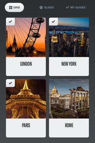
Photo credit: National Geographic City Guides via Mobile Tuxedo
National Geographic’s City Guides displays the need-to-know information on four of the most visited cities in the Western world. The same navigation could have been accomplished with four textual links taking up a fraction of the space, but the card system adds a whole new level of visual enjoyment beyond just navigation. The push-button format also encourages exploring.
4. Spinner Wheel
Favoring more the side of creativity than practicality, the spinner wheel is just usable enough to be acceptable, making it a viable option for an out-of-the-box navigation system.
Like the slider, the spinner wheel utilizes gesture controls to add a fun and natural feel to using an app. However, unlike the slider, spinner wheels are able to take advantage of the continual repetition of the circle. There is no end; getting to the end of the list means starting over at the top.
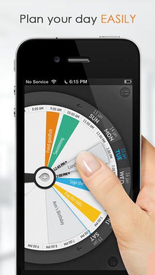
Photo credit: iTunes Preview
As a daily organizer app, Sooner has a lot of competition and has a greater need to set itself apart. The spinner wheel does just that, with the same functionality and usefulness as its competition, but with a bit more fun.
5. Full-Screen Navigation
While other sites are struggling to minimize the space their navigation systems take up, the full-screen pattern takes the exact opposite approach. It might sound contradictory to what we said about saving screen space, but full-screen navigation is very easy to use.
Although you won’t be able to display any content, the full-screen navigation pattern is best for simplicity and coherence. Once the user makes their decision about where to go, then you can dedicate screenspace to content. This pattern is like a one-step-at-a-time strategy, where instead of cramming everything into the screen at the same time, the site “chunks out” the experience (at the expense of a bit of user freedom).
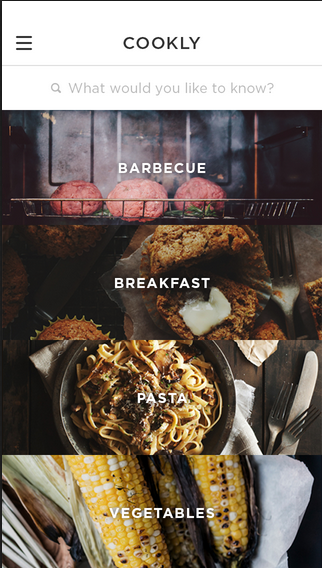
Photo credit: Cookly via Dribbble
Cookly uses a full-screen navigation menu with photo backgrounds to get entice the user to use the app. There is no content on this screen except the navigation options and the relevant pictures. But as an introduction to the app, the pictures set the right mood. The simplicity of the navigation ensures that the user will get where they want to go.
Conclusion
There’s nothing necessarily wrong with more traditional navigation UI patterns like sidebars, pulldowns, or even the hamburger menu… except that they’re used quite a lot.
Sometimes you need to get creative with how users get around your site. Just remember that you can’t sacrifice usability.
The only thing worse than getting lost in the crowd is being clever for the sake of being clever. Both creativity and familiarity are damaging in excess – it’s best to find a happy medium between the two.
For a more detailed list of the the best mobile UI design patterns, navigation and beyond, download the free ebook Mobile UI Design Patterns. Across 100 pages, we explain 46 patterns in a simple problem/solution format with examples from today’s hottest companies.